
Rebrand Revolution: Go Compare's Journey Through Digital Transformation

CREDIT: Ragged EdgeIn the paced world of online marketing the transformation of Go Compare stands out as a significant example showcasing the importance of creative design, strategic branding and digital adaptation. The shift from a comparison site to a modern digital brand exemplifies the art of adjusting to evolving consumer preferences while staying true to its core identity that connects with people of all ages.
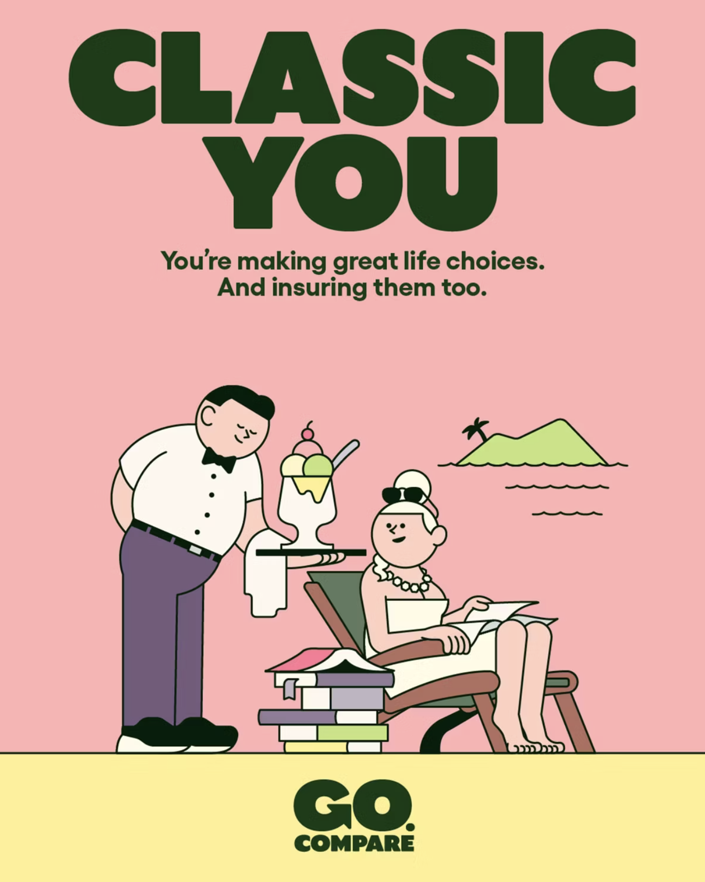
Founded in 2006 Go Compare entered the industry with a mission; to simplify the complex process of comparing insurance plans in a way that is easy to understand for everyday consumers. The brand set itself apart with its character, embodied by the memorable figure Gio Compario. This operatic persona, singing praises about the brands offerings in an unforgettable manner became a cultural symbol ingrained in societys collective memory.
However as technology advanced and customers gravitated towards mobile platforms Go Compare realized the necessity for change. This wasn't about surface level adjustments but an extensive reexamination of the brands essence, principles and communication strategies, in an increasingly digital focused environment.
In 2022 a bold rebranding initiative was undertaken with the help of Ragged Edge, an agency to better resonate with the desires of a new generation seeking simplicity, transparency and authenticity in brands.
The Origins and Growth of Go Compare
Established in 2006 Go Compare made waves in the UKs insurance comparison sector as a force. Its initial branding approach centered around creating a presence amidst tough competition by using catchy jingles and introducing Gio Compario, an iconic mascot portrayed by Welsh tenor Wynne Evans. This operatic figure quickly became synonymous with the brand conveying the message of comparison shopping through a mix of humor and slight annoyance.
The brands early marketing efforts stood out for their distinctiveness and widespread reach breaking through advertising clutter with a blend of opera and comedy. This strategy captured attention. Cemented Go Compare as a well known name across households in the UK. However with digital platforms gaining prominence among consumers the brand encountered the task of adapting its identity to remain relevant and attractive to a diverse audience.
The Choice, for Rebranding
The decision to rebrand Go Compare stemmed from acknowledging the shifting landscape and changing consumer expectations.
In 2022 the company started a revamp by teaming up with Ragged Edge, a creative agency recognized for its innovative branding strategies. The goal was to develop an identity that mirrored the brands dedication to simplicity, transparency and empowering customers in the era.
The rebranding effort went beyond updating visuals or designing a new logo; it involved completely reimagining Go Compares brand image to resonate with tech savvy audiences. The process entailed diving into Go Compares values refining the brands message and encapsulating it in a contemporary, adaptable and visually appealing identity.

CREDIT: Ragged EdgeThe Fresh Look; Emphasizing Simplicity and Adaptability
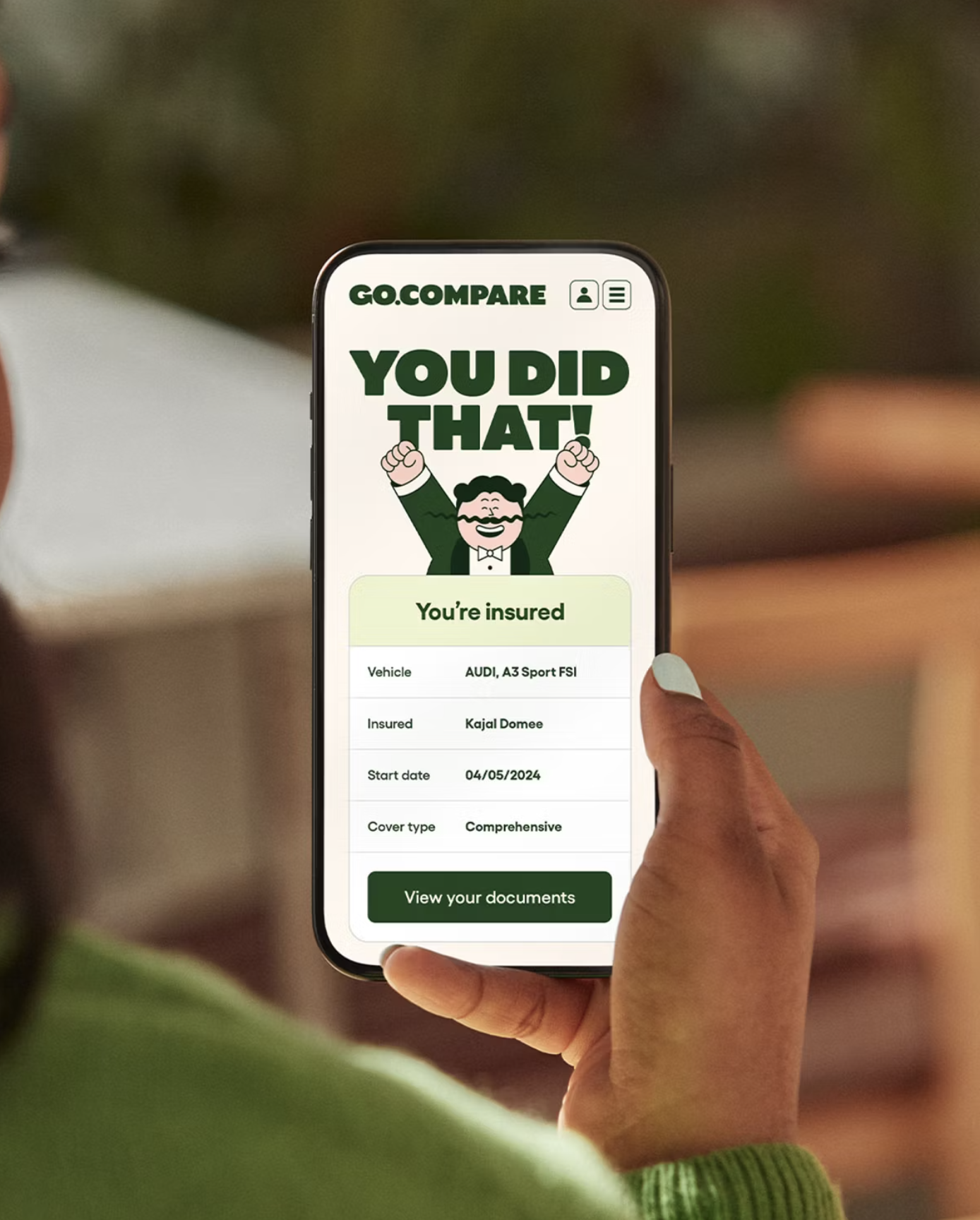
At the core of Go Compares identity lies the principle of simplification. The rebranding eliminates complexities and distractions commonly associated with financial services opting instead for a sleek and minimalist approach. The new logo embodies simplicity and versatility symbolizing Go Compares commitment, to facilitating comparison shopping in an user friendly manner.
The use of a color scheme and a modern sans serif font signifies the brands intention to be perceived as approachable, trustworthy and current.
These components collaborate to form an identity that is both memorable and versatile suitable for use across various digital platforms and interfaces.
Revamping the Brand Experience
Apart from the elements the rebranding initiative involves a comprehensive reassessment of the customer journey. Go Compares fresh branding is designed to captivate users on digital platforms ranging from social media to mobile applications with an emphasis on user friendly design and easy navigation. The rebranding extends to the language tone and messaging now highlighting clarity, warmth and a customer centric approach.
This transformation not aligns with current digital trends but also establishes a new benchmark for openness and user friendliness in the insurance comparison industry. By reinventing its brand image Go Compare has reaffirmed its dedication to empowering consumers by simplifying their decisions regarding insurance requirements.
Market Positioning and Consumer Perception
Following the rebranding effort Go Compare experienced a shift in its market positioning and how consumers perceive it. The brandings focus on simplicity, transparency and putting customers first resonated positively with an audience increasingly seeking clarity and integrity, from financial service providers.
The simple design and user friendly experience were tailored to meet the needs of tech individuals attracting a younger audience while still keeping the loyal customers engaged.
The brands makeover also underlined Go Compares dedication to innovation and empowering customers which're essential qualities in an industry known for its complexity and lack of transparency. By presenting itself as an approachable choice Go Compare solidified its reputation as a trustworthy advisor in the insurance comparison sector.
Response from Industry and Competitive Advantage
The response from the industry towards Go Compares rebranding has been mostly positive with many recognizing the thinking strategy behind it. By embracing an approach that focuses on digital expertise and adaptability Go Compare has positioned itself favorably against competitors. The rebranding initiative sends a message to both the market and consumers that Go Compare is not just following digital trends but is also setting new standards for the industry.
This strategic shift has also given Go Compare an edge, over its rivals allowing it to stand out in a market. The updated contemporary identity sets the brand apart not visually but also through a brand experience that resonates with todays consumers preferences and requirements.
Lessons to Learn for the Future of Branding
The rebranding journey of Go Compare offers insights for other brands navigating the complexities of the digital era. One key lesson is the importance of aligning brand identity with consumer expectations and digital best practices as interactions increasingly take place on platforms. Having a user friendly identity is essential in todays digital landscape.
Moreover the rebranding of Go Compare illustrates the effectiveness of simplicity in design and messaging. In a world filled with information and choices brands that offer clarity, ease and transparency are more likely to build connections with their audiences.
Lastly Go Compares rebrand emphasizes the need for evolution. Brands must be willing to review and enhance their identity to stay relevant and competitive by keeping of emerging trends, technologies and consumer behaviors.
In wrapping up our examination of Go Compares rebranding journey it is clear that this effort goes beyond just changing aesthetics. It signifies a shift in brand strategy that shows an understanding of the digital first consumer environment and a forward thinking approach, to engaging todays audiences.
The transformation of Go Compare from its melodramatic beginnings to a modern user friendly digital platform provides valuable insights into the art and science of contemporary brand evolution.

CREDIT: Ragged EdgeThe Strategic Impact of Go Compares Rebranding
Go Compares rebranding exemplifies the brands dedication to innovation empowering customers and leading the market. By prioritizing a first approach Go Compare not only improved its visual and interactive appeal but also solidified its role as a trusted advisor in the insurance comparison industry. This change emphasizes the significance of brands being adaptable, responsive and willing to redefine themselves to meet evolving consumer expectations.
The Cultural and Market Significance
The impact and market influence of Go Compares rebranding effort are profound. Through altering its visual representation the brand has established new benchmarks for transparency, simplicity and user interaction in the digital era. This move has not strengthened Go Compares competitive advantage but has also positioned the brand as a standard bearer for excellence and innovation within the field.
The positive feedback from consumers and industry experts underscores the effectiveness of Go Compares approach indicating a trend, towards authentic user centered brand communications.
The shift from a narrative centered on characters to one focused on values in branding reflects a trend in marketing that prioritizes authenticity and usefulness.

Key Insights and Future Directions
Go Compares rebranding provides a roadmap for companies navigating the challenges of the digital world. The essential lessons learned from this transformation – embracing simplicity empowering customers and adopting a digital first approach – offer valuable guidance applicable across various sectors.
The success of this rebranding initiative underscores the significance of planning and innovative execution in establishing a brand that not only survives but thrives amidst digital advancements. It urges brands to assess their identity, values and communication strategies in response to the dynamic market landscape.
Envisioning Tomorrow
Looking Go Compares rebranding journey stands as an inspiration for brands aiming to navigate the digital shift. It showcases how brands can effectively pivot and adjust to norms by prioritizing consumer needs and digital interaction as core elements of their approach.
In an era where change's constant Go Compares narrative serves as a testament, to the transformative power of branding when guided by a clear vision, thoughtful strategy development and creative foresight.
In todays changing digital landscape the recent rebranding of Go Compare highlights the importance of a brands ability to adapt, innovate and set new trends. This detailed examination of Go Compares rebrand by Phable.io serves as a guide for other companies looking to make a significant impact in the modern digital era. It emphasizes the importance of embracing looking strategies in areas such as brand identity, customer experience and online interaction. By drawing insights from Go Compares transformation journey brands can gain inspiration and valuable insights to navigate their evolution successfully. This underlines the roles played by innovation and flexibility in attaining enduring success and relevance, amidst constant change.