Lacoste's New Brand Identity Explained: The Strategy Behind One of Fashion's Most Important Rebrands
Source: Lacoste
Most fashion rebrands make the same mistake.
They chase modernity.
Logos become flatter. Typography becomes simpler. Distinctive assets are stripped away in pursuit of contemporary relevance. In the process, many brands lose the very characteristics that made them memorable in the first place.
Over the past decade, luxury and fashion branding has become increasingly uniform. Historic wordmarks have been replaced with generic sans-serif typography. Heritage has often been sacrificed for minimalism. In many cases, brands that once felt distinctive now look remarkably similar.
Lacoste has taken a different path.
In 2026, the French fashion house unveiled a significant evolution of its visual identity. Rather than abandoning its past, the company has looked back into its archives, reintroducing more heritage-led design cues, refining its iconic crocodile emblem and building a visual system that places greater emphasis on French culture, craftsmanship and history.
At first glance, the changes appear subtle.
In reality, they reveal a great deal about where Lacoste believes the future of the brand lies.
This is not simply a logo update.
It is a strategic repositioning of one of the world's most recognisable fashion businesses.
What This Article Covers
Lacoste's latest visual identity refresh is about far more than aesthetics.
In this article, we examine what changed, why those decisions were made and what the redesign reveals about Lacoste's broader commercial strategy. We'll explore the evolution of the crocodile, the introduction of a new typography system, the role of French heritage within the brand and how the identity supports Lacoste's increasingly premium positioning.
We'll also examine what other organisations can learn from the project, why many heritage brands are moving away from minimalist design trends and whether Lacoste's latest identity strengthens its competitive position in the years ahead.
Specifically, this article covers:
Why Lacoste evolved its visual identity
What changed in the new brand system
The strategic thinking behind the redesign
The role of heritage in modern fashion branding
How Lacoste balances sportswear and luxury
Why the brand moved away from minimalist design trends
The commercial objectives behind the refresh
What other brands can learn from Lacoste's approach
Our assessment of whether the redesign succeeds
In a Hurry? The Key Takeaways
Lacoste has introduced a new heritage-inspired visual identity.
The redesign strengthens the brand's French luxury positioning.
A bespoke serif typography system replaces a more contemporary approach.
The famous crocodile has been refined rather than reinvented.
The identity reflects a wider shift away from minimalist branding.
The refresh supports Lacoste's long-term ambition to sit between luxury fashion and sportswear.
The project demonstrates how heritage brands can modernise without abandoning their history.
Why Lacoste Needed to Rebrand
To understand the redesign, it is important to understand the challenge facing the business.
For decades, Lacoste occupied a unique position within fashion.
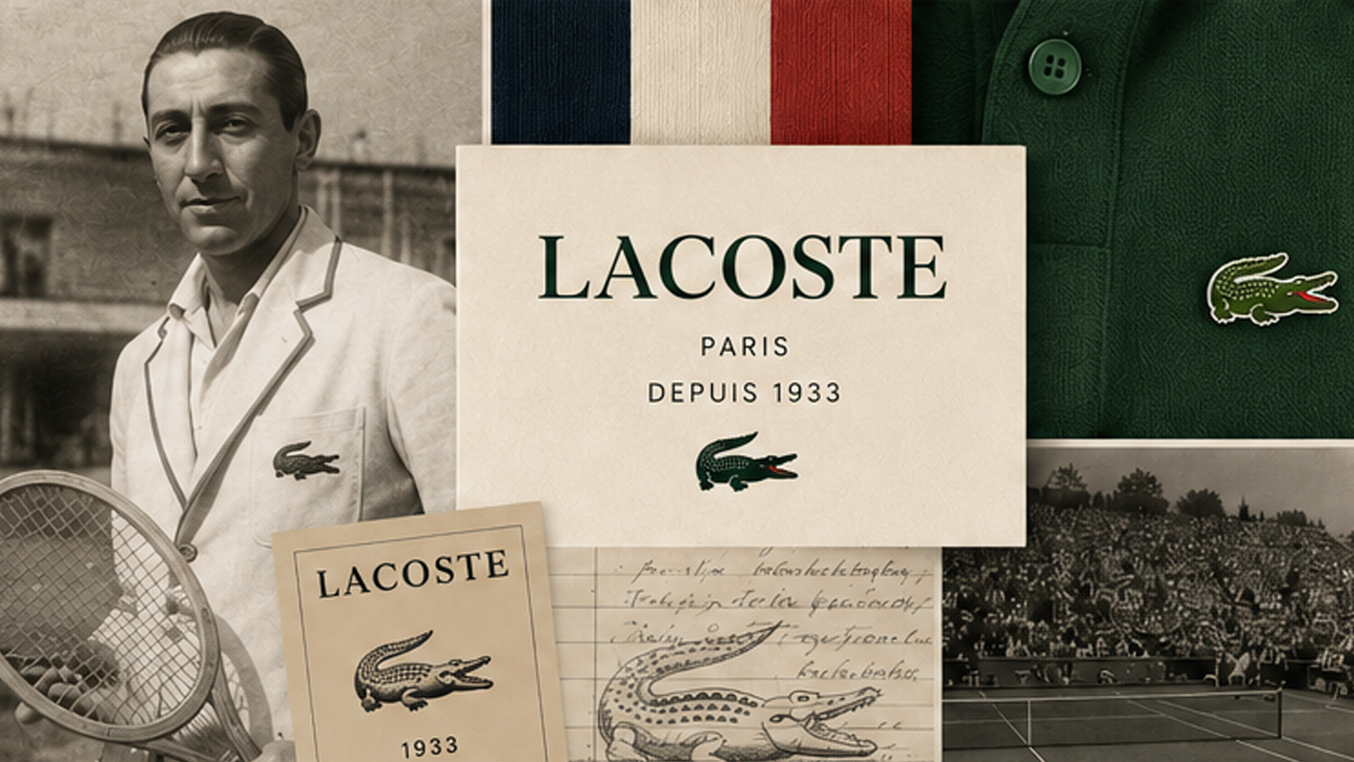
Founded by tennis champion René Lacoste in 1933, the company became famous for creating the modern polo shirt and pioneering one of the earliest examples of logo branding in apparel. The embroidered crocodile quickly became one of the most recognisable symbols in global fashion.
For much of its history, this positioning was clear.
Lacoste represented elegance through sport.
But the market around the brand changed.
Sportswear brands became more fashion conscious.
Luxury brands became increasingly casual.
Streetwear blurred the distinction between premium fashion and performance apparel.
Consumers who once viewed fashion categories separately now move seamlessly between them.
As a result, Lacoste faced a strategic challenge.
How do you maintain your sporting credibility while increasing your fashion desirability?
How do you remain authentic to your history while competing within a luxury market increasingly driven by storytelling, heritage and cultural relevance?
The answer appears to be a renewed emphasis on what made the brand distinctive in the first place.
What Actually Changed?
Many successful identity projects are not immediately obvious.
This is one of them.
The most significant changes occur within the brand's visual system rather than through a radical logo redesign.
The identity introduces a bespoke serif typography system inspired by Lacoste's historical materials and archives.
The new typeface feels more refined, more elegant and more culturally rooted than the brand's previous visual language.
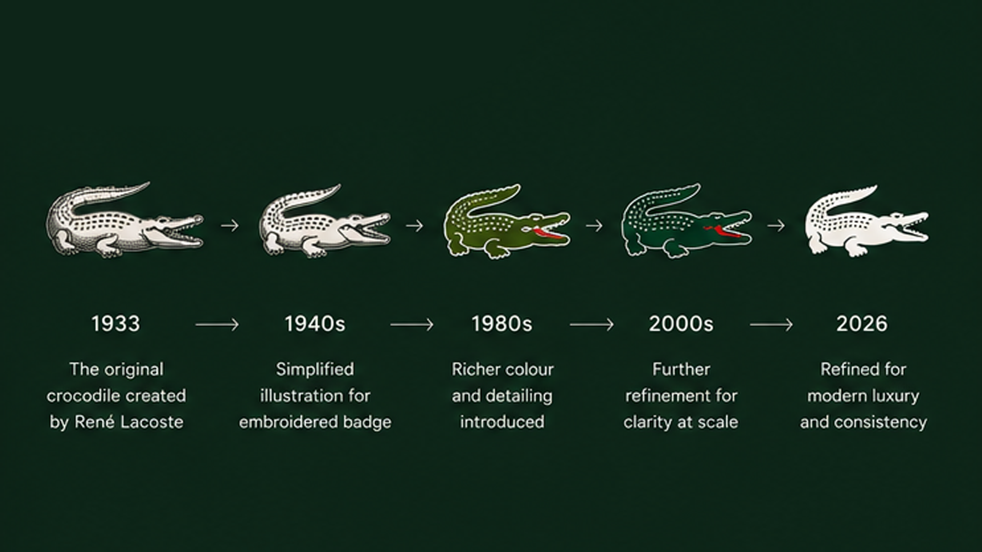
The crocodile itself has also been updated.
Importantly, Lacoste resisted the temptation to reinvent its most valuable asset. Instead, the company refined and clarified the emblem, improving consistency while preserving the character that consumers instantly recognise.
Beyond these elements, the wider system places greater emphasis on editorial layouts, typography, heritage storytelling and premium presentation.
Collectively, these changes move Lacoste closer to the visual language of a luxury fashion house than a traditional sportswear company.
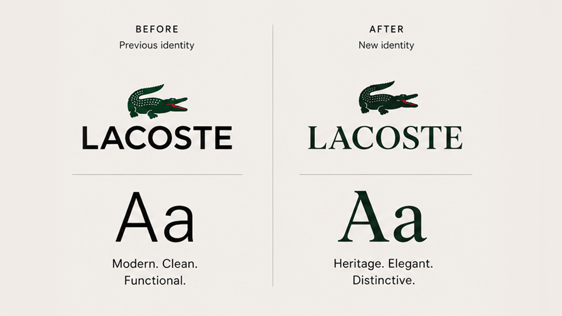
The Typography Strategy
Perhaps the most important aspect of the redesign is typography.
Many fashion brands spent the last decade simplifying their identities.
Distinctive wordmarks disappeared.
Character was removed.
Brands increasingly adopted similar geometric sans-serif typefaces.
As a result, many competitors began to look interchangeable.
Lacoste's decision to introduce a more expressive serif system represents a significant strategic shift.
Rather than pursuing simplicity for its own sake, the company has prioritised distinction.
The typography immediately communicates heritage, confidence and cultural depth.
More importantly, it gives the brand ownership of a visual language that feels uniquely Lacoste.
This is becoming increasingly important in a world where visual sameness has become a competitive weakness.
The Evolution of the Crocodile
The crocodile remains one of the most valuable assets in global fashion.
Unlike many fashion logos, it transcends language.
Consumers do not need to read the word Lacoste to recognise the brand.
That makes it extraordinarily powerful.
The redesign demonstrates a level of restraint often missing from modern rebrands.
Rather than redesigning the crocodile, the company refined it.
The proportions, detail and application have been improved, but the essence remains unchanged.
This approach reflects a broader truth about successful identity systems.
The strongest assets rarely need reinvention.
They need stewardship.
Why Heritage Matters More Than Ever
One of the most interesting aspects of the project is its emphasis on French heritage.
For many years, heritage branding was often viewed as restrictive.
Brands wanted to appear modern.
Today, the opposite is often true.
Consumers increasingly value authenticity, provenance and cultural depth.
History has become a competitive advantage.
For Lacoste, French heritage is not a marketing invention.
It is a genuine differentiator.
Few competitors can claim nearly a century of cultural relevance, sporting credibility and fashion influence.
The new identity embraces this reality.
Every visual decision reinforces the same message:
This is not simply sportswear.
This is a French cultural institution.
The Bigger Business Strategy
Viewed purely as a design project, the refresh appears relatively modest.
Viewed as a business decision, it becomes much more significant.
Over recent years, Lacoste has increased its presence within premium fashion, invested in elevated collections and strengthened its position within luxury retail environments.
The new identity provides the visual infrastructure required to support that evolution.
The goal is not to become a luxury fashion house overnight.
The goal is to strengthen perceptions of quality, craftsmanship and cultural relevance while retaining the sporting heritage that made the brand successful.
This balancing act is difficult.
Move too far towards fashion and you risk losing authenticity.
Remain too rooted in sport and future growth becomes constrained.
The redesign attempts to solve both challenges simultaneously.
What Other Brands Can Learn From Lacoste
The most valuable lesson from this project is surprisingly simple.
Not every rebrand requires reinvention.
For brands with genuine heritage, the strongest strategy is often excavation rather than invention.
Many organisations spend years searching for new stories.
Lacoste demonstrates the value of rediscovering existing ones.
Rather than asking:
"What should we become?"
The company appears to have asked:
"What have we forgotten?"
The answer was already sitting in its archives.
Final Verdict
The strongest rebrands rarely generate shock.
They generate clarity.
Lacoste's latest identity succeeds because it strengthens what was already distinctive rather than replacing it.
The refined crocodile, heritage-inspired typography and renewed emphasis on French culture create a system that feels more premium, more confident and more strategically focused than the version it replaces.
More importantly, the identity aligns with the future direction of the business itself.
This is not a sportswear company trying to become fashionable.
It is a heritage fashion brand rediscovering what made it valuable in the first place.
That distinction makes all the difference.
Frequently Asked Questions
Why did Lacoste change its brand identity?
Lacoste evolved its visual identity to strengthen its premium positioning, reinforce its French heritage and support the brand's continued development between luxury fashion and sportswear.
What changed in the new Lacoste identity?
The most significant changes include a new heritage-inspired typography system, refinements to the crocodile emblem and a broader visual language that places greater emphasis on editorial design and brand storytelling.
Did Lacoste redesign the crocodile logo?
No. The crocodile was refined rather than fundamentally redesigned. The objective was to improve consistency while preserving one of the brand's most recognisable assets.
Is Lacoste becoming a luxury brand?
Lacoste continues to occupy a position between premium sportswear and luxury fashion. The new identity suggests a stronger emphasis on luxury cues while maintaining the sporting heritage central to the brand's history.
What can other brands learn from Lacoste's rebrand?
The project demonstrates that heritage can be a competitive advantage. Rather than chasing trends, brands with authentic histories can often create stronger identities by rediscovering and modernising their existing strengths.