Branding for Technology Companies — Built for Clarity and Growth
We act as your strategic branding partner, turning complex technology into clear, commercially effective brands that scale.
Explore our technology branding case studies or discuss your branding project.
Built for complexity
AI, DevOps, SaaS, infrastructure, cloud, data, fintech, cybersecurity, climate, healthtech, telecoms.
We learn the technology first, then make it compelling.
Designed to perform
Positioning, messaging, identity, and content systems built to create clarity, alignment, and demand.
Branding is not decoration. It’s persuasion.
Proven to scale
Trusted by startups, scale-ups, and enterprise technology companies.
We build frameworks that grow with your business, not one-off design projects.
Substack
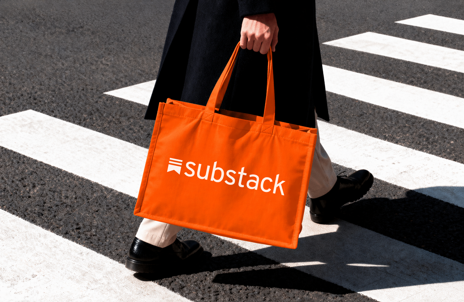
Substack has become one of the defining technology platforms in independent publishing, giving writers, journalists and creators the tools to build publications and direct relationships with their audiences. Phable worked with Substack’s internal team on the branding and content design of a number of high-profile publications within its creator ecosystem. The work focused on how individual publications could develop a distinctive identity while still feeling at home within the wider Substack experience, bringing together editorial design, visual systems and digital content. Rather than rebranding the platform itself, this project demonstrated how thoughtful brand and content design can strengthen the experience of a technology product whose success depends as much on its creators and their audiences as it does on the software behind it.

Rothschild
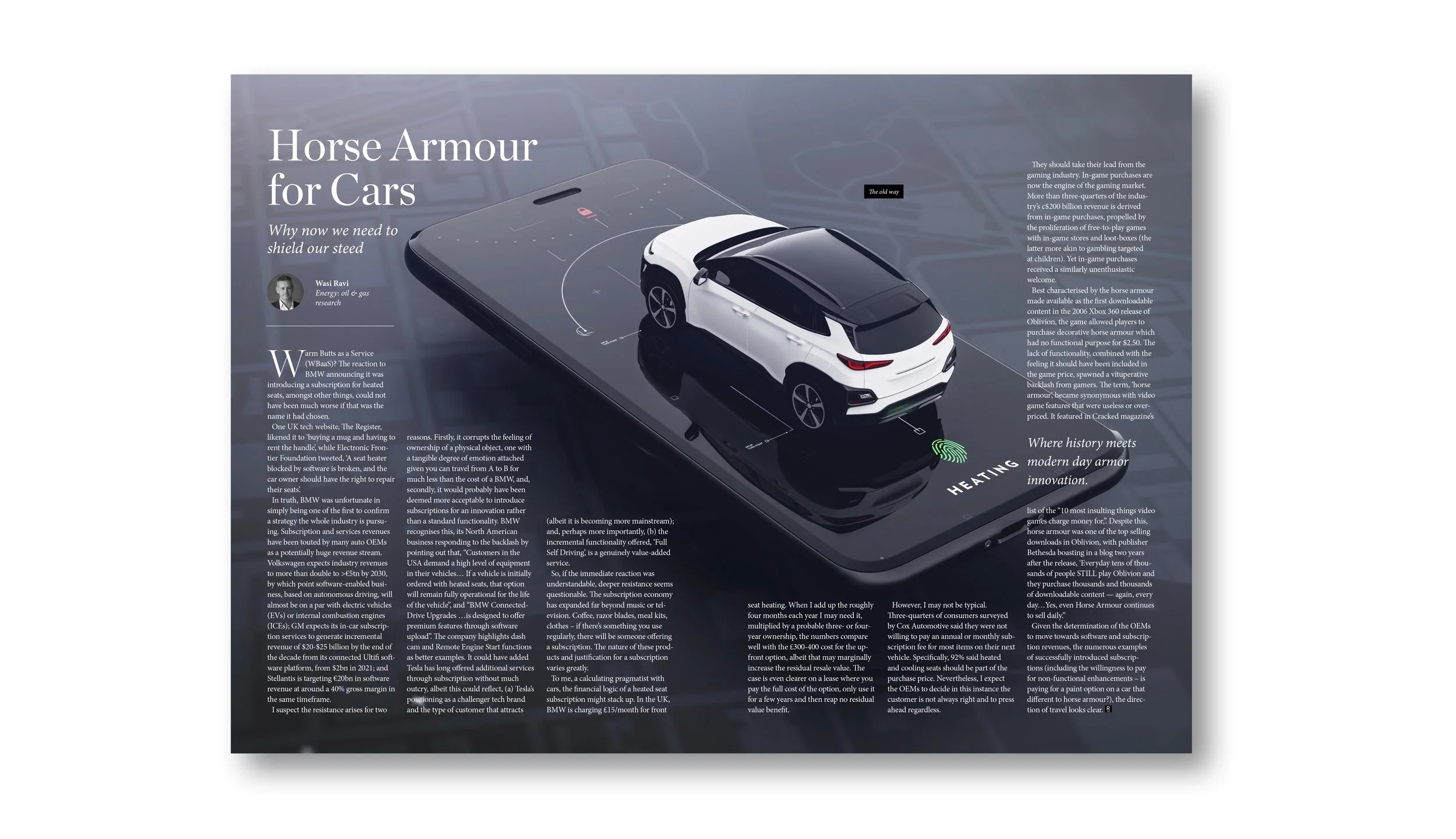
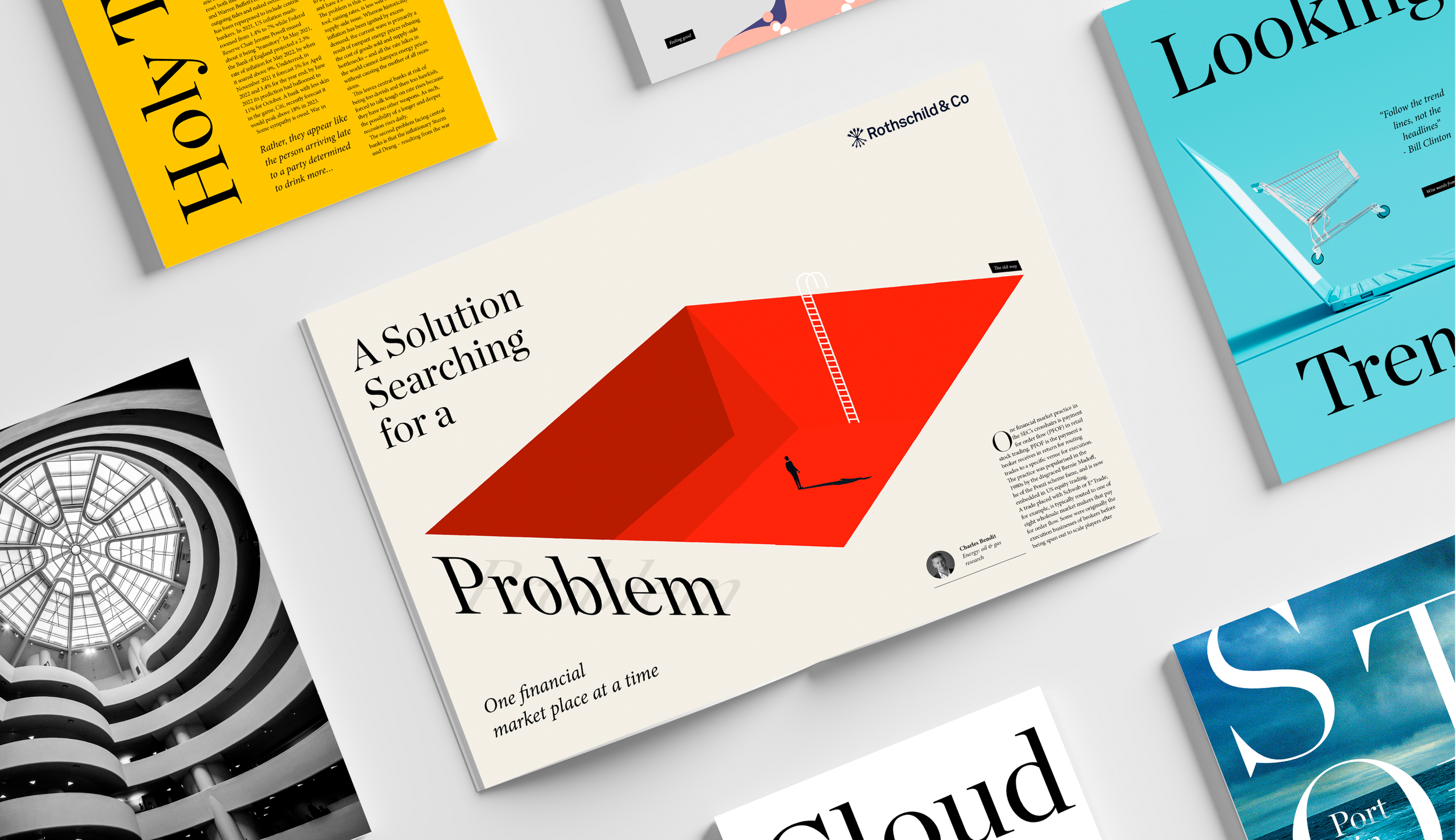
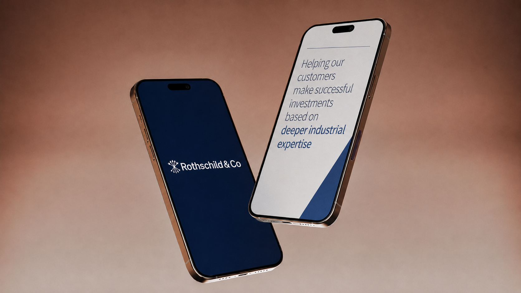
Rothschild partnered with Phable to refine how its brand and communications were presented across it’s print and digital touchpoints, ensuring clarity and consistency at an institutional level. We developed structured content and design systems that aligned messaging with the firm’s reputation for expertise and trust. The work simplified complex financial narratives into clear, authoritative communication, improving accessibility for a global audience. This enabled Rothschild to strengthen its brand presence, reinforcing credibility while ensuring its brand remained consistent, modern, and aligned with the expectations of high-value clients and stakeholders.
ViSense
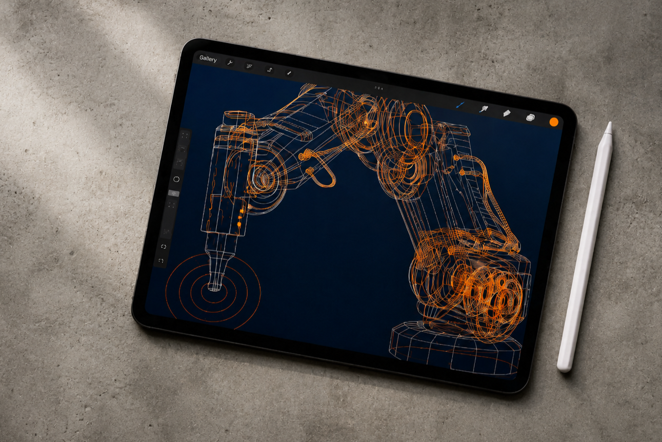
ViSense is a Swiss AI company using computer vision and machine learning to diagnose errors in industrial machinery. Phable led a comprehensive rebrand designed to turn a highly technical product into a clearer and more distinctive commercial proposition. Working directly with the founders, we examined the company’s audiences and value proposition before developing its positioning, messaging, tone of voice, visual identity and brand guidelines. We then carried the new identity through the website, event materials and wider communications. For an industrial AI business, the challenge was to communicate sophisticated technology without allowing technical detail to obscure the reason customers should care. The new brand gave ViSense a more confident way to explain both what its technology does and the practical value it creates for industrial customers.

Regenerate
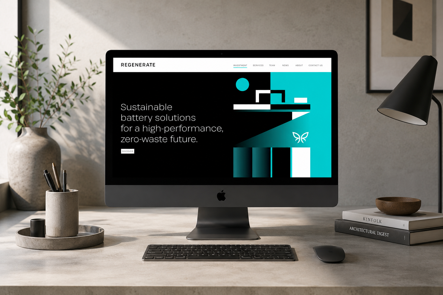
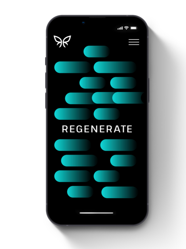
Regenerate Technology is working on a central challenge in the transition to cleaner energy: recovering and upcycling valuable metals from used batteries so they can contribute to the next generation of battery materials. Phable developed a new visual identity for the company, including its logo, colour system and wider brand guidelines, creating a clearer connection between the science behind the business and its circular-economy ambition. The challenge was to give a highly technical battery and materials company an identity that could communicate innovation and environmental purpose without falling into the familiar visual language of sustainability brands. The resulting brand gave Regenerate a more distinctive platform for presenting its battery technology, research and zero-waste vision to partners, stakeholders and the wider clean-technology market.
American Battery Technology Company
American Battery Technology Company develops technologies for producing and recovering critical battery materials, including lithium-ion battery recycling and primary lithium extraction. Phable led a comprehensive rebrand for ABTC as the company moved through an important period of commercial growth, beginning with a detailed brand investigation with its founders before developing a new identity, messaging, visual assets and the proposition Leading the Charge. The work was subsequently applied across the company’s website, investor and marketing communications, helping a technically complex battery business present itself with greater clarity and consistency to investors, partners and the wider market. ABTC continued to use the identity and messaging created by Phable as the company progressed to a US stock-market listing, making the project an important example of branding for a clean-technology company moving from emerging venture to public business.
Byanat
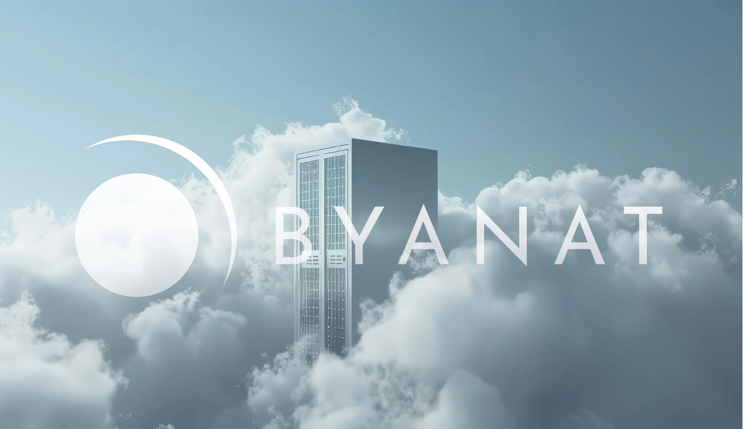
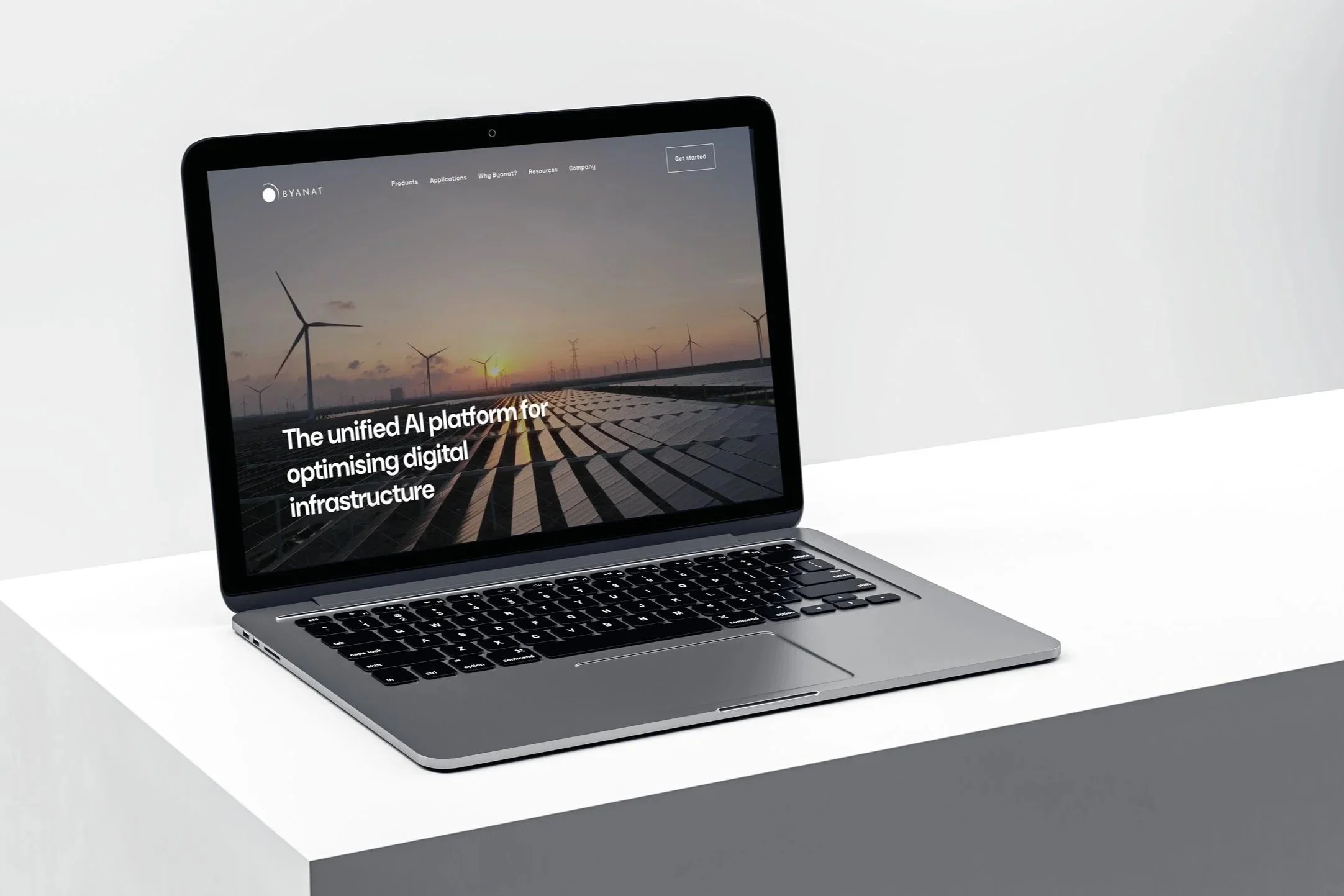
Byanat is an Omani technology company building a unified AI platform for the infrastructure behind telecom networks and data centres across it’s region. Phable worked with the founders to create a stronger brand and communications system around a proposition spanning artificial intelligence, data analytics, network observability and infrastructure optimisation. Our work brought together visual identity, digital experience, messaging and campaign content, giving Byanat a more coherent way to explain sophisticated technology to enterprise buyers and partners. Crucially, the brand needed to work beyond the language of a technology startup: Byanat was building for major infrastructure operators and expanding across the MENA region. The resulting identity helped present the company with the clarity and confidence expected of an enterprise AI business while retaining the ambition and distinctiveness of an emerging technology brand.
Bubbly
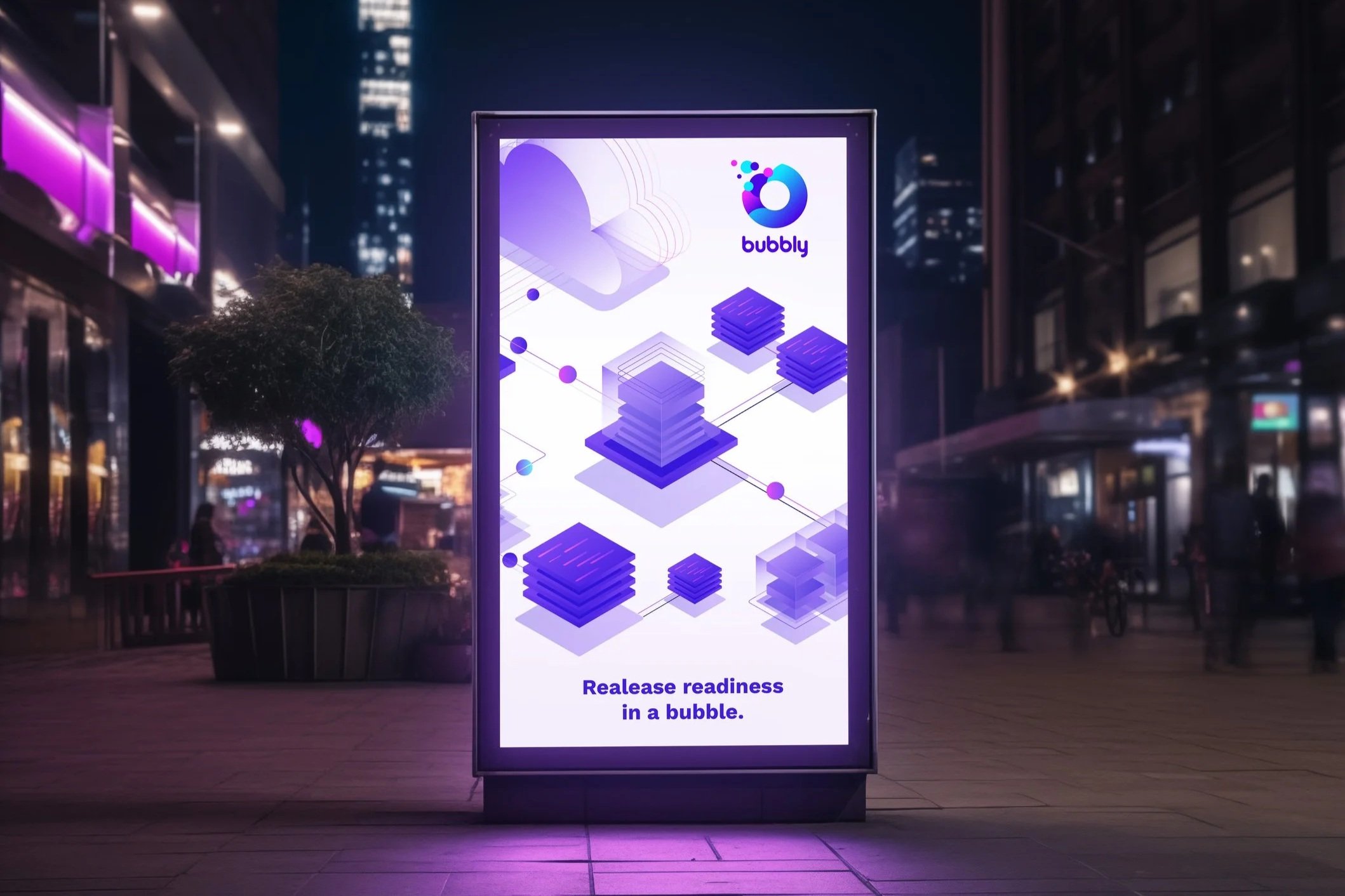
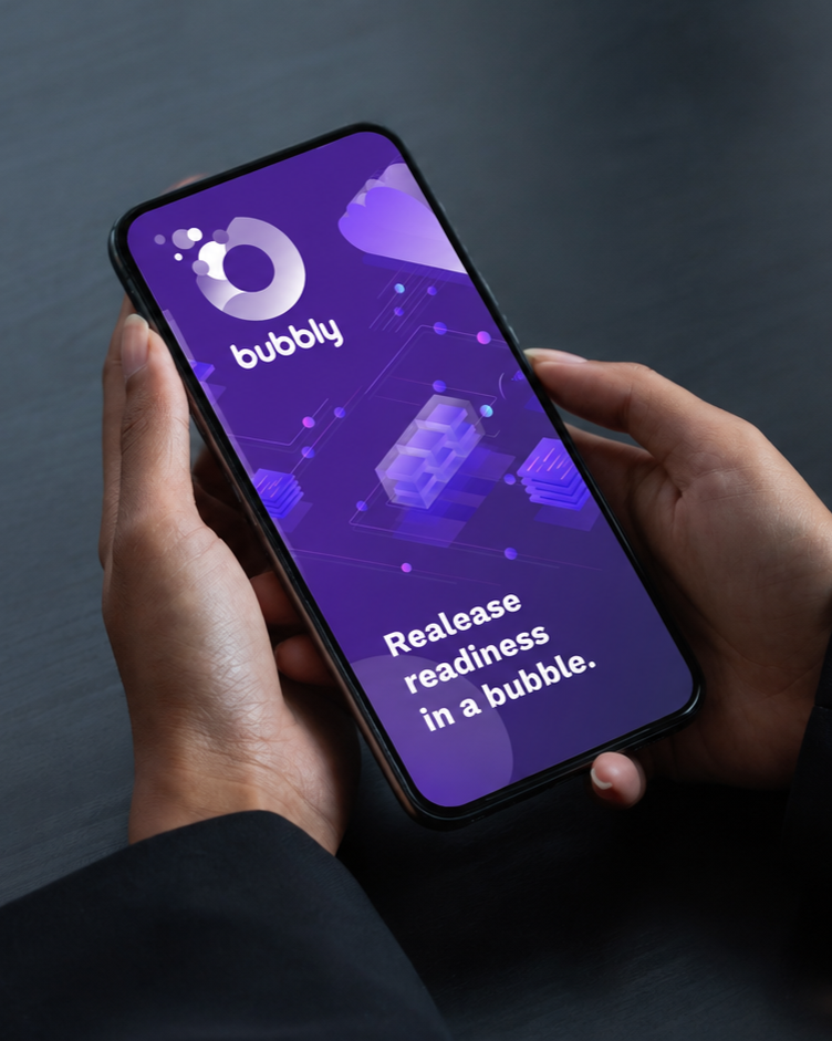
Bubbly was created by DevOps consultancy Verifa as an open-source tool for assessing release readiness within modern software-delivery pipelines. Phable worked with the team from the earliest stages of the brand, beginning with a stakeholder workshop to understand the product, its place within CI/CD workflows and the expectations of the developer community it was designed for. We explored more than a dozen creative directions before developing a distinctive logo and visual identity around the idea of having release readiness contained “in a bubble”. The result was deliberately different from the often functional visual language of developer tooling while still feeling credible within an open-source environment. Bubbly demonstrates Phable’s experience branding highly specialised software products where understanding the technology is essential before a meaningful creative idea can emerge.
GitHub
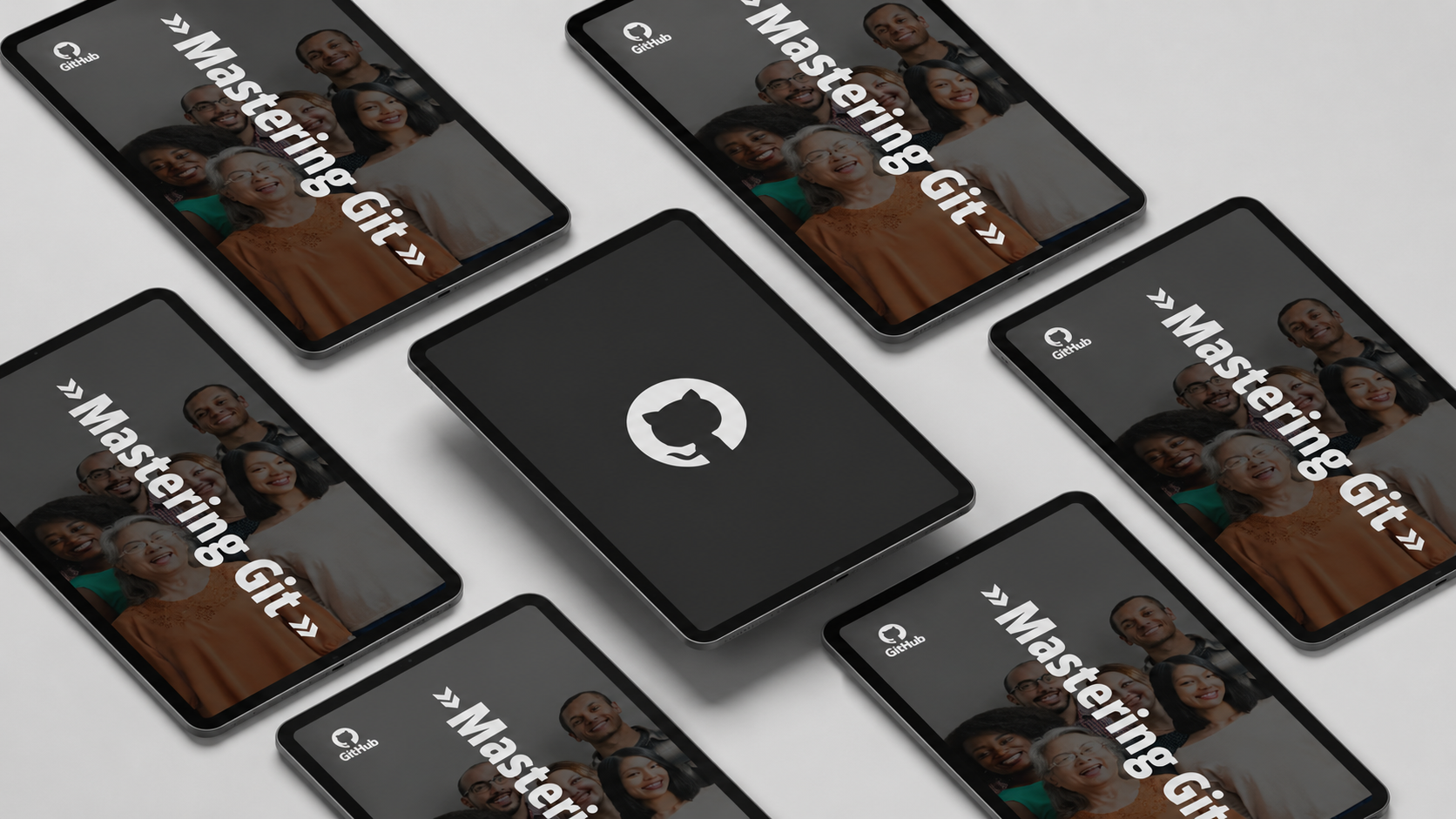
Phable’s work with GitHub centred on Git Academy, an initiative created with DevOps consultancy Praqma to engage and educate the developer community through a programme of in-person events. Working alongside GitHub’s marketing team, Phable provided creative direction and produced the branding and promotional materials needed to turn the initiative into a coherent event experience. This included campaign content, banners, cards, merchandise and professionally produced print materials for attendees. The brief was not to reinvent one of the world’s best-known developer brands, but to understand its visual standards, its audience and the culture surrounding modern software development well enough to create work that felt naturally part of the GitHub ecosystem. It is an example of Phable applying technology-brand expertise within an established global brand rather than creating one from the ground up.
Citrix
Phable worked on a campaign for Citrix in collaboration with Logicalis, creating content designed to communicate the value of Citrix cloud technology to enterprise audiences. The project centred on the relationship between Citrix and Logicalis and the way their combined expertise could make the transition to cloud infrastructure and digital working easier for customers. Phable developed the video strategy and supporting social campaign, turning a potentially technical enterprise proposition into clearer, more accessible communications focused on reliability, onboarding and business value. Rather than a corporate rebrand, the work shows another side of technology branding: helping an established global technology company explain a specific product and partnership in a way that remains consistent with its wider brand while still giving audiences a clear reason to engage.


Eficode
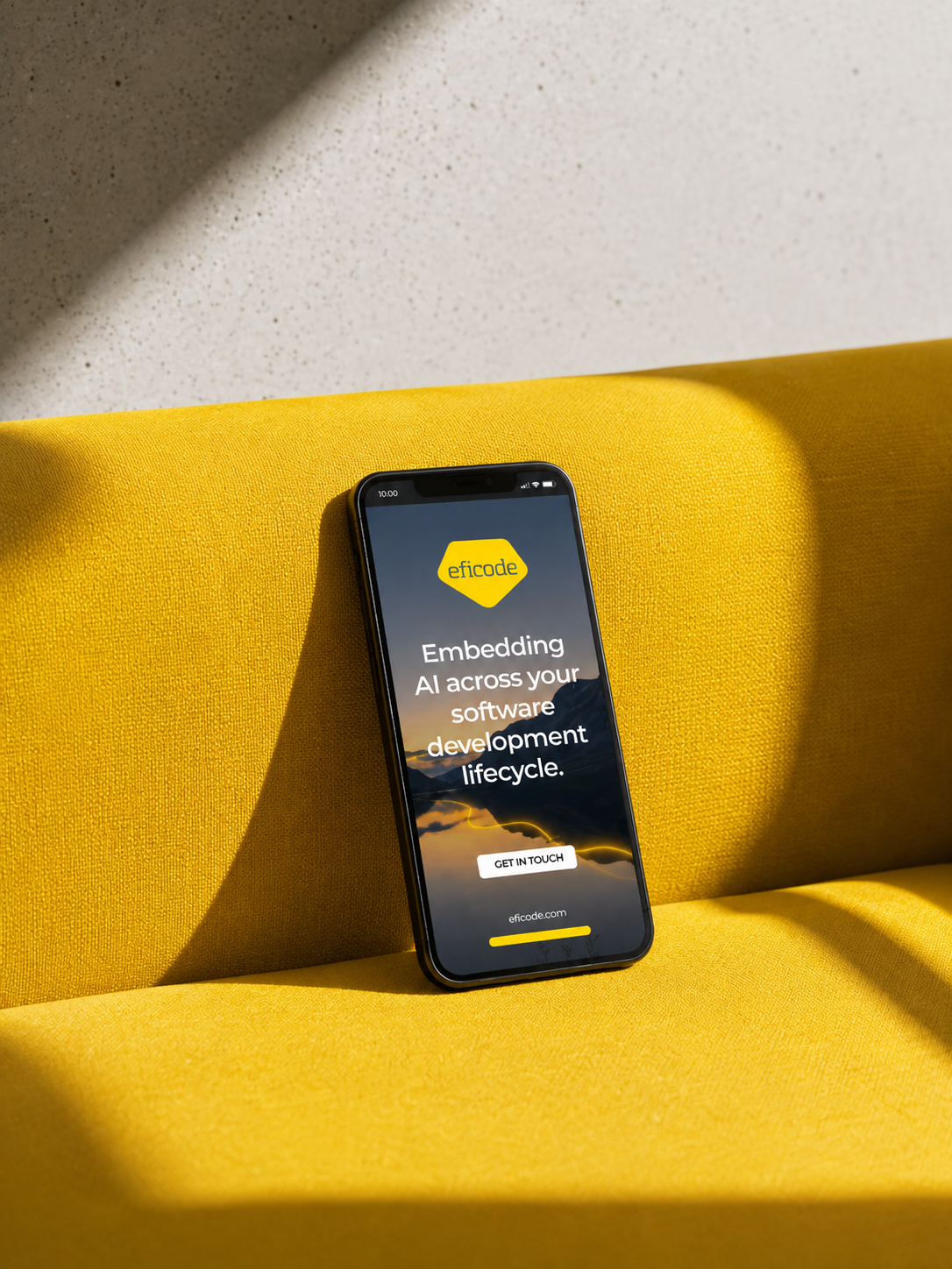
Eficode partnered with Phable to refine its brand and content strategy, supporting growth within the DevOps and software delivery market. We developed structured messaging and content systems that clarified its services and value proposition across digital channels. The work simplified complex technical offerings into clear, actionable communication, improving engagement with both technical and business audiences. This enabled Eficode to strengthen its market positioning, supporting expansion by making its expertise more accessible, credible, and aligned with enterprise demand.

Krunam
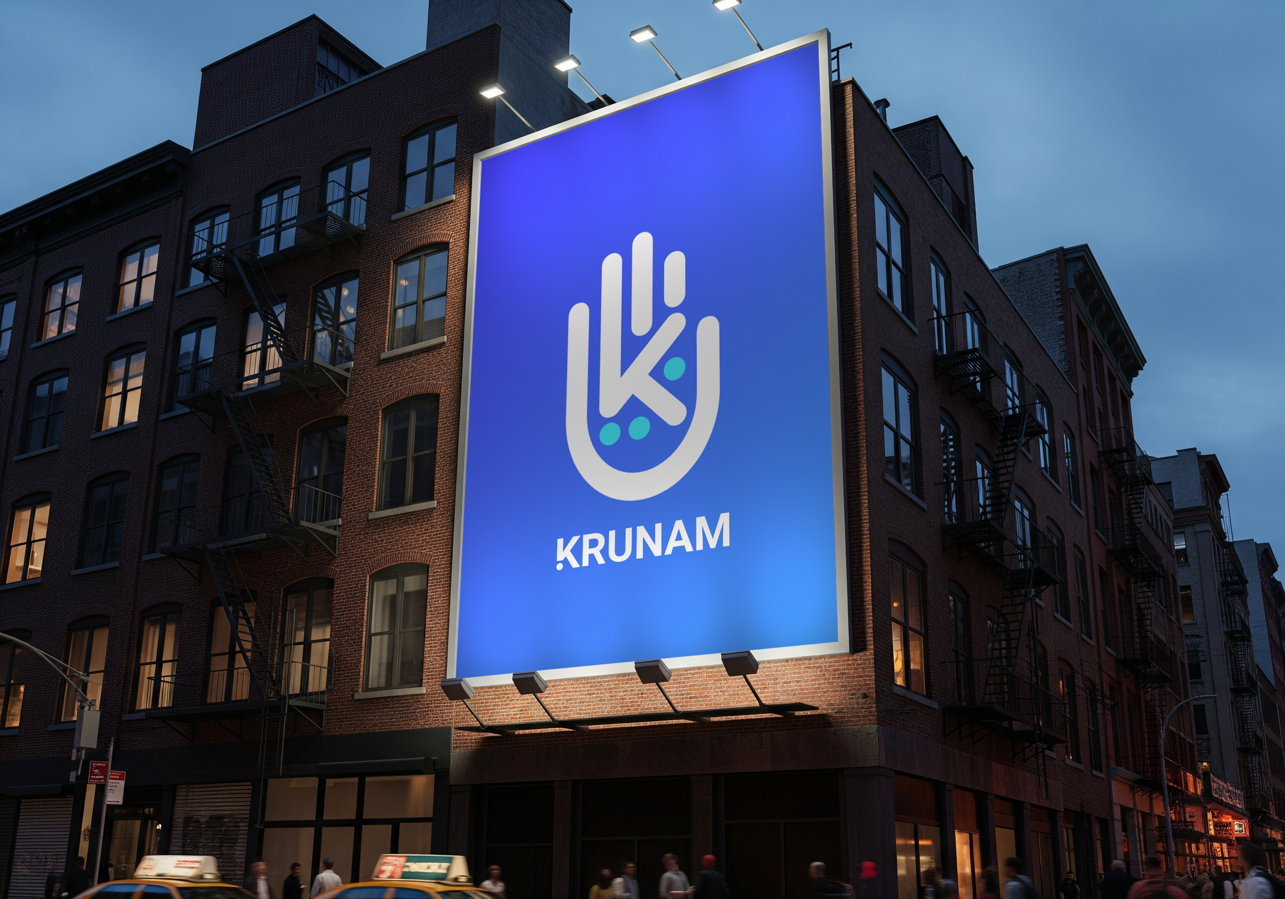
Krunam is a purpose-driven technology company built around the principle of Technology for Good. Phable worked with the business to translate that ambition into a brand that could speak credibly to the technology sector while remaining accessible to a much broader audience. We explored a range of creative directions before developing the logo and wider visual identity, then extended the system across illustrations, marketing materials, brand guidelines and the company’s website. For Krunam, the challenge was to avoid presenting technology and social purpose as two separate ideas: the identity needed to make the company’s underlying philosophy feel integral to the business itself. The project demonstrates Phable’s experience creating technology brands where mission, storytelling and commercial credibility all need to work together.

Cucumber
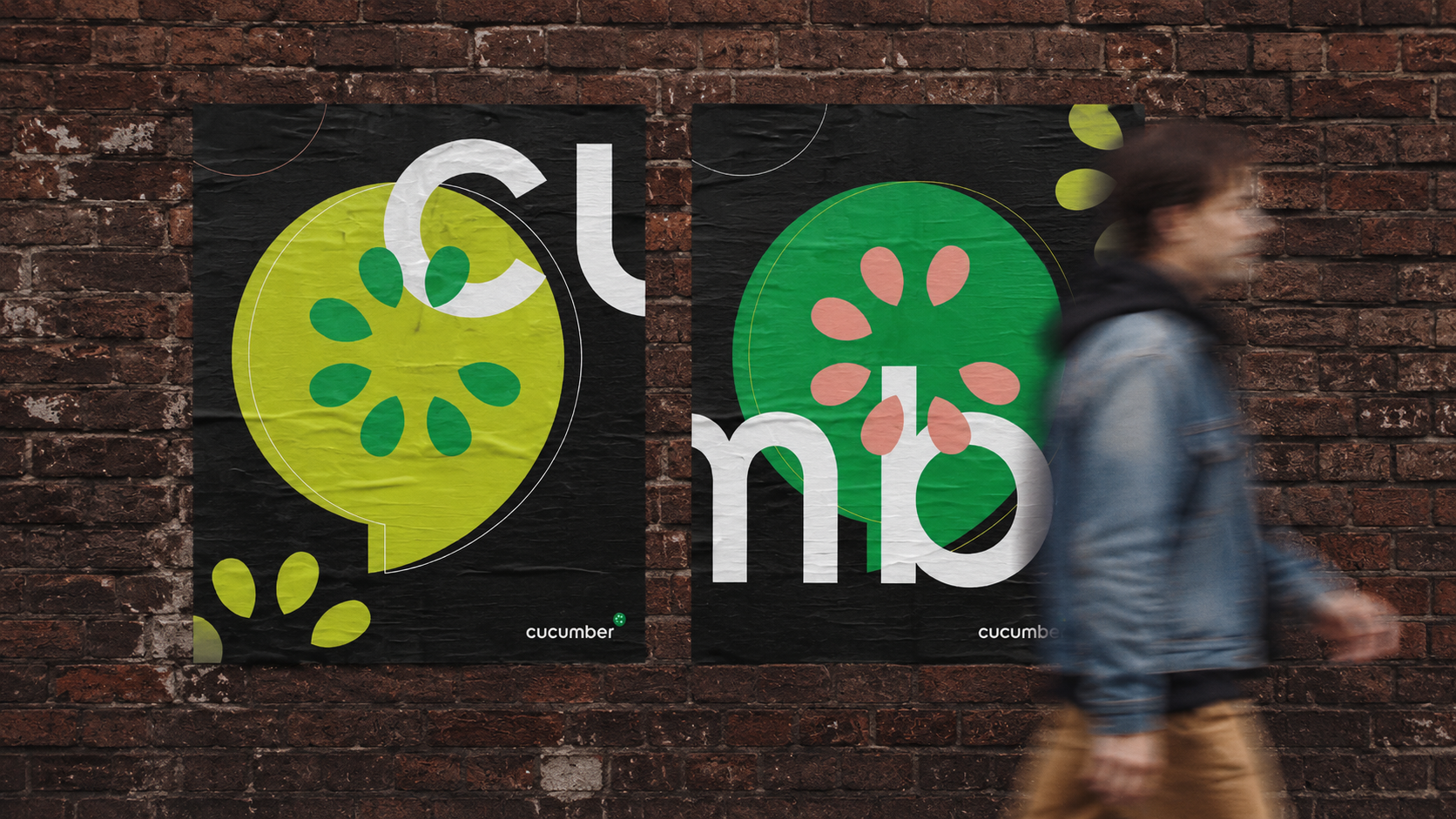
Cucumber is an open-source software platform whose tools and approach to behaviour-driven development help development teams collaborate more effectively around the software they create. Phable worked with Cucumber on a different kind of branding challenge: finding a more engaging way to explain its philosophy, methodology and technology to developers and prospective customers. We created A Slice of Cucumber, an editorial white paper combining interviews, company stories, illustration and technical content in a format deliberately removed from the conventional corporate case study. The project turned complex software ideas into something people would actually want to read, while providing a route into Cucumber’s wider products and services. It demonstrates an important part of Phable’s approach to technology branding: sometimes the most effective way to build a brand is not another campaign, but better storytelling.


Recharge
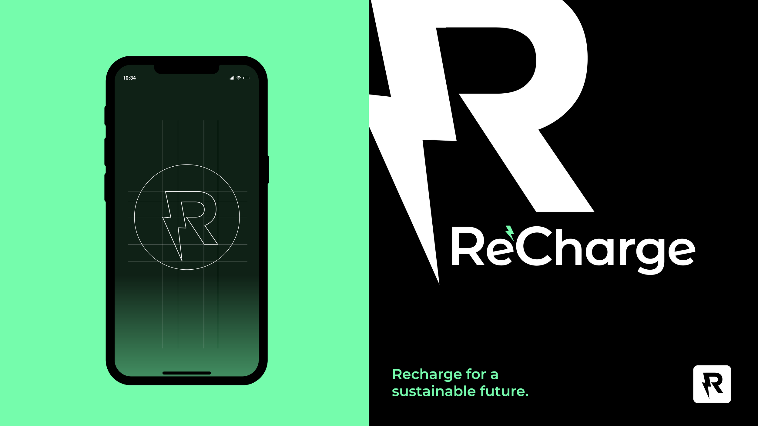
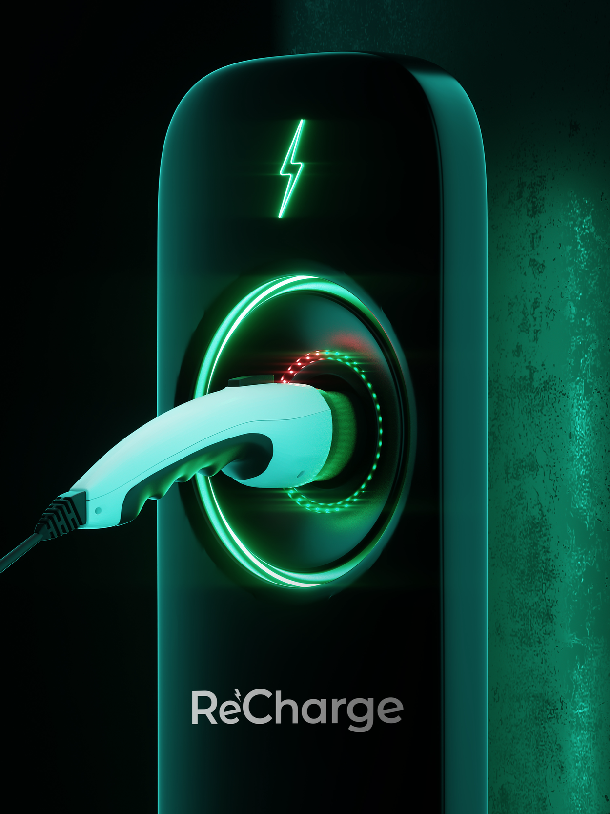
ReCharge is an electric-vehicle battery company that approached Phable as it prepared to move beyond a predominantly US focus and present the business to a wider international market. We developed a comprehensive brand refresh designed to give the company an identity capable of speaking both to future EV manufacturers and to a growing global audience interested in electric mobility. The work included a new logo, visual identity, website, social assets and detailed brand guidelines, creating greater consistency across the company’s communications while moving the brand away from the narrow visual conventions often associated with battery technology. For a business operating at the intersection of automotive technology, energy and sustainability, the new identity provided a more versatile platform for communicating ReCharge’s ambitions as the EV market continued to develop internationally.
Appsurify
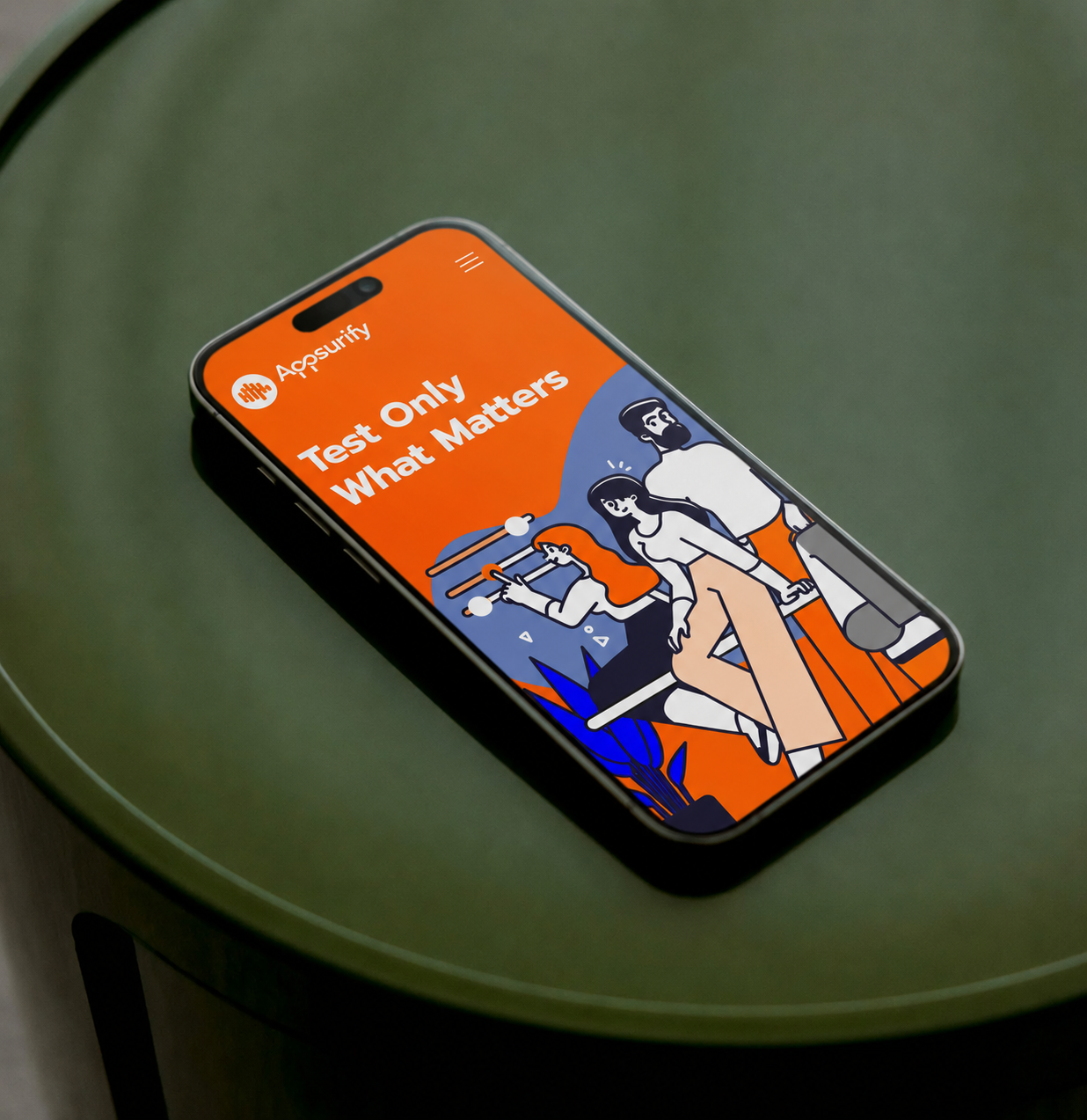
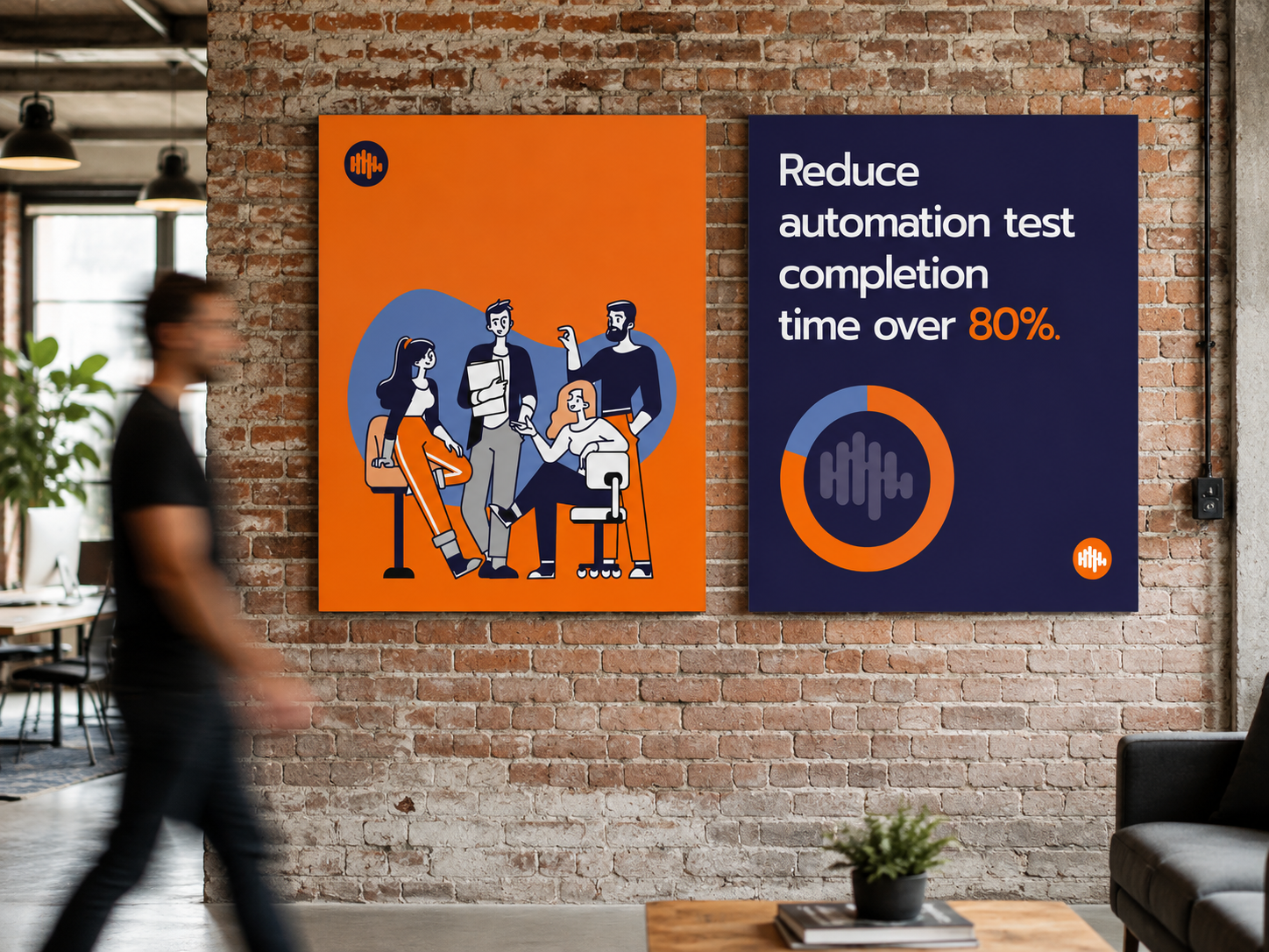
Appsurify uses AI to help software teams test more intelligently, identifying which tests should run so developers and QA teams can reduce unnecessary testing and accelerate software delivery. In a market crowded with visually similar SaaS and DevOps companies, Phable deliberately moved the brand away from predictable technology aesthetics. We created a distinctive visual identity and illustration style, developed the messaging strategy and applied the new brand across Appsurify’s website, social channels, marketing materials and launch campaign. The result was an AI software brand that remained credible to developers and QA professionals without looking like every other developer tool around it. It is a good example of Phable’s approach to branding complex technology companies: understanding the product first, then finding a clearer and more memorable way for the market to understand it.

NextDC
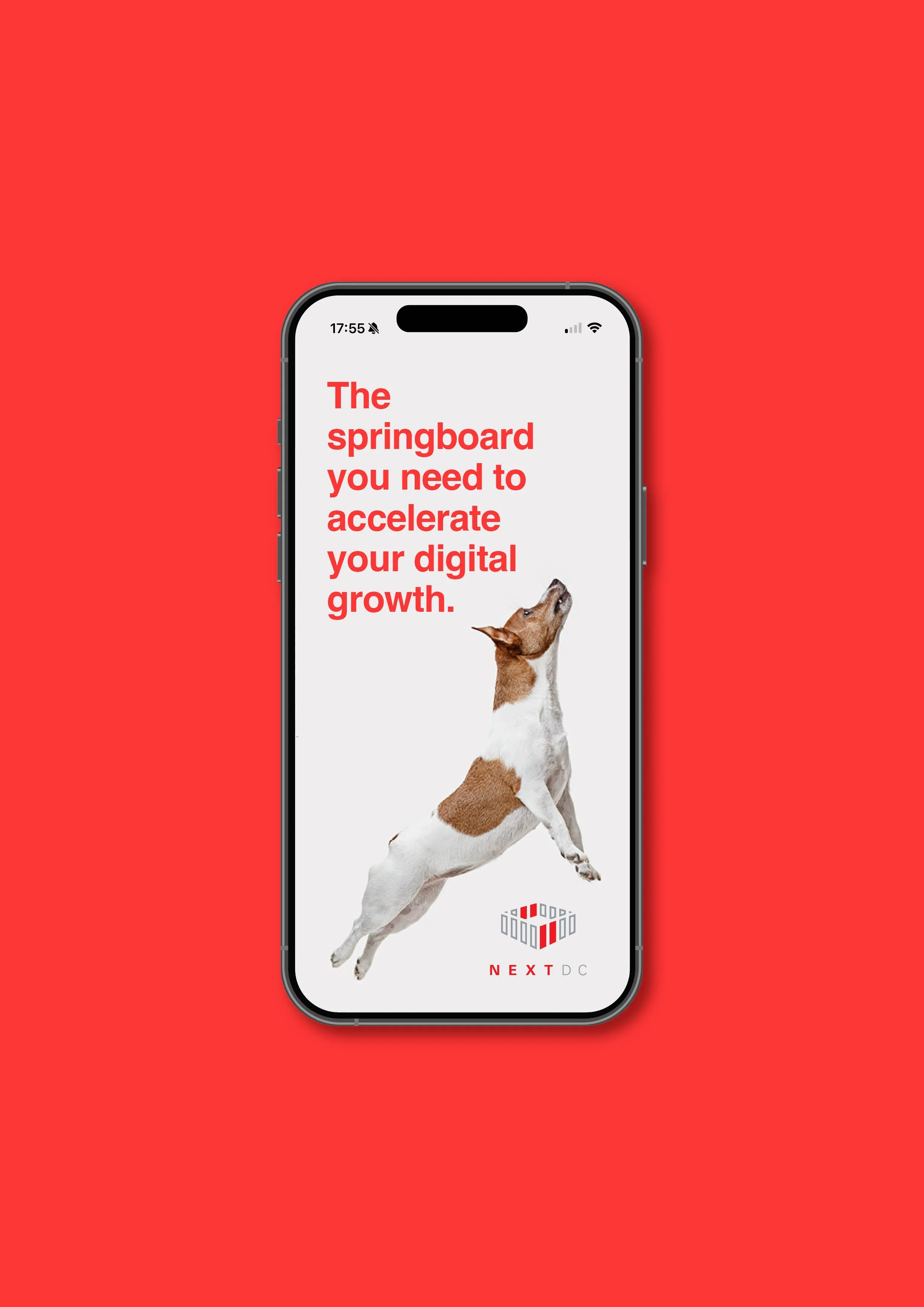
NEXTDC is one of Australia’s major data-centre operators, providing the critical digital infrastructure behind enterprise cloud and connectivity services. Phable worked with the company to develop Data Traction, a new campaign concept that gave NEXTDC a more distinctive way to communicate the commercial value of infrastructure that is inherently complex and largely invisible to its end users. The idea became the foundation for an extensive programme of videos, animation, social campaigns, presentations and sales content, allowing the brand to communicate consistently across both technical and business audiences. The campaign generated unprecedented traffic and engagement for NEXTDC and was described by the client as its most impactful campaign to date. It is a strong example of Phable combining technology-sector understanding, brand thinking and large-scale content production for an established enterprise infrastructure business.
Yip
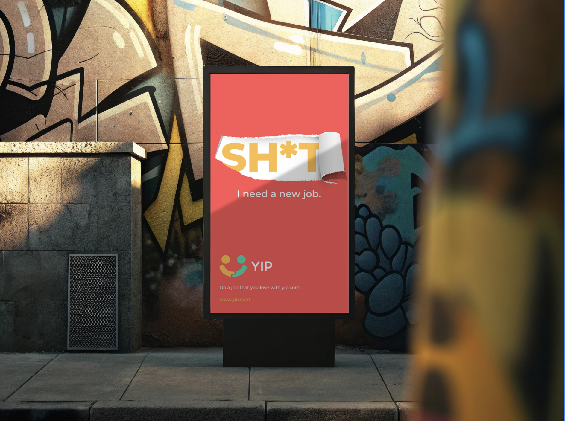
YIP is an Amsterdam-based digital learning and skill-sharing platform created to connect people looking to develop themselves with instructors willing to share their knowledge and expertise. Phable worked alongside entrepreneur Won Yip and the founding team from the earliest stages of the business, helping to build the brand rather than simply refreshing an existing one. We developed the visual identity, logo system, illustrations, messaging and comprehensive brand guidelines before taking YIP into the market through digital content and highly visible out-of-home campaigns across Amsterdam, including trams, bicycles and billboards. Phable continued to support the platform through social and content campaigns as it developed. YIP demonstrates our experience building a technology startup brand from inception and creating the identity, communications and launch activity needed to turn a new digital proposition into something audiences can recognise and understand.

Soulloop
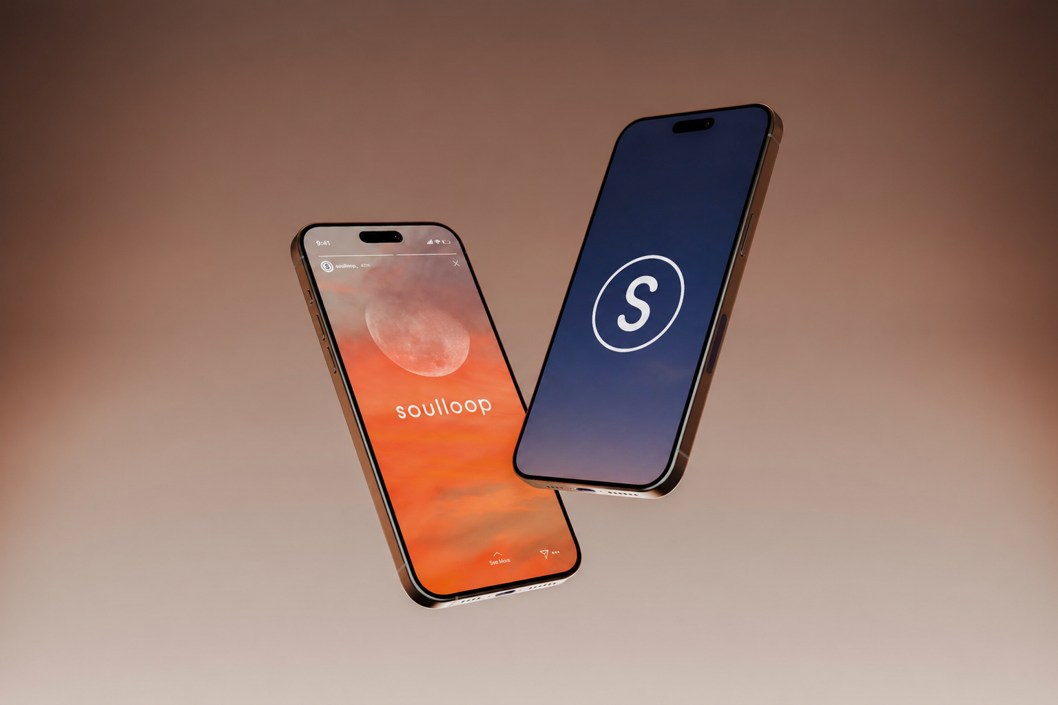
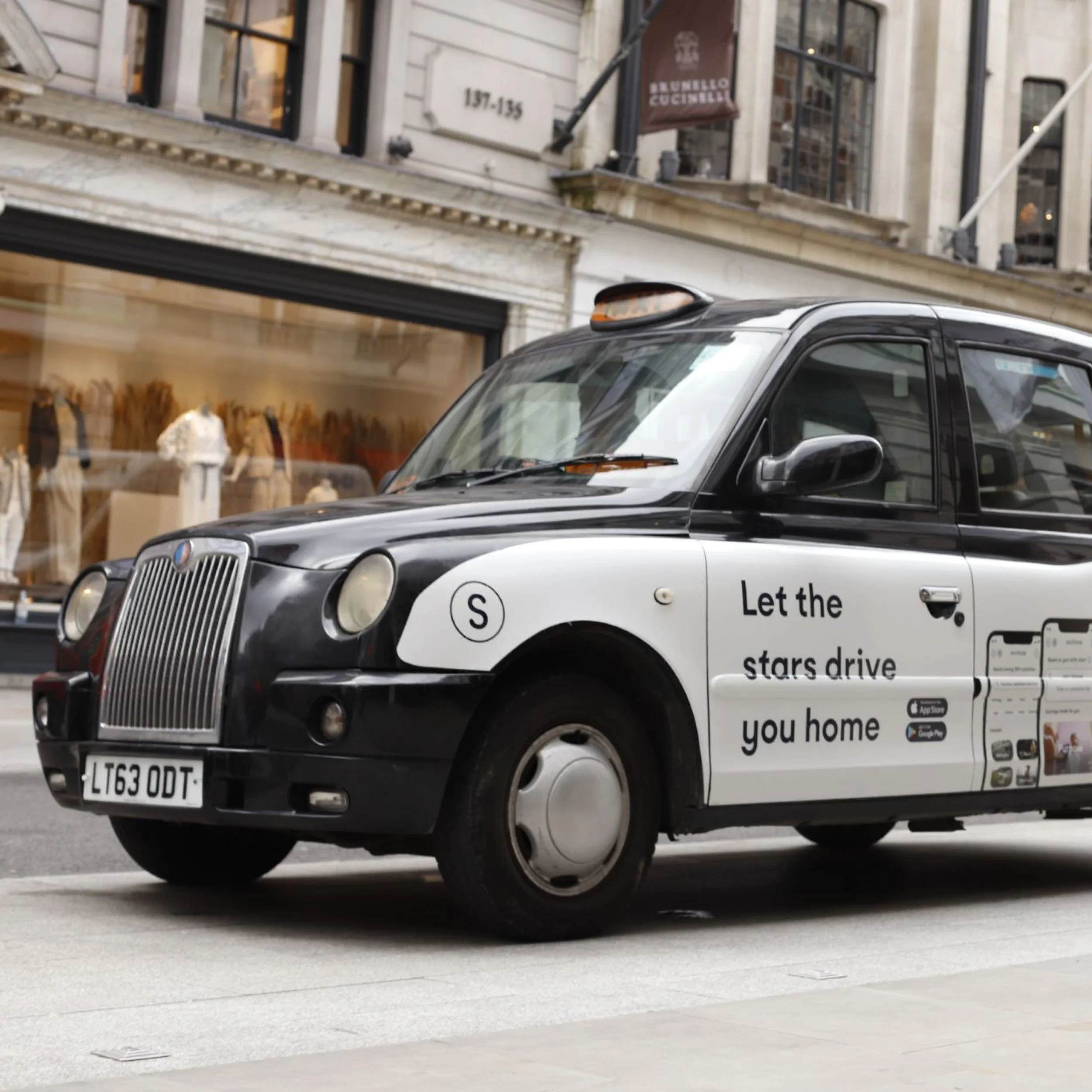
Soulloop is a Brazilian and UK wellbeing company whose digital platform is designed around personal purpose, self-development and positive change. Phable worked closely with the founder and senior team as the newly launched app sought to build awareness and attract users across both English-speaking and Brazilian markets. Our work included bespoke app iconography, campaign messaging, social content and an explainer video featuring the company’s CEO, creating a more coherent visual and verbal experience around the product. The challenge was to give an emerging wellbeing technology brand enough personality to connect emotionally with users while still explaining what the digital product offered. The resulting campaign gave Soulloop a more consistent platform for introducing its app, communicating its purpose and supporting its international growth.


JustBusiness
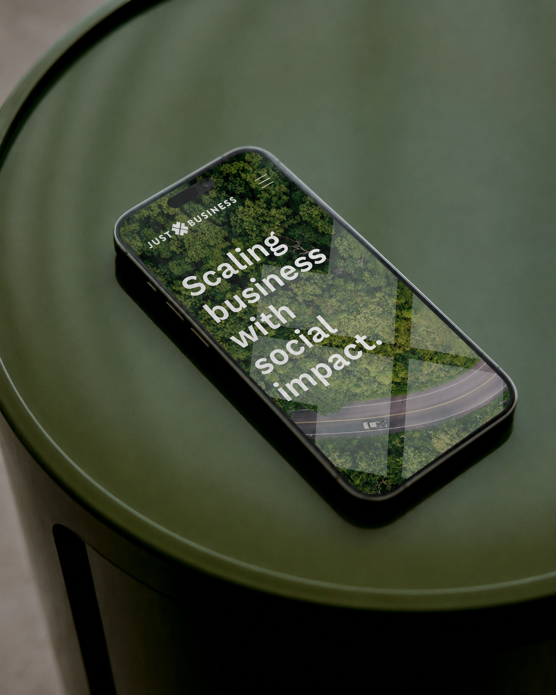
Just Business is a social-impact organisation focused on supporting investment in businesses capable of delivering both positive change and sustainable financial returns. Phable undertook a comprehensive review of the existing brand before refreshing its identity, developing updated brand guidelines and rebuilding the organisation’s website. We also created marketing and social assets designed to give Just Business a clearer and more credible voice when speaking to investors, businesses and people interested in impact-led enterprise. The challenge was to communicate social purpose without allowing the brand to feel charitable or disconnected from commercial realities. By bringing the mission, visual identity and digital experience into a more coherent system, Phable helped Just Business present impact investment as a serious and professionally considered proposition.

PraxiData
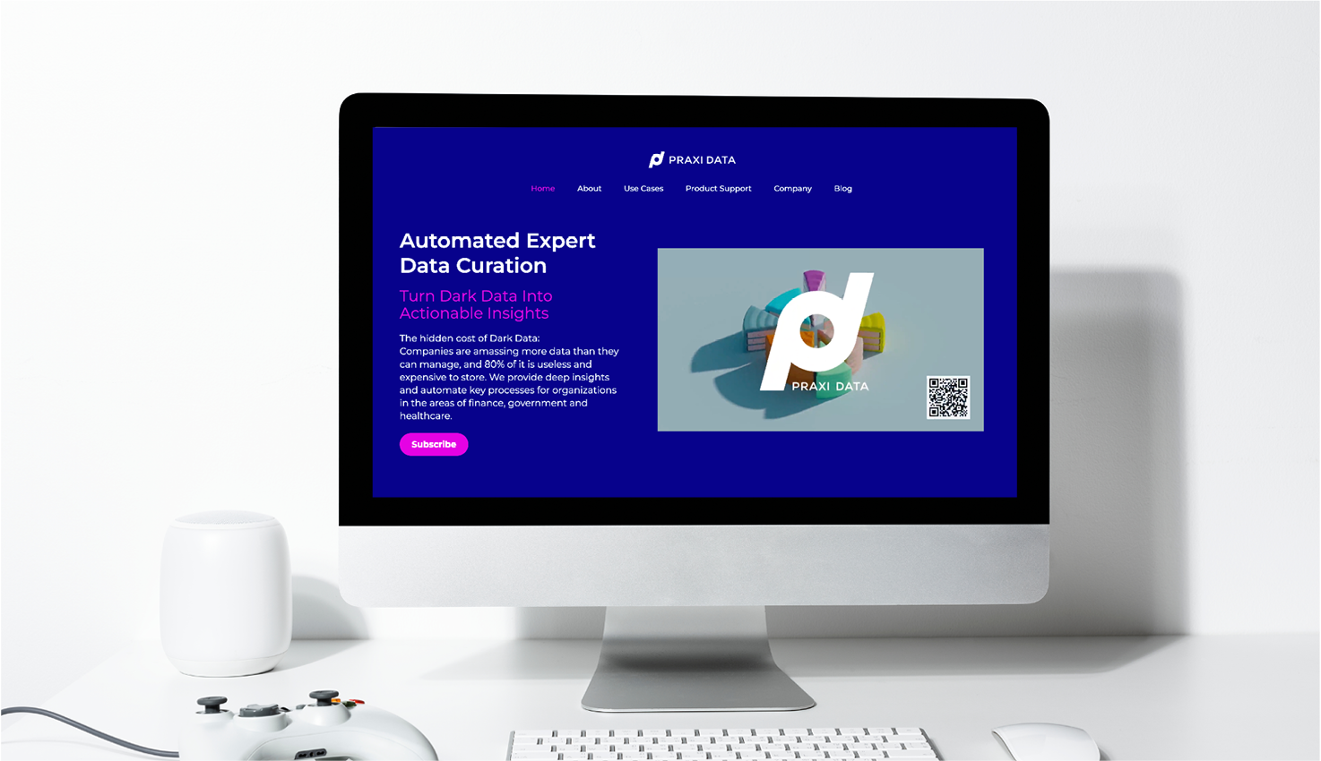
Praxi Data specialises in data curation, helping organisations make better use of information while reducing the internal resources required to organise and manage it. Phable has worked with the company as an ongoing creative and content partner, supporting both its brand and the way a technically specialised service is communicated to enterprise audiences. Our work has included logo and illustration development, website design, social campaigns, out-of-home creative, white papers, ebooks, blogs and other thought-leadership content. More recently, we redesigned the Praxi Data website to make its proposition clearer and create a stronger route from technical expertise to commercial enquiry. The relationship demonstrates Phable’s experience building brands in data and analytics through sustained collaboration rather than a single isolated branding project.
Quantal
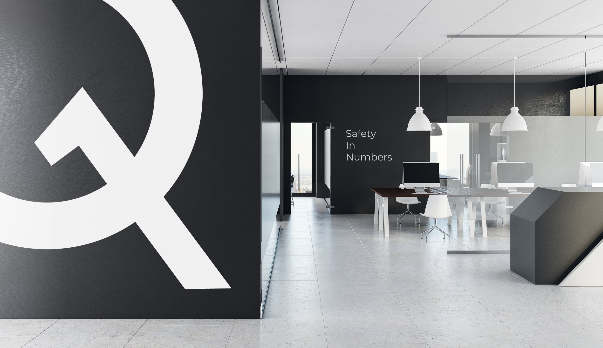
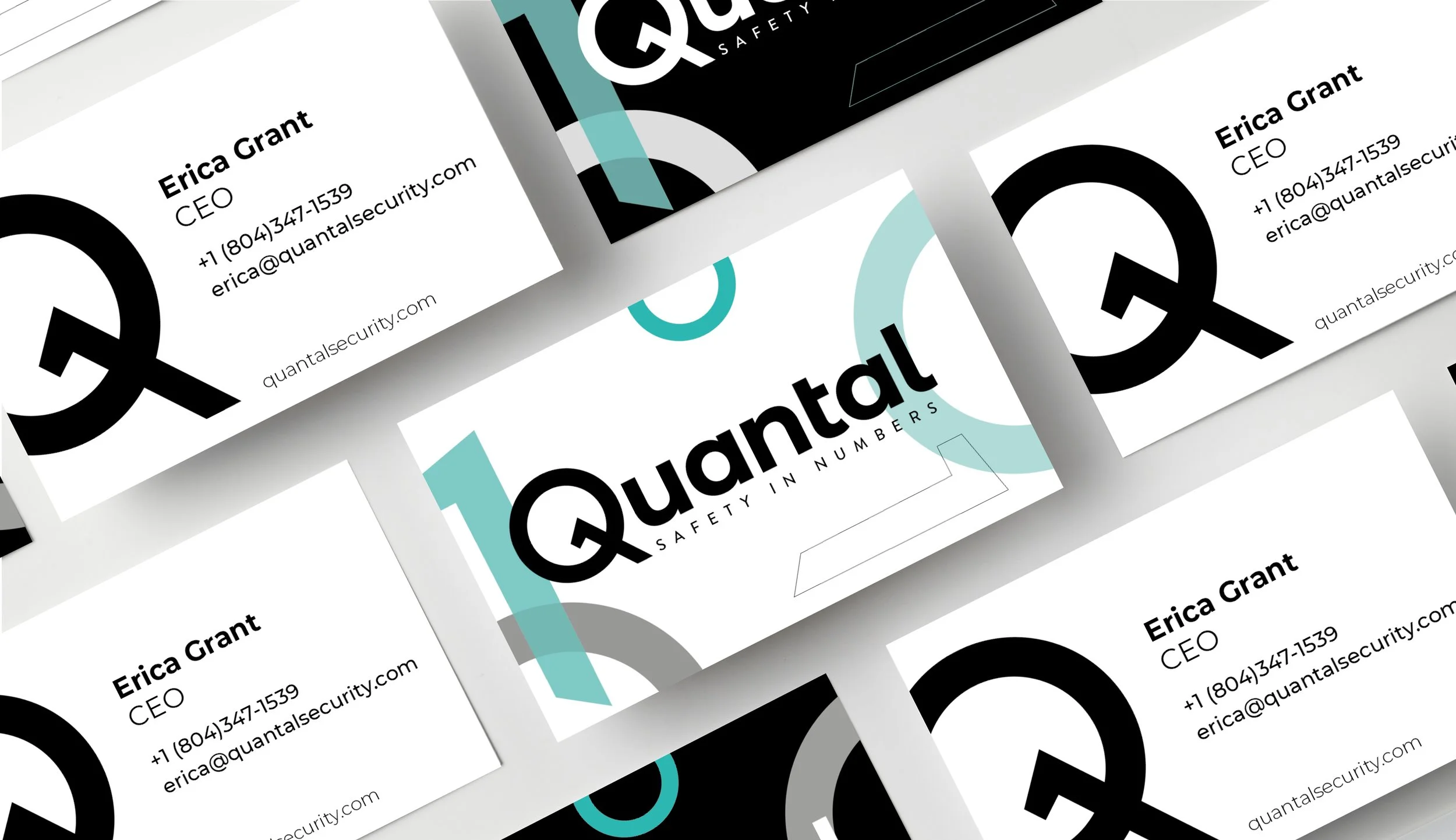
Quantal is a US technology startup developing security products that use quantum-generated randomness, including a new approach to digital locking and authentication. Phable worked directly with founder Erica Grant to build a brand capable of making an unfamiliar and highly technical proposition understandable to investors, partners and future customers. Following a detailed brand investigation, we developed the identity, positioning, messaging and slogan, then carried the new brand through the company’s website and into the software product itself. Our work extended to UX and UI design for Quantal’s dashboards and platform, ensuring the brand was experienced consistently rather than ending at the marketing website. The project demonstrates Phable’s ability to work across deep-tech branding, quantum technology, cybersecurity and digital product design as one connected challenge.
Cloud Present
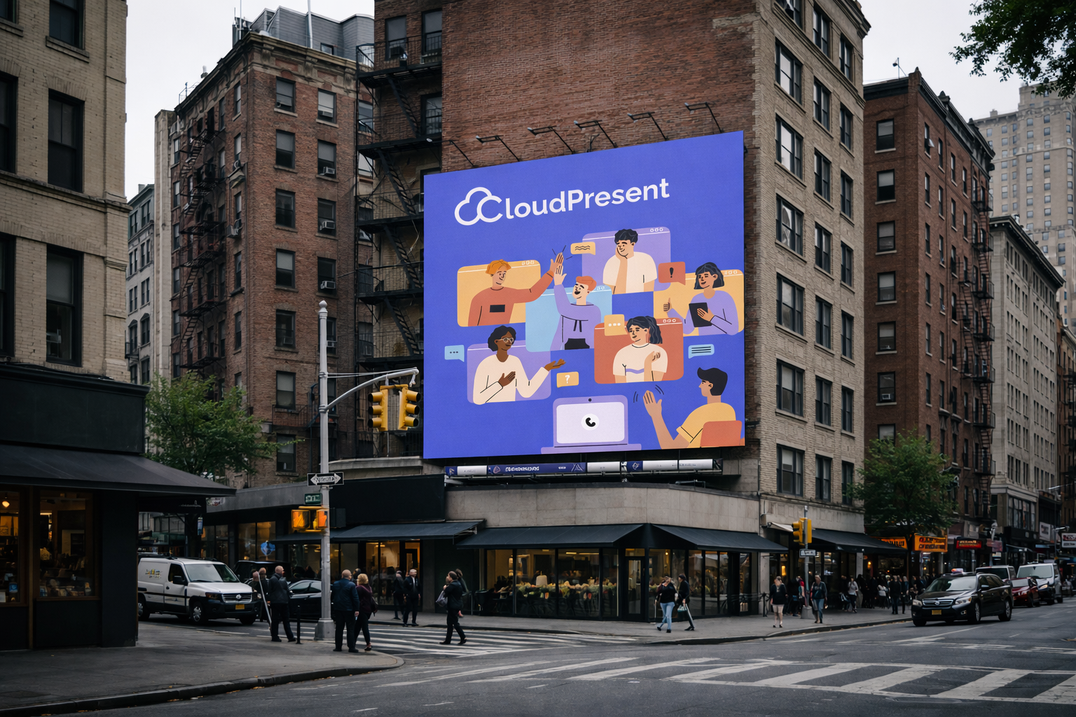
Cloud Present approached Phable with a challenge familiar to many technology companies: its service needed to be understood quickly without relying on dense technical explanation. Rather than undertaking a conventional rebrand, Phable created an animated explainer from beginning to end, developing the script, narrative, illustrations, storyboard and final animation around the company’s proposition. The project translated Cloud Present’s cloud-based offering into a concise visual story that could communicate value to prospective customers more immediately. It demonstrates an important part of Phable’s approach to technology branding: the problem is not always the identity itself. For cloud and software companies in particular, how clearly the product can be explained is often just as important as how the brand looks, and effective storytelling can become a valuable part of the wider brand system.
Economic Mind
Economic Mind set out to tackle an unusually ambitious data problem: building a bottom-up model of the complete global economy by structuring and quantifying the activities of companies and markets around the world. Phable developed the branding needed to turn that complexity into a proposition professional audiences could quickly understand and trust. Our work brought together brand strategy, messaging and visual identity around a clear central idea — Clarity in Every Market — creating a distinctive system for communicating vast amounts of data without making the company feel academic or impenetrable. The identity and communications were designed around the needs of consultants, investors, strategists and other decision-makers, giving Economic Mind a coherent technology brand from which to launch a new kind of market-intelligence platform.

Virtuoso
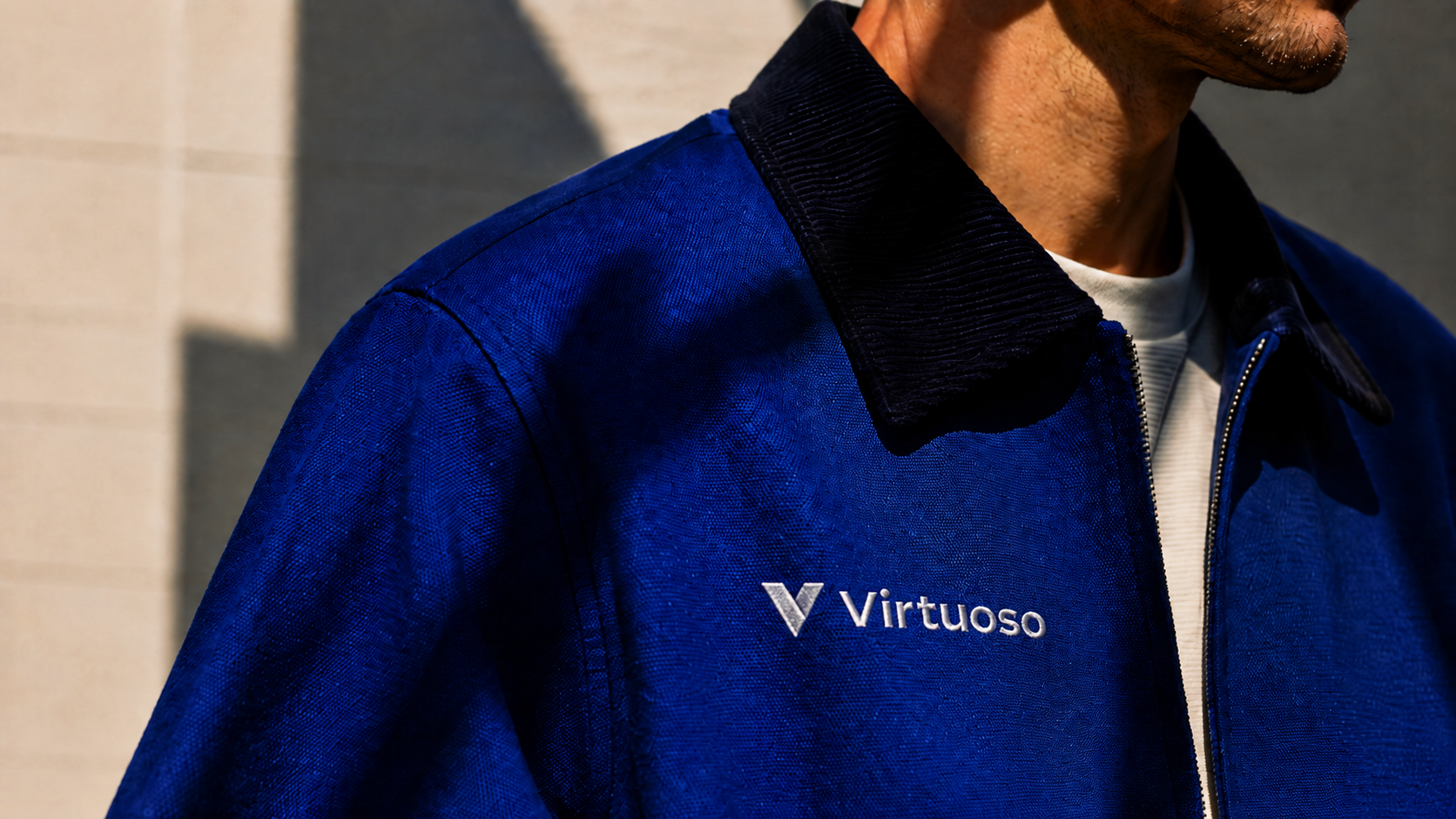
Virtuoso is an AI-powered codeless test automation platform designed to reduce many of the manual processes involved in software testing. Phable developed a new visual direction for the company at a point when AI and software-testing businesses were increasingly competing within a visually crowded SaaS market. Rather than relying on familiar technology imagery, we created a distinctive identity built around bespoke illustration, animation and a visual language capable of expressing both intelligence and simplicity. The creative system helped communicate Virtuoso’s ability to automate complicated testing processes while giving the company a more recognisable presence among developers, QA teams and enterprise technology buyers. The project adds another dimension to Phable’s experience branding artificial intelligence, SaaS and software-testing products where differentiation needs to work alongside technical credibility.


B.O.R.I.S
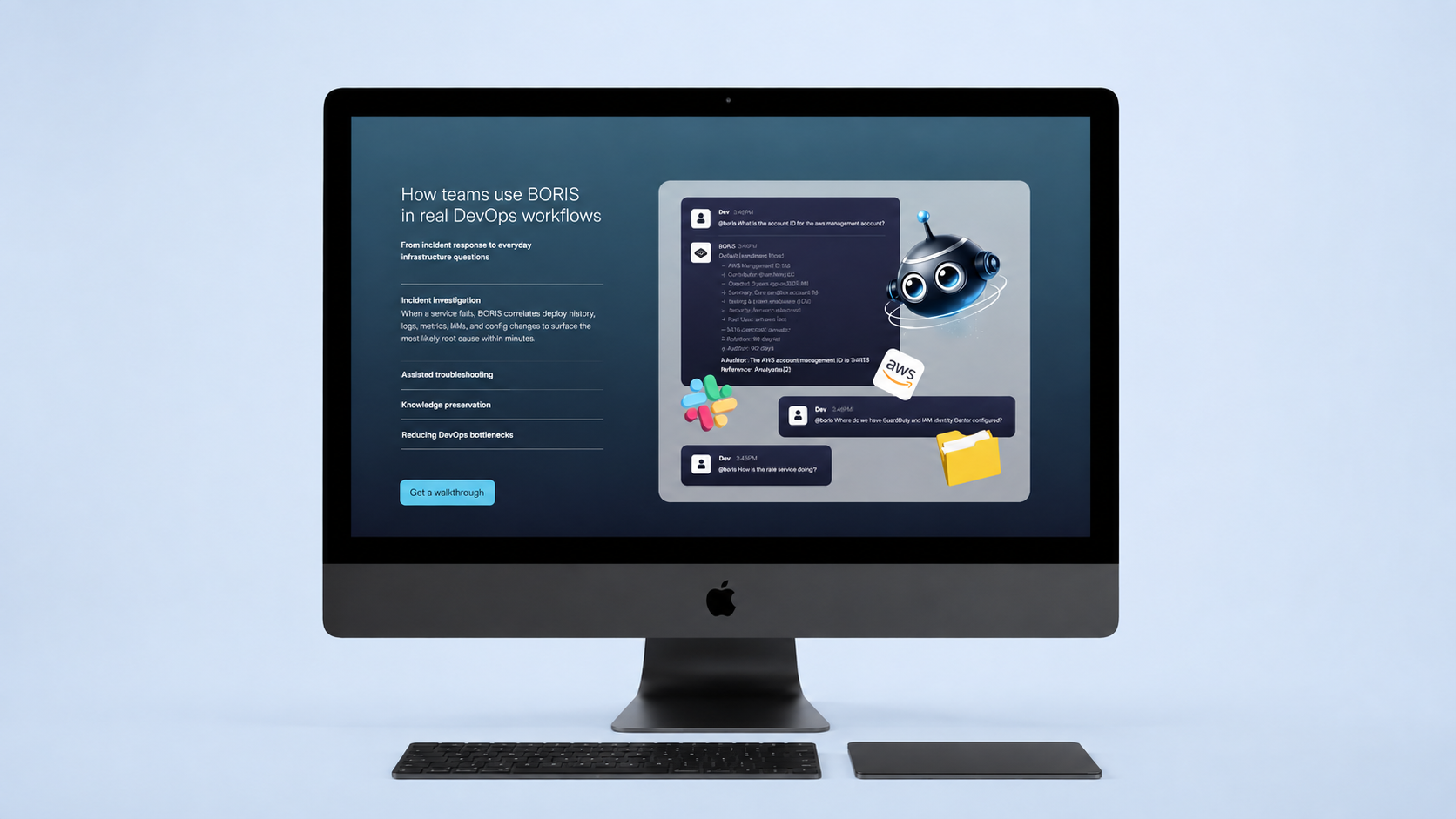
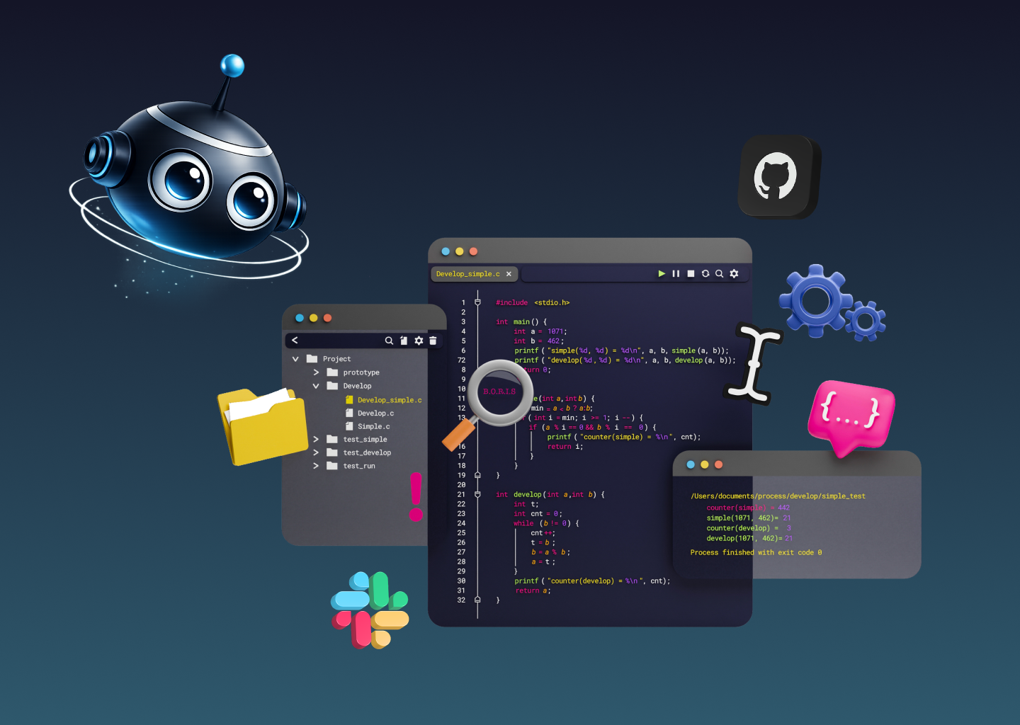
B.O.R.I.S is an agentic AI product for DevOps, cloud and engineering teams, designed to give both people and AI systems a persistent understanding of complex infrastructure. Phable created the brand identity, web design, avatar design and wider visual language, building a distinctive AI technology brand around a highly technical product. The resulting identity gives B.O.R.I.S a memorable presence across its website and digital communications while clearly positioning it within the emerging fields of agentic AI, cloud infrastructure and intelligent developer tools.

EvoMone
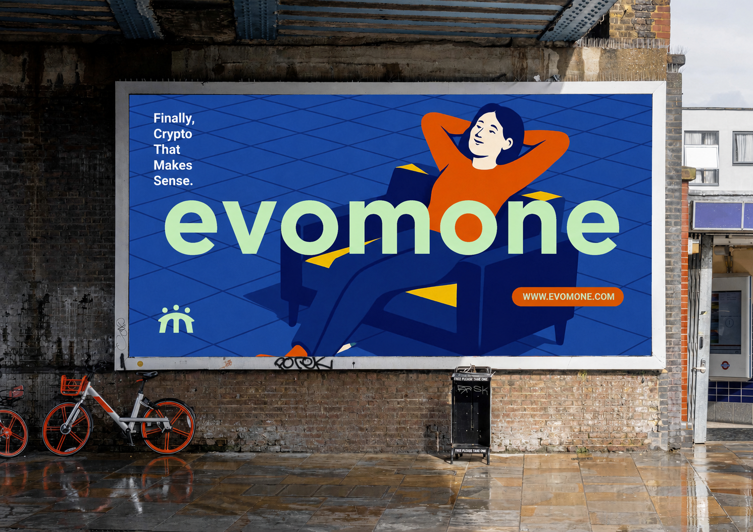
EvoMone is a fintech app combining a self-custody Bitcoin wallet with private messaging, making it possible to send Bitcoin as easily as sending a message. Phable developed the branding, visual identity, web design and wider visual language around the product, creating a distinctive cryptocurrency brand that makes complex financial technology feel simple and accessible. The resulting identity gives EvoMone a confident consumer presence while clearly positioning the product within Bitcoin, digital payments, fintech and the emerging future of decentralised finance.

Heights
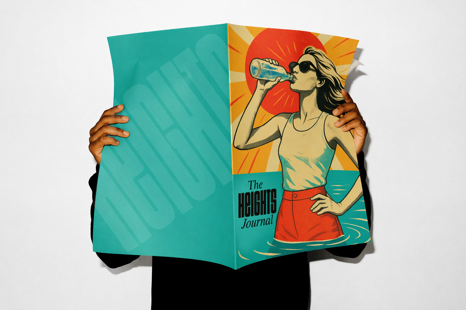
Heights is a science-led health and supplements brand focused on helping people improve everyday wellbeing through smarter nutrition. Phable worked with Heights to launch its first branded print publication, creating the concept, editorial design and visual language for a dedicated broadsheet. Designed as an extension of the Heights brand rather than traditional marketing material, the publication was distributed free through gyms and lifestyle retailers and included with supplement orders placed online. The project brought together branding, editorial design and content to give Heights a physical presence beyond its digital channels, turning useful health and lifestyle storytelling into a distinctive brand experience customers could take away, read and share.


Rat & Boa
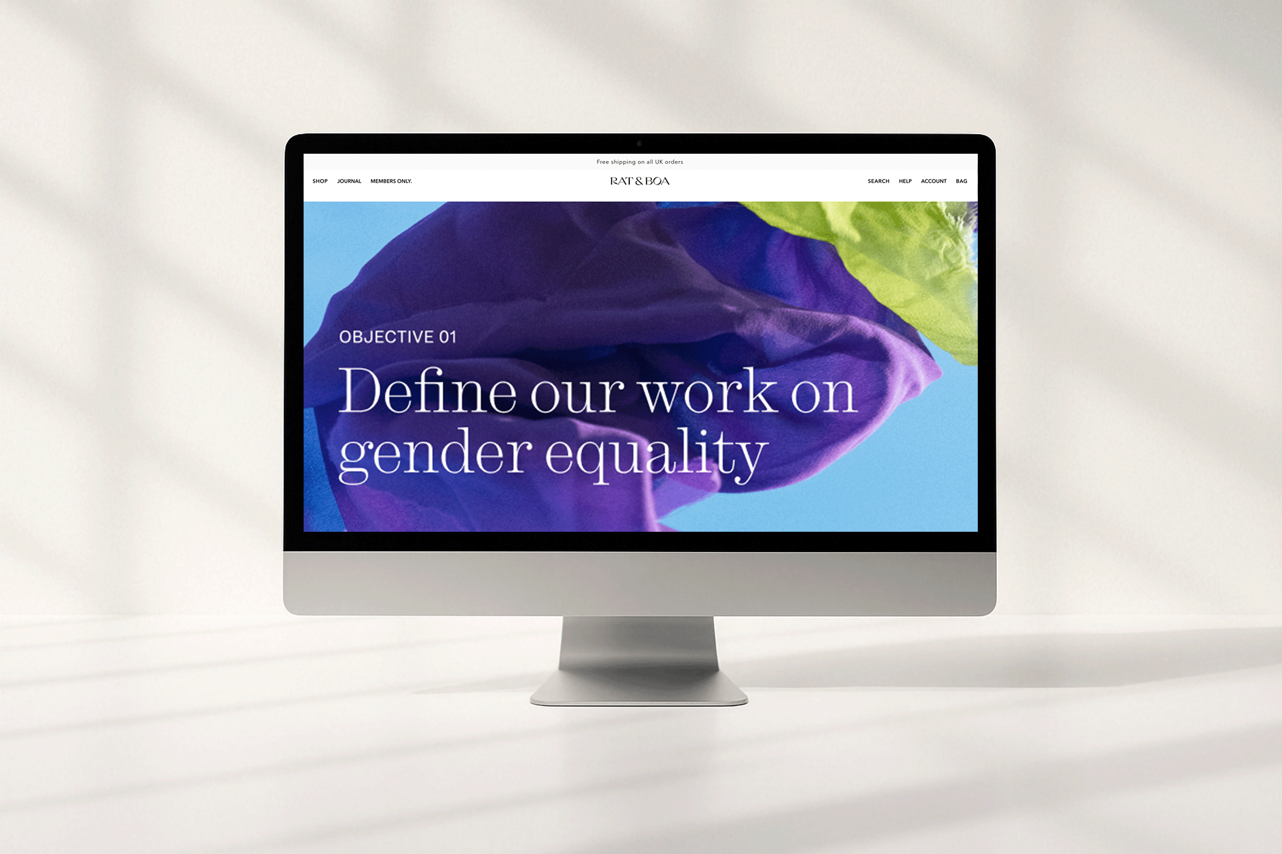
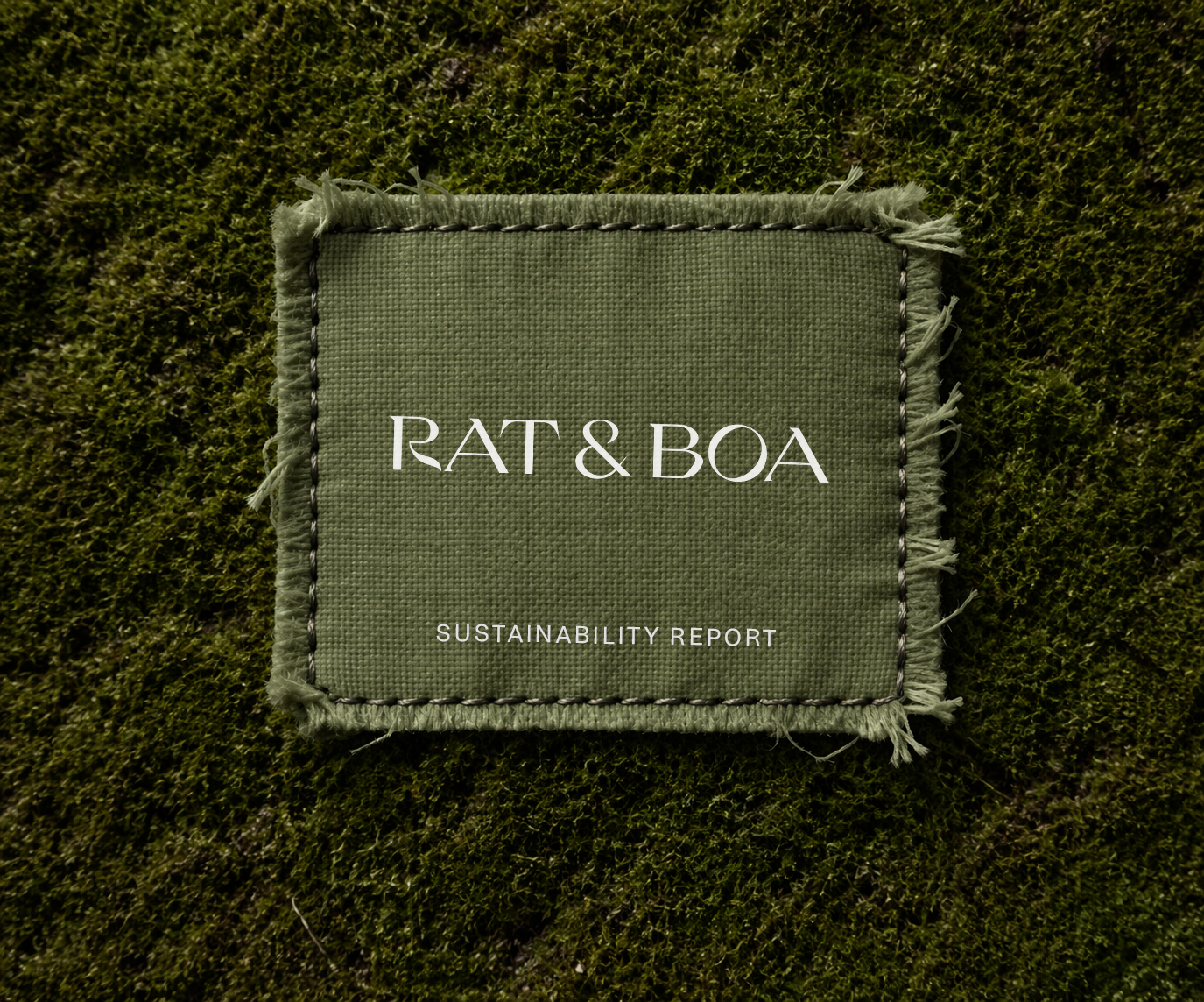
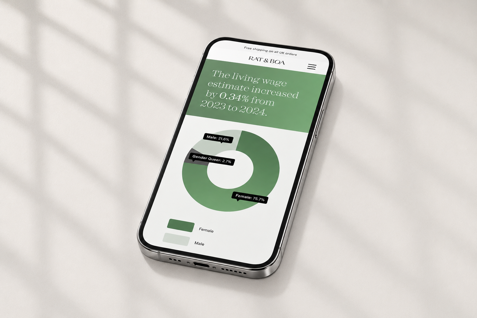
Rat & Boa is an international fashion brand known for its distinctive womenswear and bold visual identity. Phable worked with the brand to design a digital sustainability report that transformed detailed environmental and social information into an engaging, highly visual brand experience. Bringing together editorial design, digital storytelling and information design, the report communicated Rat & Boa’s approach to people, planet, sourcing and responsible production while remaining unmistakably part of its wider creative world. The project demonstrates Phable’s experience in sustainability report design and fashion branding, turning complex corporate information into digital content that is clear, accessible and visually compelling.
ViaCash
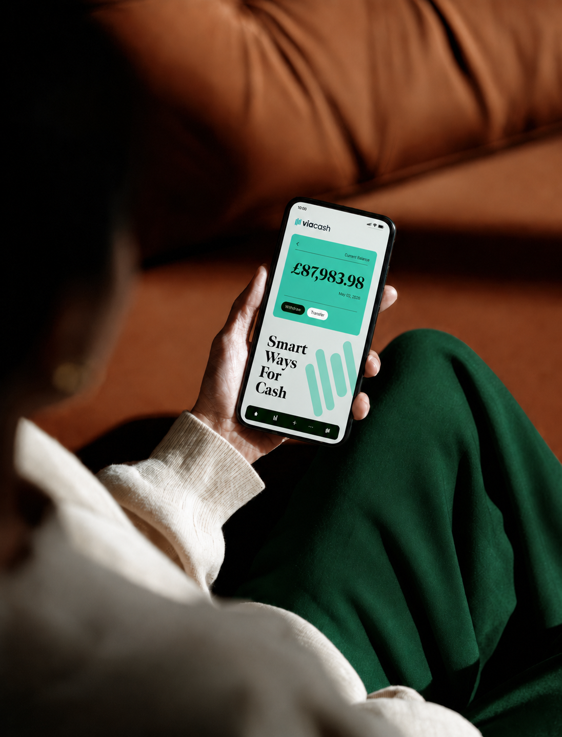
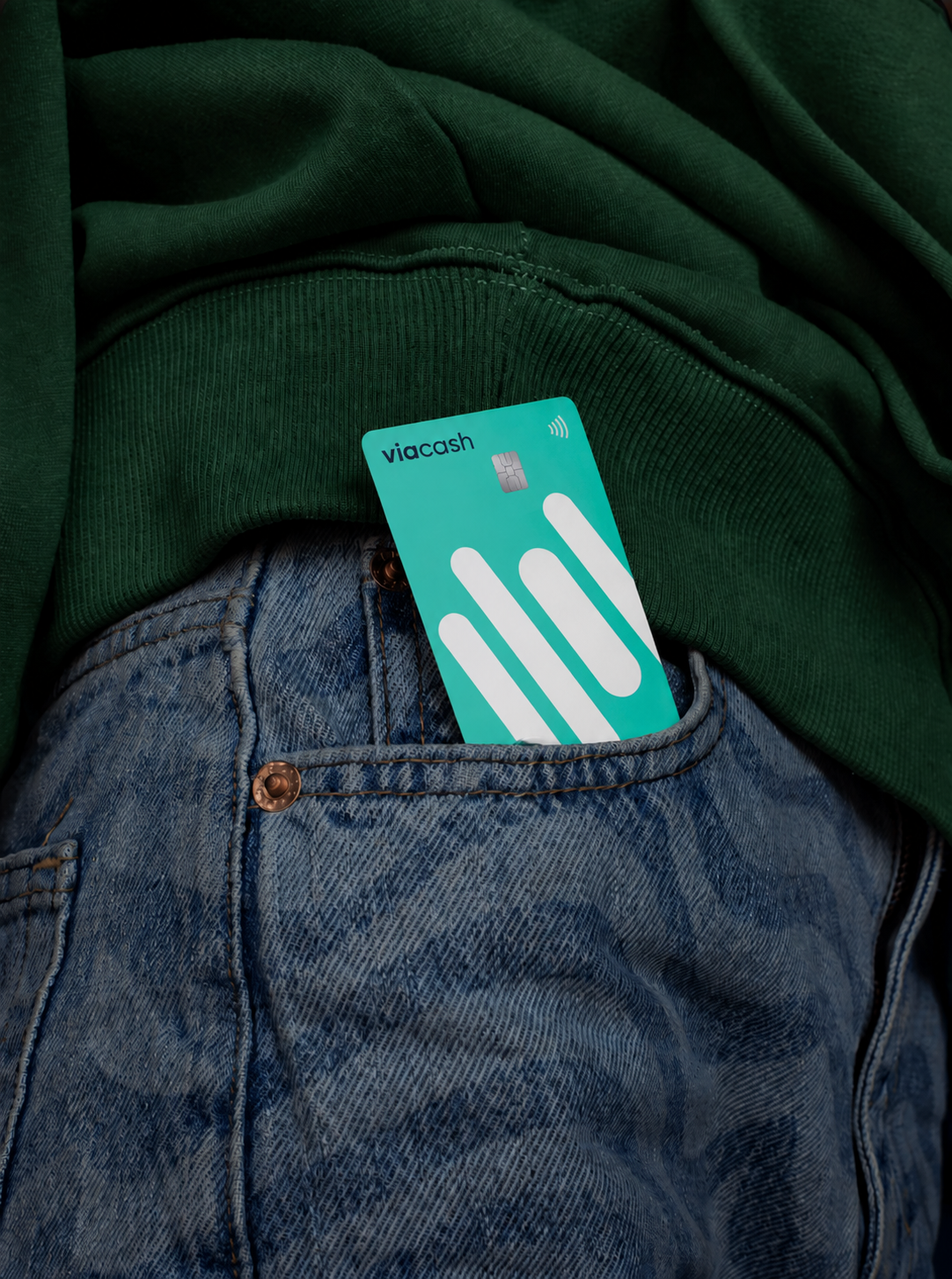
ViaCash built one of Europe’s largest bank-independent payment infrastructures, enabling customers to make cash deposits and withdrawals through retail checkouts using a barcode-based system. Phable worked with the fintech company to redesign its digital presence and make this unusual relationship between banks, retailers and consumers easier to understand. We created a new, user-focused website designed to increase awareness and encourage platform sign-ups, then supported the brand with a thought-leadership white paper exploring themes around payments, accessibility and financial inclusion. The project required Phable to translate financial infrastructure that operates largely behind the scenes into a proposition customers and commercial partners could grasp quickly. It provides strong experience in fintech branding, payment technology and communicating complex financial services through digital design and content.
Business Leader
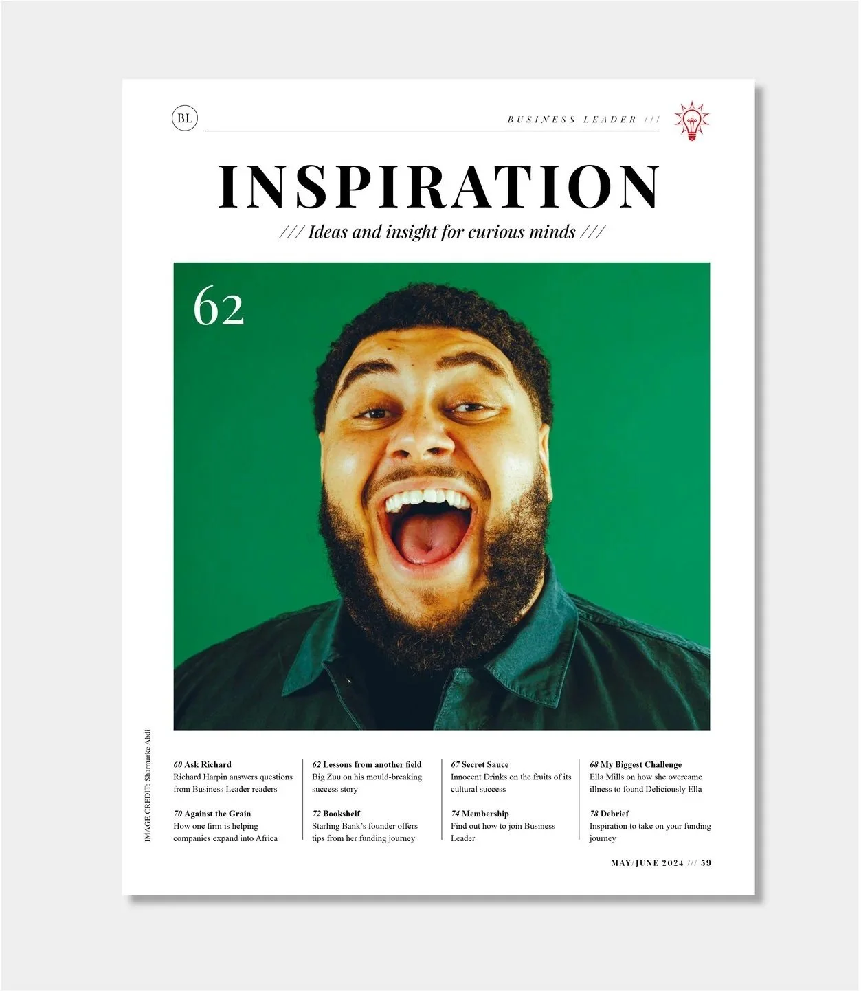
Business Leader is a UK business-media platform created for entrepreneurs, founders and senior business leaders. Following a change in ownership, Phable was commissioned to rethink the brand for its next stage, working across identity, messaging, website, editorial design, content and events rather than treating each channel separately. We refreshed the visual identity and redesigned the digital platform and print magazine, while also creating social campaigns, video, reports, presentations and event materials around the new direction. The challenge was to retain the authority expected of established business journalism while making Business Leader feel relevant to a new generation of ambitious founders and executives. The result was a connected brand and editorial system capable of operating across print, digital, social, membership and live experiences.



M2i Global
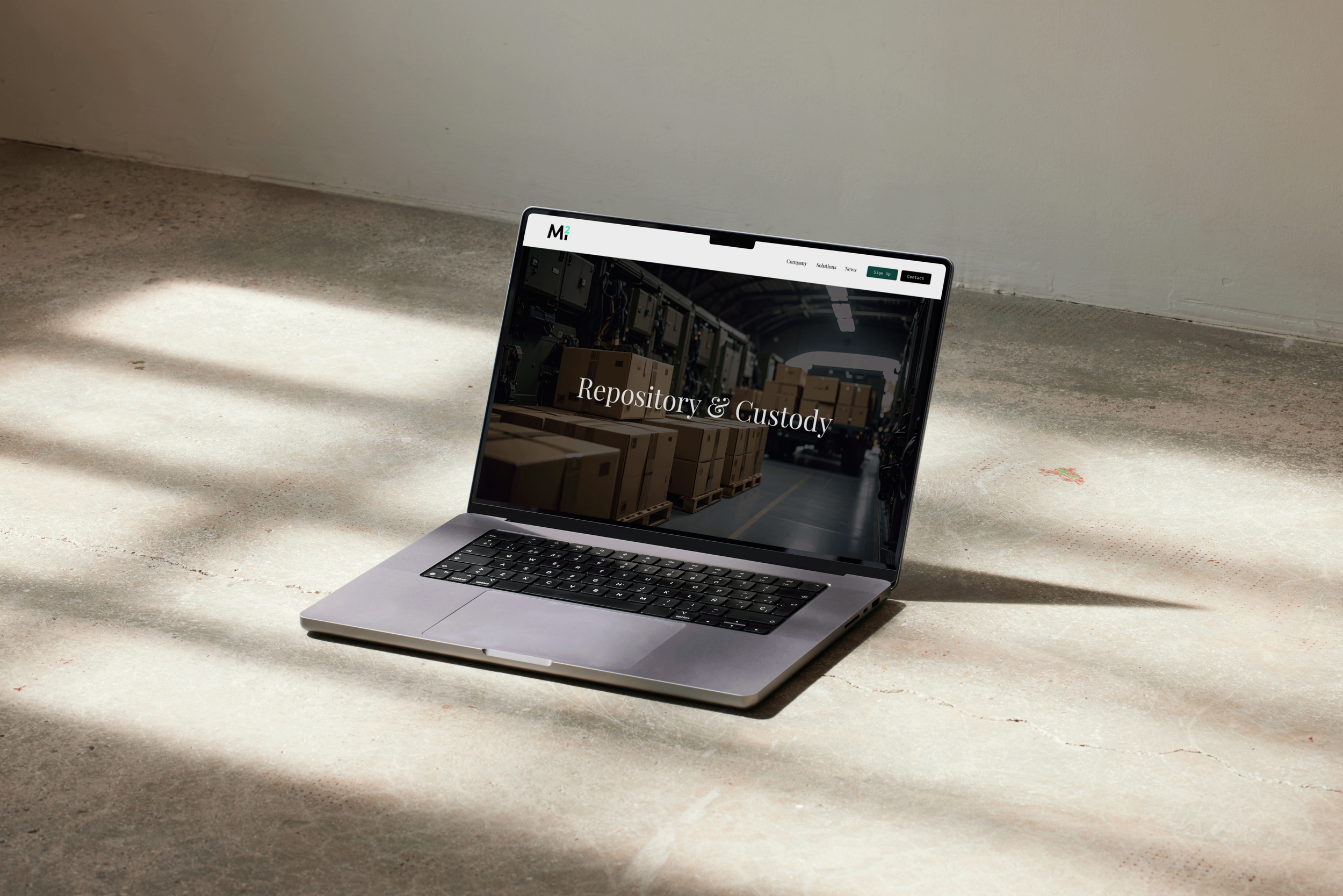
M2i Global is a US technology and research organisation working on one of the most strategically important challenges in advanced industry: securing sustainable access to critical minerals. Its work spans areas including mining, mineral processing, supply chains and relationships with the US defence sector, creating a proposition that needs to make sense to audiences across industry, government and investment. Phable redesigned M2i’s website and refined the brand around that mission, introducing a clearer digital experience alongside bespoke infographics and a homepage film designed to make technically complicated initiatives easier to grasp. The project gives Phable direct experience communicating critical-minerals technology and advanced industrial innovation, where brand credibility depends on presenting complex scientific, geopolitical and commercial information with clarity.


Spectrum Bier
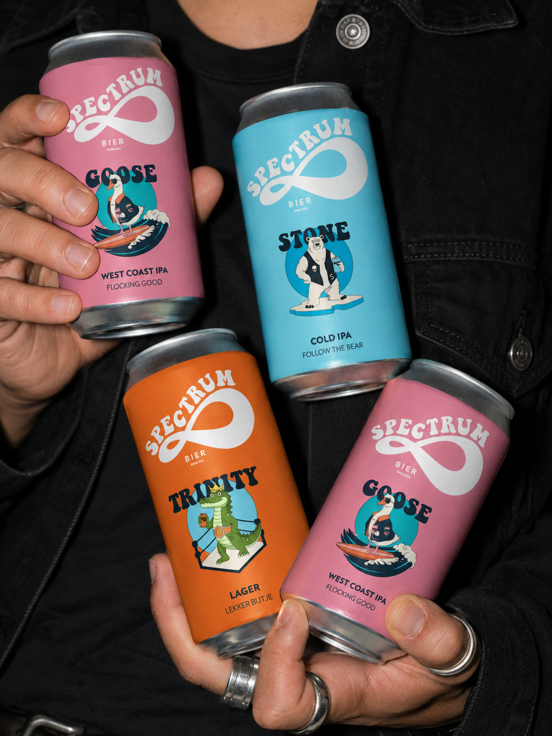
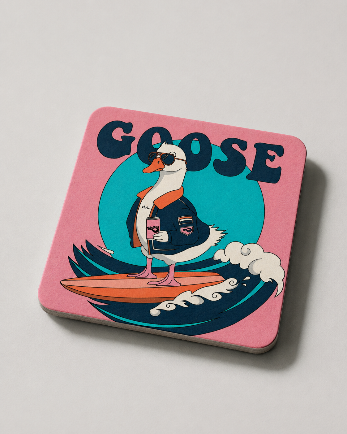
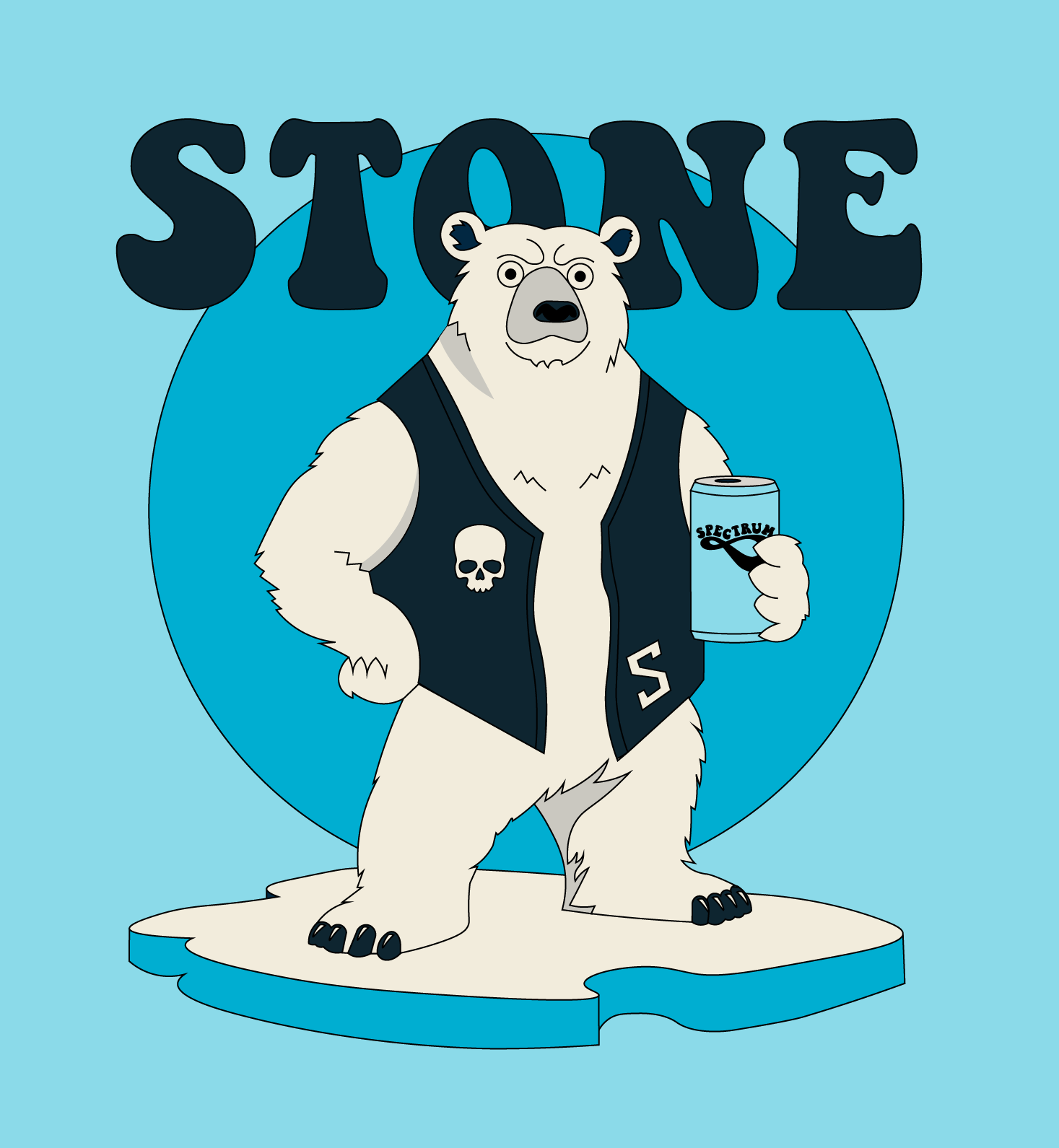
Spectrum Bier is an independent craft brewery whose beers were created with enough individuality that the brand needed to celebrate difference rather than impose one anonymous house style across every product. Phable developed the brewery’s identity from its logo and website through to custom illustrations, packaging and individual beer labels, creating a system that allowed each release to have its own personality while still belonging unmistakably to Spectrum. We extended the approach into social content so that the same character carried through from the shelf into the brewery’s digital presence. Although far removed from Phable’s technology work, Spectrum Bier demonstrates the underlying branding discipline just as clearly: understanding what makes a product distinctive and building a visual world that gives people a reason to notice and remember it.

Scaled
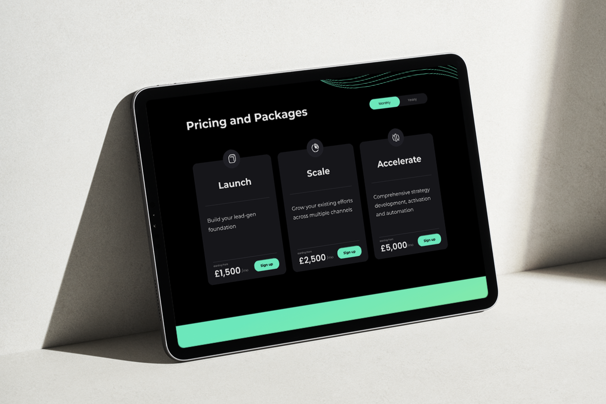
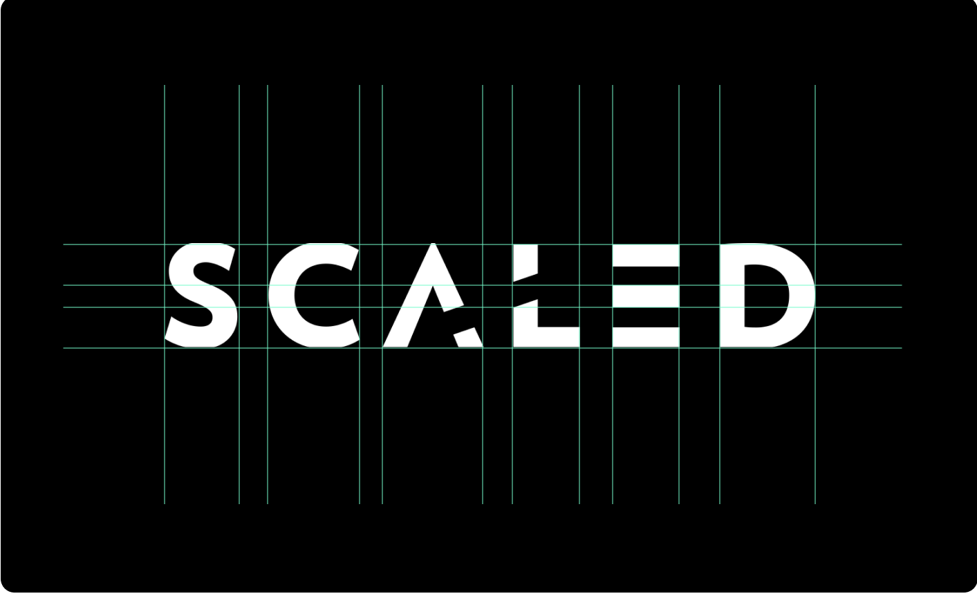
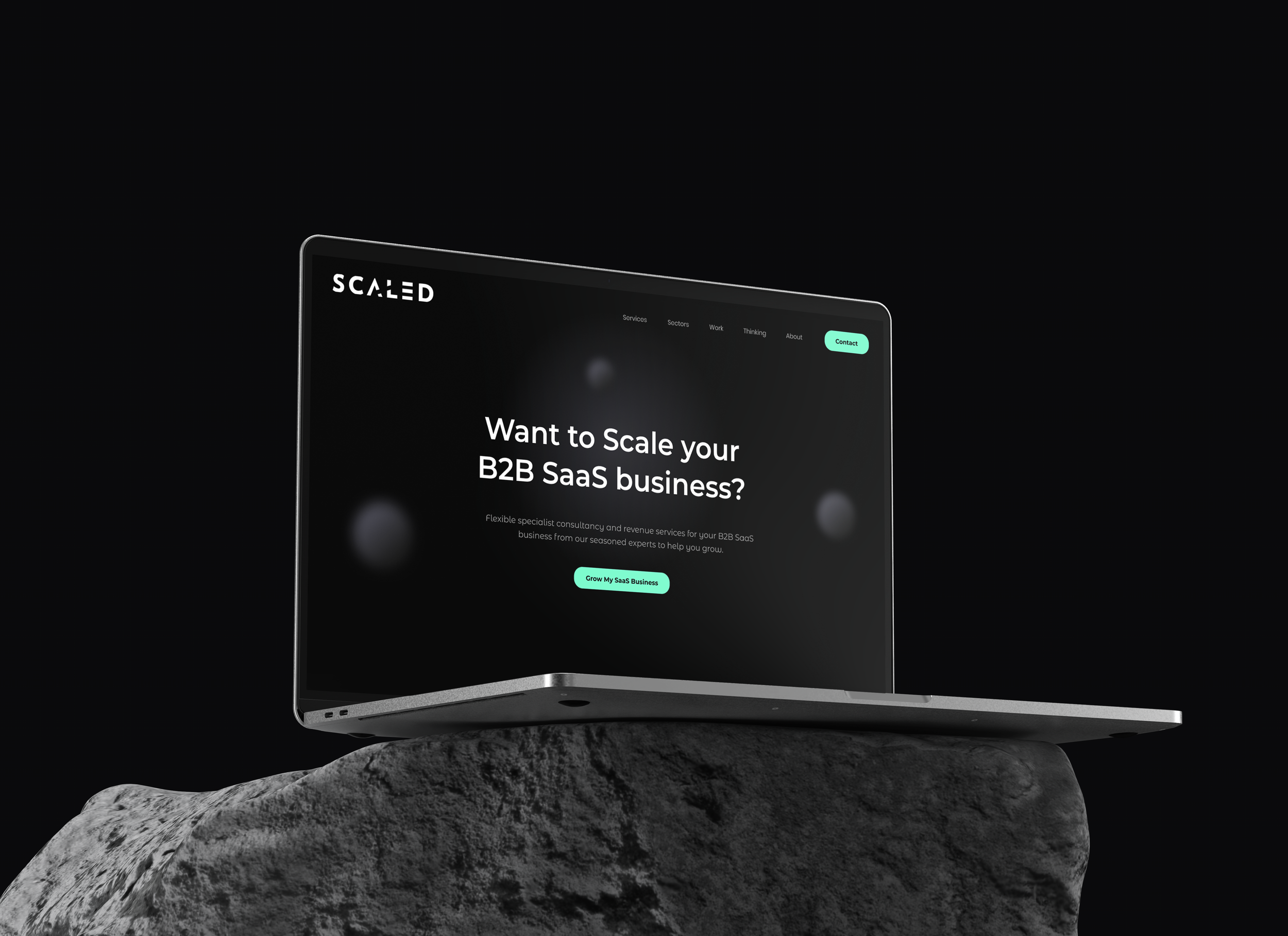
Scaled is a UK B2B growth consultancy working with founders and leadership teams across SaaS, technology, agencies and professional services. Phable helped overhaul the company’s digital presence, combining a redesigned website with refreshed brand elements and a programme of long-form content. The new site was structured to present Scaled’s expertise more clearly and provide a stronger platform for explaining its approach to business growth, while a series of ebooks allowed the consultancy to turn that expertise into useful thought leadership for prospective clients. Rather than a conventional identity project, the work shows how brand, website and content can operate together to establish authority around a complex professional service. It also adds relevant experience around businesses serving the B2B SaaS and technology ecosystem.
Wakeline
Wakeline is a German deep-tech company developing a different approach to artificial intelligence: systems that continue learning while they operate, rather than relying solely on periodic retraining. Phable has worked closely with the company as its technology and proposition have evolved, developing the brand strategy, positioning, messaging and digital communications needed to explain a genuinely complex AI concept to investors, partners and commercial audiences. The challenge was not simply to make the technology easier to understand, but to give Wakeline a distinctive position within an increasingly crowded AI market without reducing its technical credibility. The resulting brand provides a clear platform for communicating continuous-learning AI, from the company’s core proposition and website through to investor communications, thought leadership and product storytelling.
A2Z-CM
A2Z-CM is a Dutch consultancy and management-recruitment business operating in a market where reputation, trust and professional credibility are particularly important. Phable began with a detailed review of the company’s existing website and brand before undertaking a wider refresh that included a redesigned digital presence, new logos and a more unified identity and messaging system. We then extended the work into ebooks, white papers, blogs and social campaigns designed to demonstrate A2Z-CM’s expertise and build authority around its services. The project was less about making the company appear radically different and more about ensuring every part of the brand reinforced the level of professionalism expected by senior candidates and corporate clients. It demonstrates Phable’s experience bringing brand, digital design and thought leadership together for specialist professional-service businesses.
Maaind
Maaind partnered with Phable to define and communicate its brand within an emerging and complex technology space. We developed structured messaging and content systems that clarified its positioning and offering. The work simplified technical concepts into clear, compelling communication, improving engagement and understanding. This enabled Maaind to strengthen its authority, supporting growth by making its proposition more accessible, credible, and aligned with market expectations.