Phable / Identity, illustration & website
Krunam / Technology for goodA human
A human
signal in a
technical world.
A purposeful identity for a business working at the intersection of technology and online safety.
Clarity. Humanity. Connection.
Trust & safety technology brandingFrom a defining mark to a connected system ↘
Make the purpose
part of the identity.
The business
Krunam’s original proposition centred on AI image and video classification for online child protection and content moderation. Its ambition, “Technology for Good”, gave the brand a clear human purpose.
That purpose needed a visual language that could move between technical conversations and a wider audience.
Phable’s role
We developed the logo and visual identity, explored creative directions, and extended the chosen system into illustrations, brand guidelines and marketing content.
Our website work took the identity from wireframes through to final execution. The expanded applications below explore where that original system can go next.
01 / A distinctive starting pointOne mark.
One mark.
An unmistakable
character.
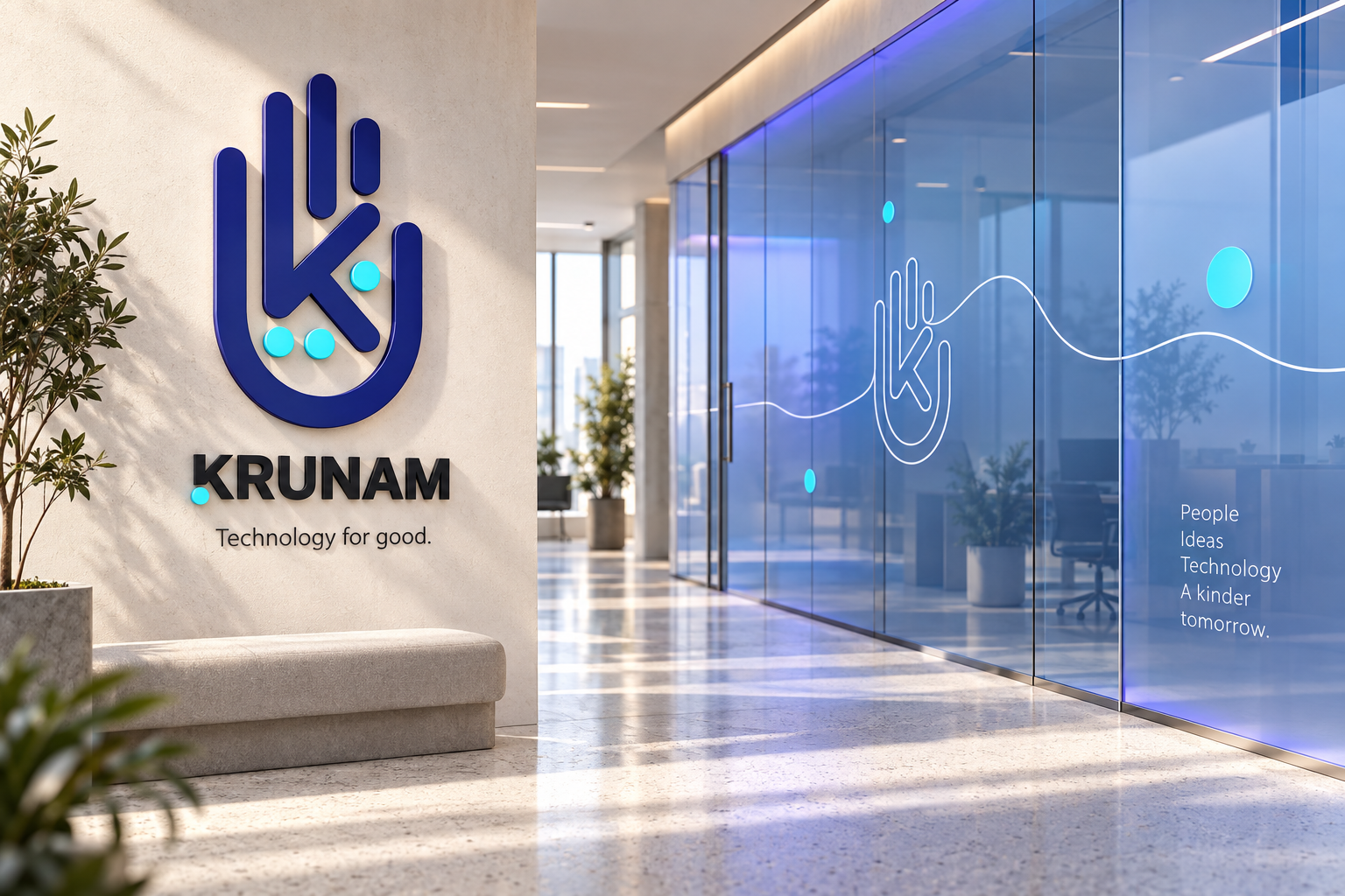
The original hand-shaped K combines rounded forms, a strong silhouette and three bright cyan points. It holds its character at a range of scales.
Original Phable identity
Simple enough to travel.
The thread through the original workA lighter touch
A lighter touch
for a serious subject.
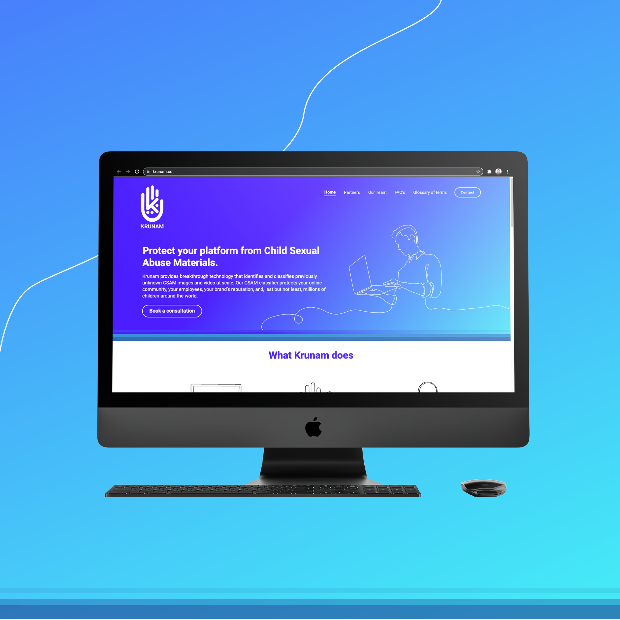
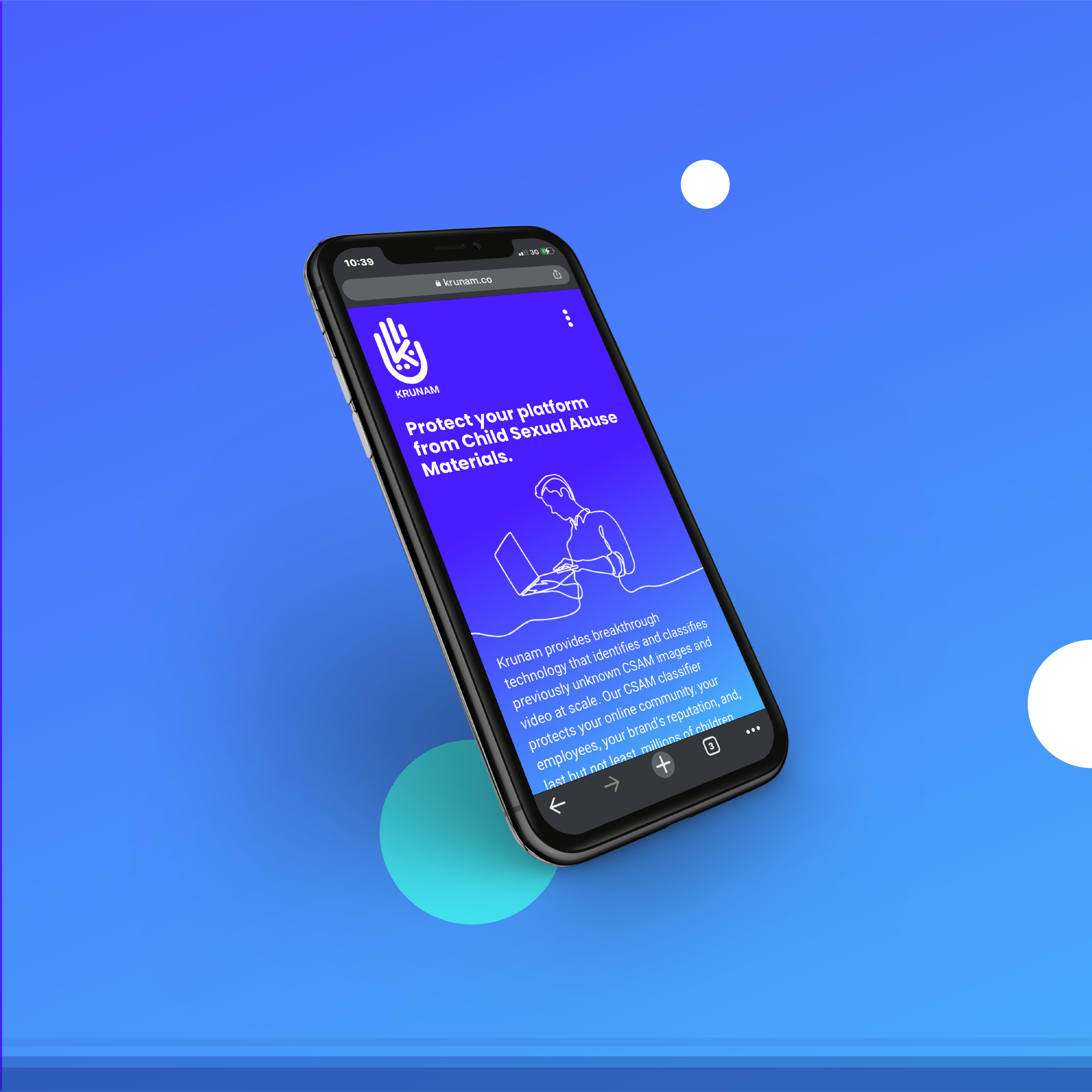
The original illustrations connect people, computers and the brand’s hand mark in a continuous line. The website artwork shows that language working across desktop and mobile.
A proposed typographic extensionSora / Source Sans 3
Clear
intentions.Aa
intentions.Aa
Sora / Display
0123456789
Geometric forms.
Open, confident statements.
0123456789
Source Sans 3 / Reading
Make the complex approachable.
Careful hierarchy gives a technical subject a clearer path. A concise headline establishes the idea; a comfortable reading face carries the detail. Space does as much work as scale.
02 / Connect the brand to the conversationPurpose first.
Purpose first.
A clear next step.
● ● ●Krunam / Website concept
Approach Resources AboutLet’s talk ↗
Technology for goodHuman purpose.
Human purpose.
Technical focus.
Exploring technology’s role in safer online spaces.
01 / Our focus
Online safety
02 / Our approach
A shared understanding
03 / Your next step
Tell us the challenge
An enquiry should feel approachableStart with
Start with
the right
conversation.
A proposed consultation flow asks for context before inviting an enquiry. Clear choices and a short explanation help a platform team understand what comes next.
Two illustrative interface states. No personal information is entered and no content upload is requested.
9:41●●● ▰
☰
Let’s talk / 01What brings
you here?
Help us understand the conversation you’d like to have.
Platform safety●
Technology partnership○
General enquiry○
Continue →
Next / Your project context9:41●●● ▰
☰
Let’s talk / 02A little
context helps.
Tell us about your team and what you would like to discuss.
Organisation
Your challenge or question
Continue to contact →
Share your contact details at the next step.Put the purpose
in people’s hands.
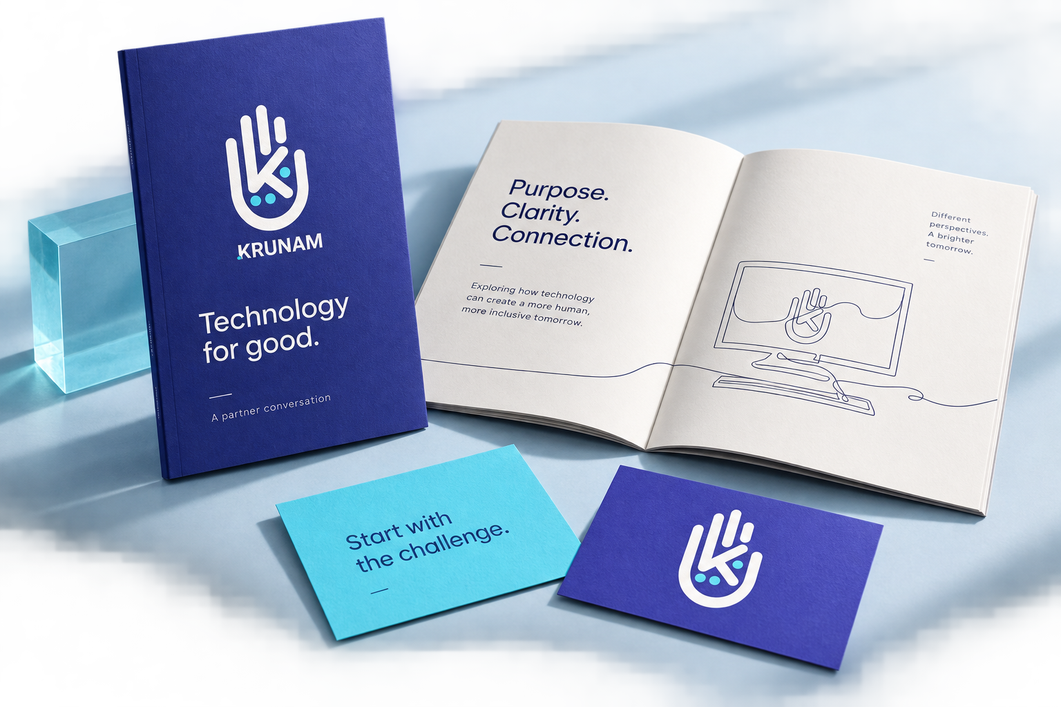
A partner briefing translates the digital identity into a tactile introduction: a deep indigo cover, generous white pages and a bright cyan conversation card.
03 / Give the identity a physical presenceRecognisable.
Recognisable.
Even from
behind.
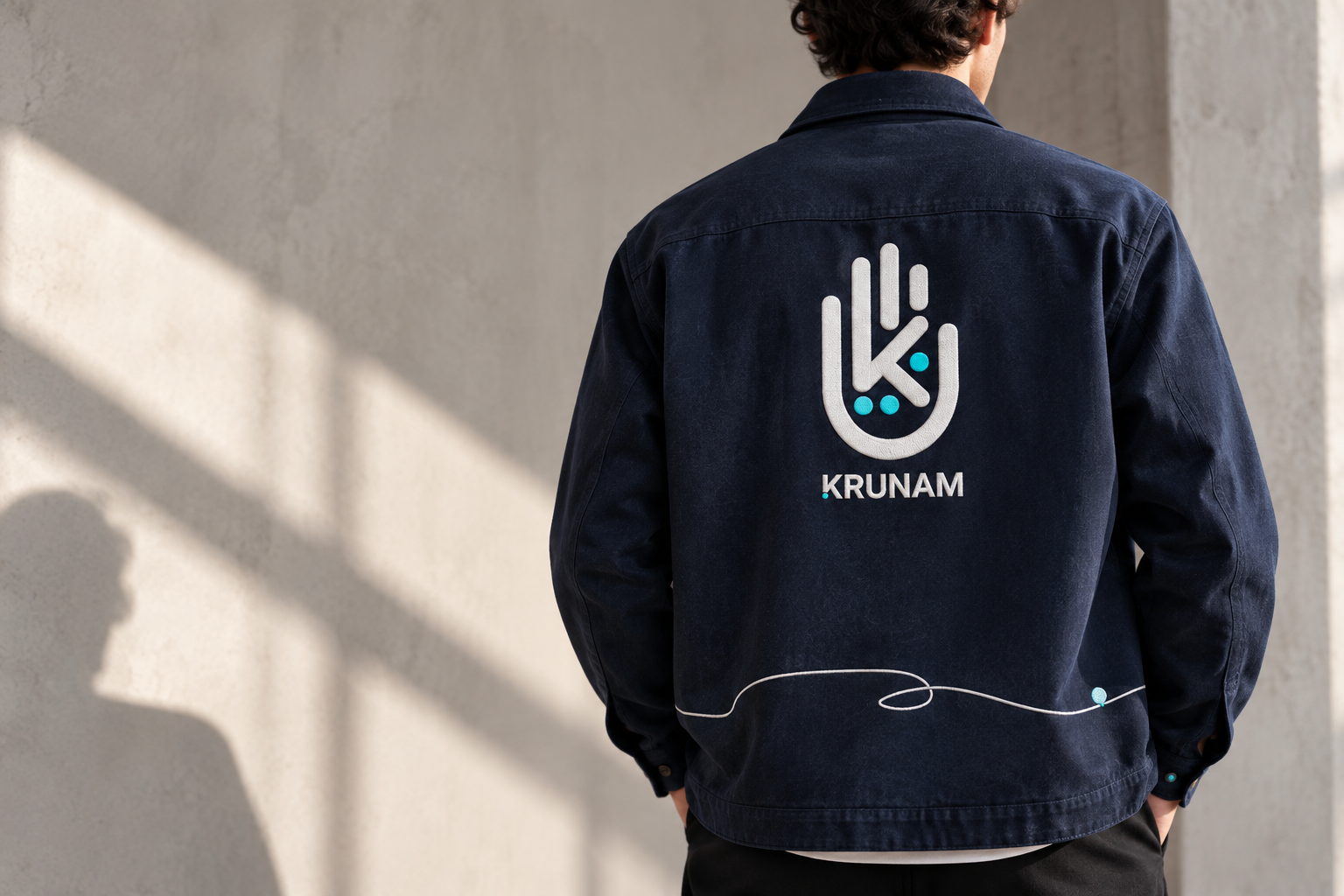
White embroidery gives the mark a tactile quality. Cyan details and a fine line across the hem make the garment feel part of the wider identity.
A restrained team overshirt concept, with the original mark doing the work.
A partner presentation, with a clear rhythmFrom purpose
From purpose
to possibility.
An identity with a connecting thread
Good starts
with connection.
Trust & safety technology brandingGive a complex
Give a complex
business a clear
human identity.
From the first mark to the website and the next conversation, Phable helps technology businesses connect their purpose with a considered visual system.
Talk about your brand ↗What did Phable design for Krunam?
Phable developed Krunam’s logo and visual identity, illustrations, brand guidelines, marketing content and website, from wireframes to final execution.
What should a trust and safety technology brand communicate?
A clear purpose, an understandable offer and a considered route into conversation. Identity, language and digital design should help people understand the business without relying on unsupported performance claims.
Explore more technology branding case studies or our ongoing creative support.
Original identity, illustration and website artwork: Phable’s Krunam project. The original business and website are presented in their historical project context. New spatial, print, apparel, typography, digital, social, icon, presentation and motion applications are portfolio concepts. Physical scenes are generated and interfaces are nonfunctional. No AI development, product efficacy or measured business outcome is attributed to Phable.