Phable × Quantal
Complex security.
One clear story.
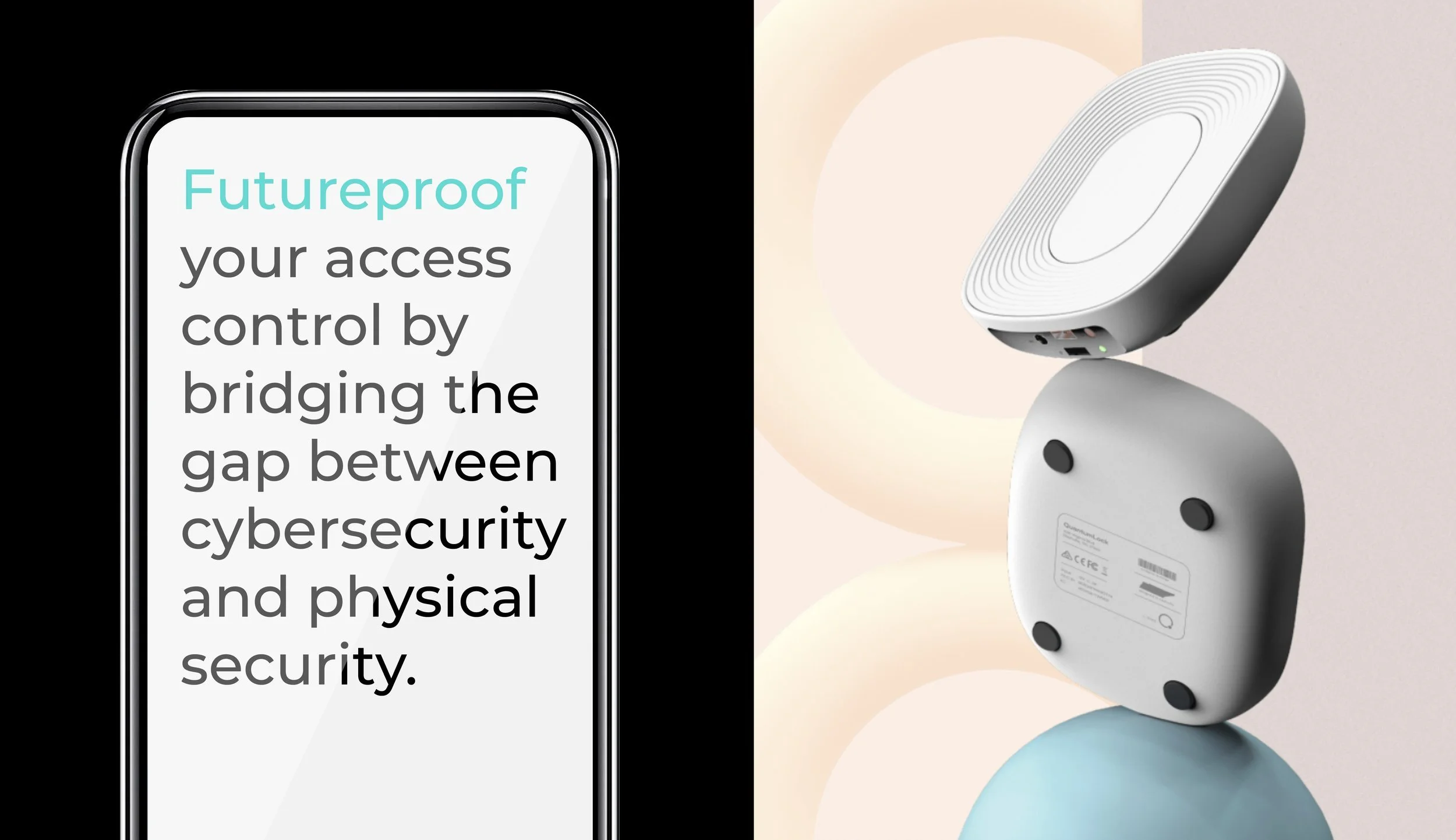
Brand identity, website and software interface design for a company connecting physical security with quantum technology.
Phable worked with founder Erica Grant to give Quantal a coherent identity, message and digital experience. The idea, “Safety in Numbers”, connects a technical proposition with a simple human need.
Brand strategy · Identity · Website design · Software UX/UI
A distinctive idea, with the detail to support it.
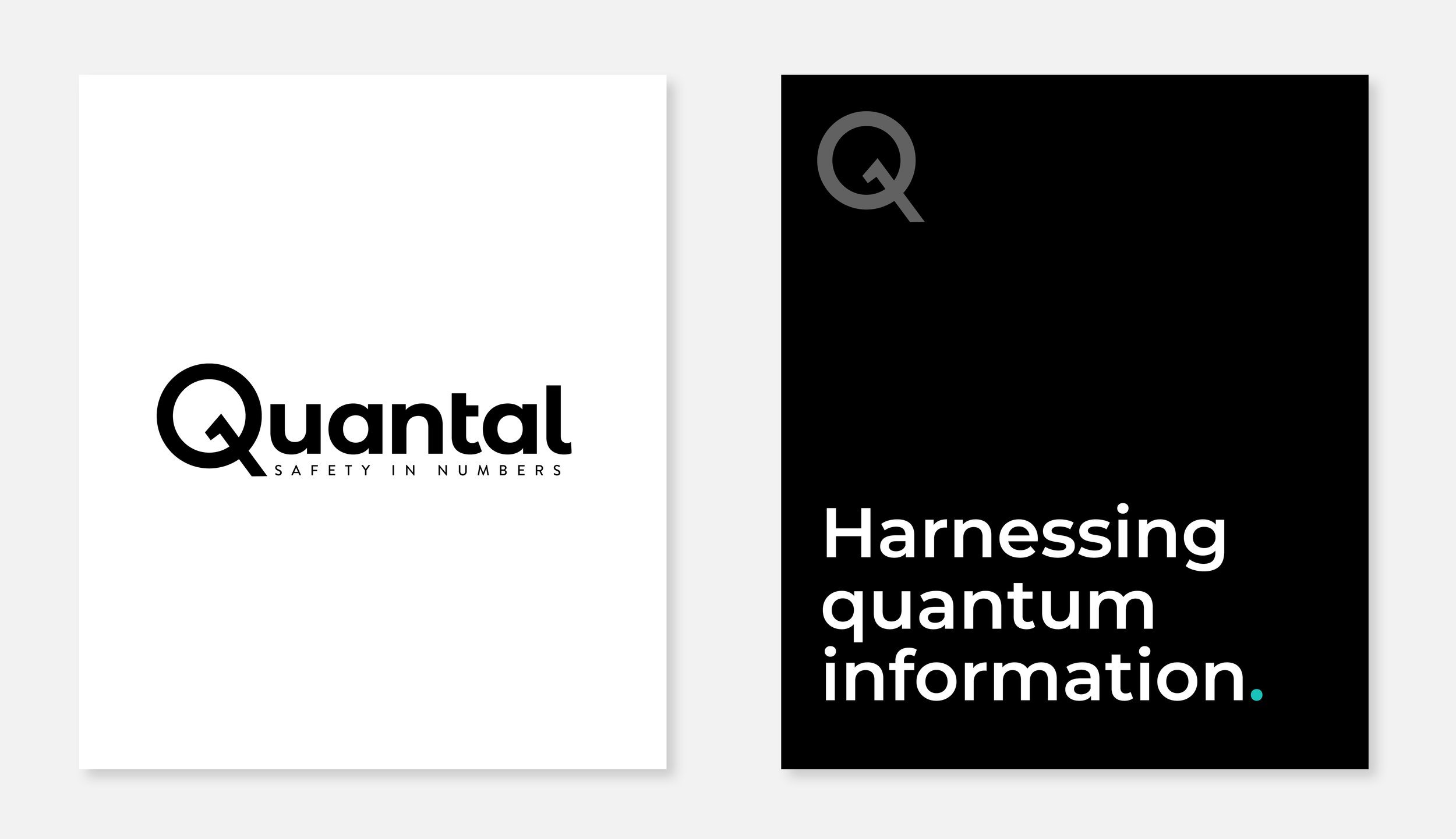
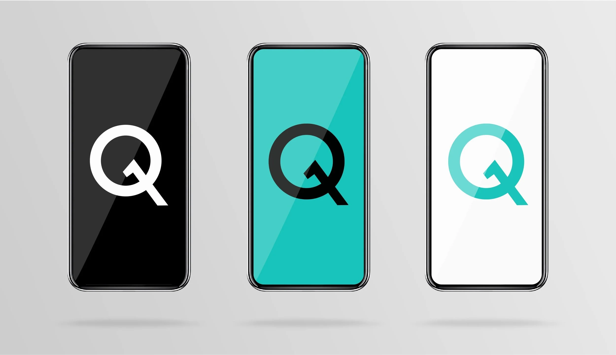
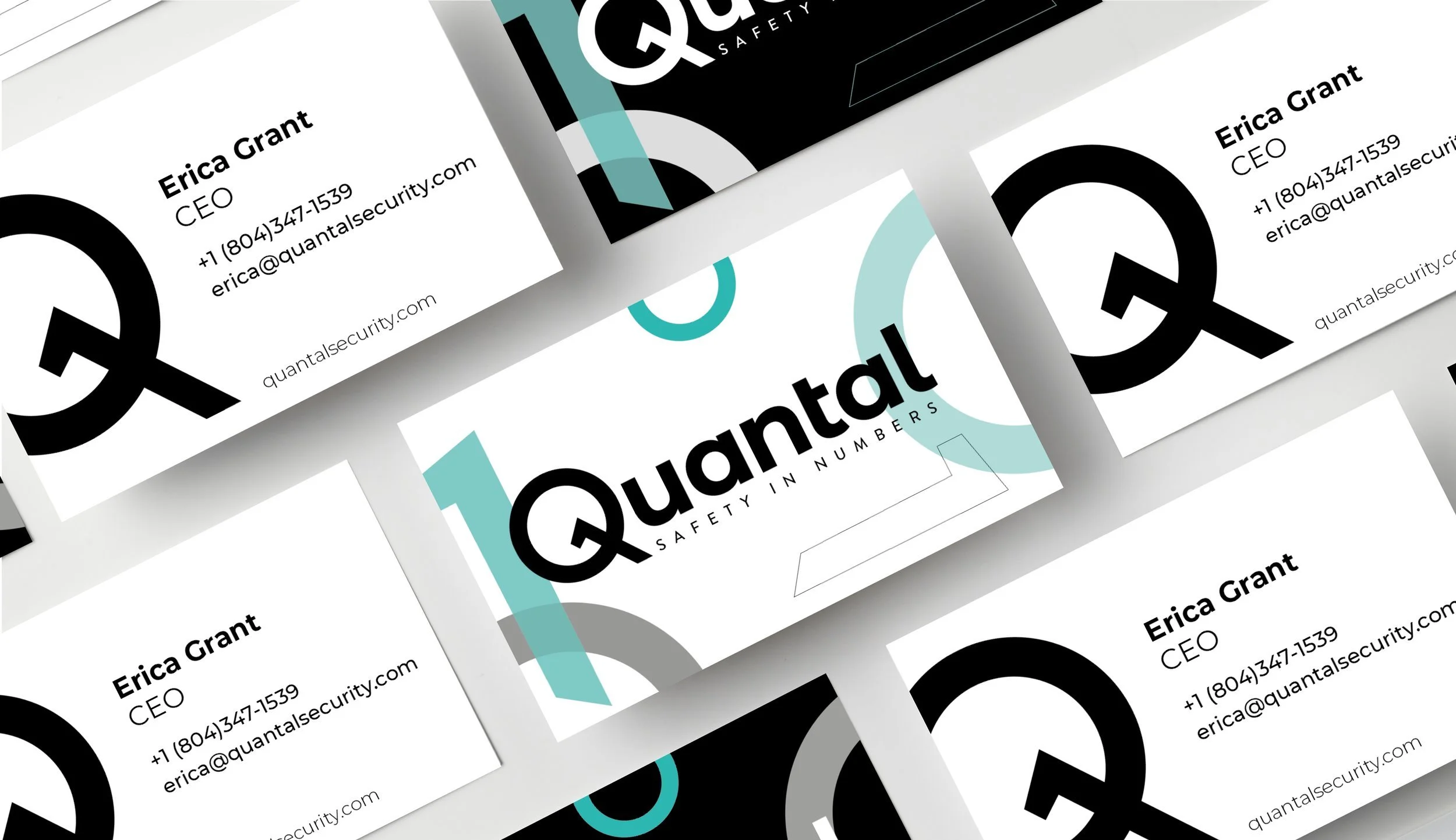
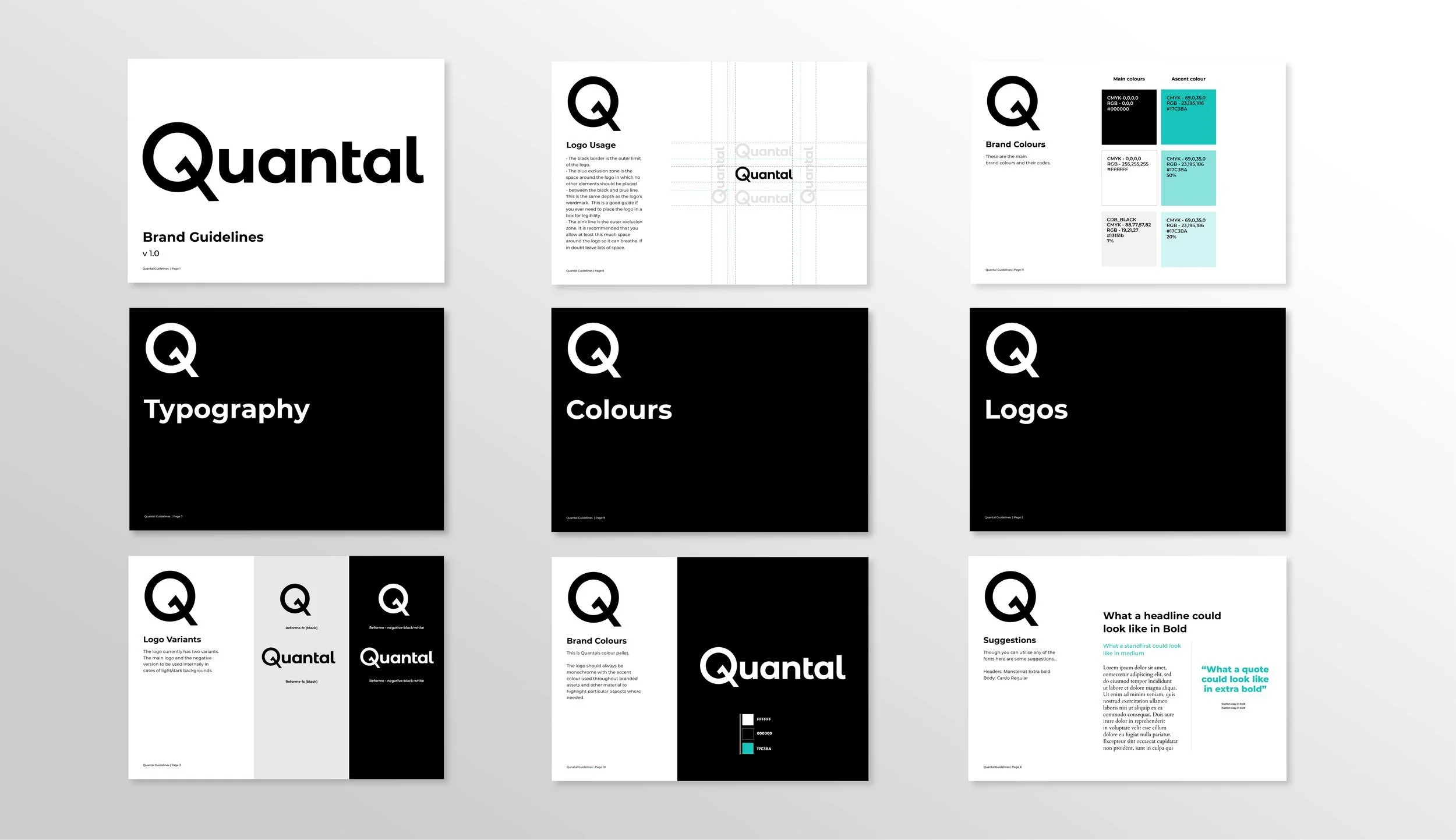
The Q symbol combines a recognisable letterform with a key-like detail. Black, white and turquoise create a precise visual language; the original geometric typography and binary forms connect the identity to its subject.

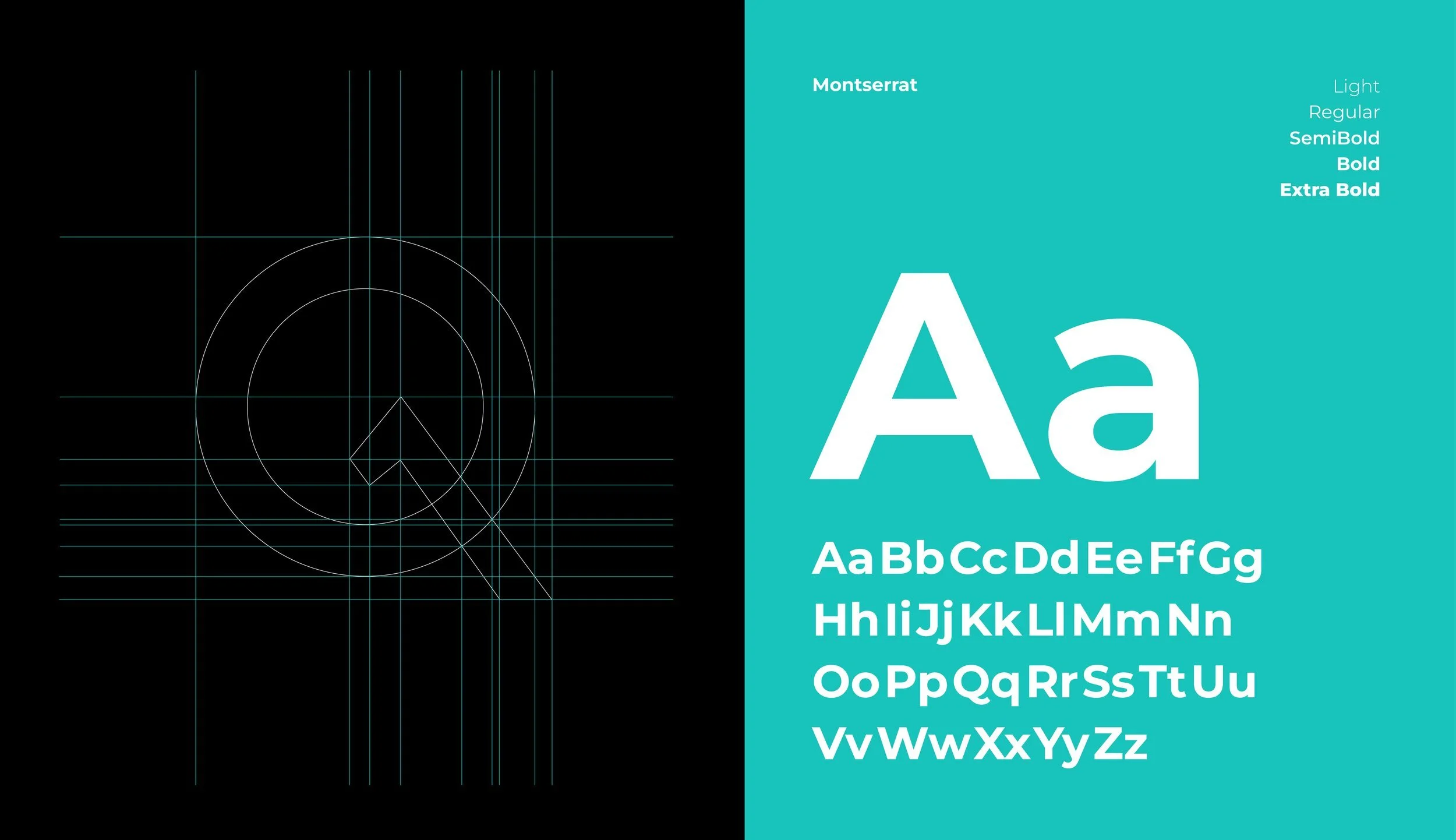
QUANTAL / TYPOGRAPHY IN USEMontserrat · original brand typeface
Safety
In Numbers.
In Numbers.
ABCDEFGHIJKLMNOPQRSTUVWXYZ
abcdefghijklmnopqrstuvwxyz
0123456789 & →
abcdefghijklmnopqrstuvwxyz
0123456789 & →
Explore the weight
A clear voice, from the smallest interface label to the largest brand statement.
From the proposition to the product.
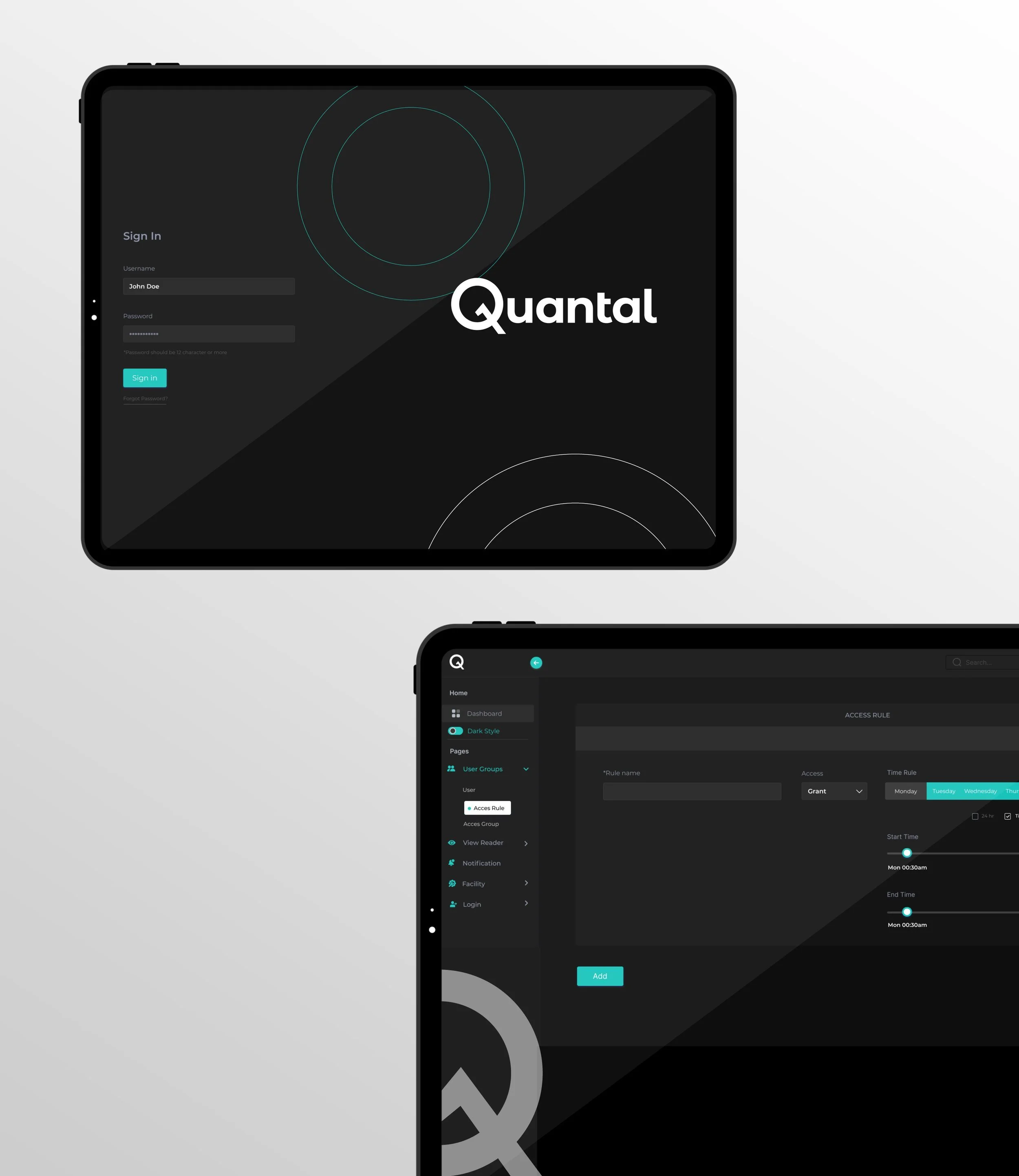
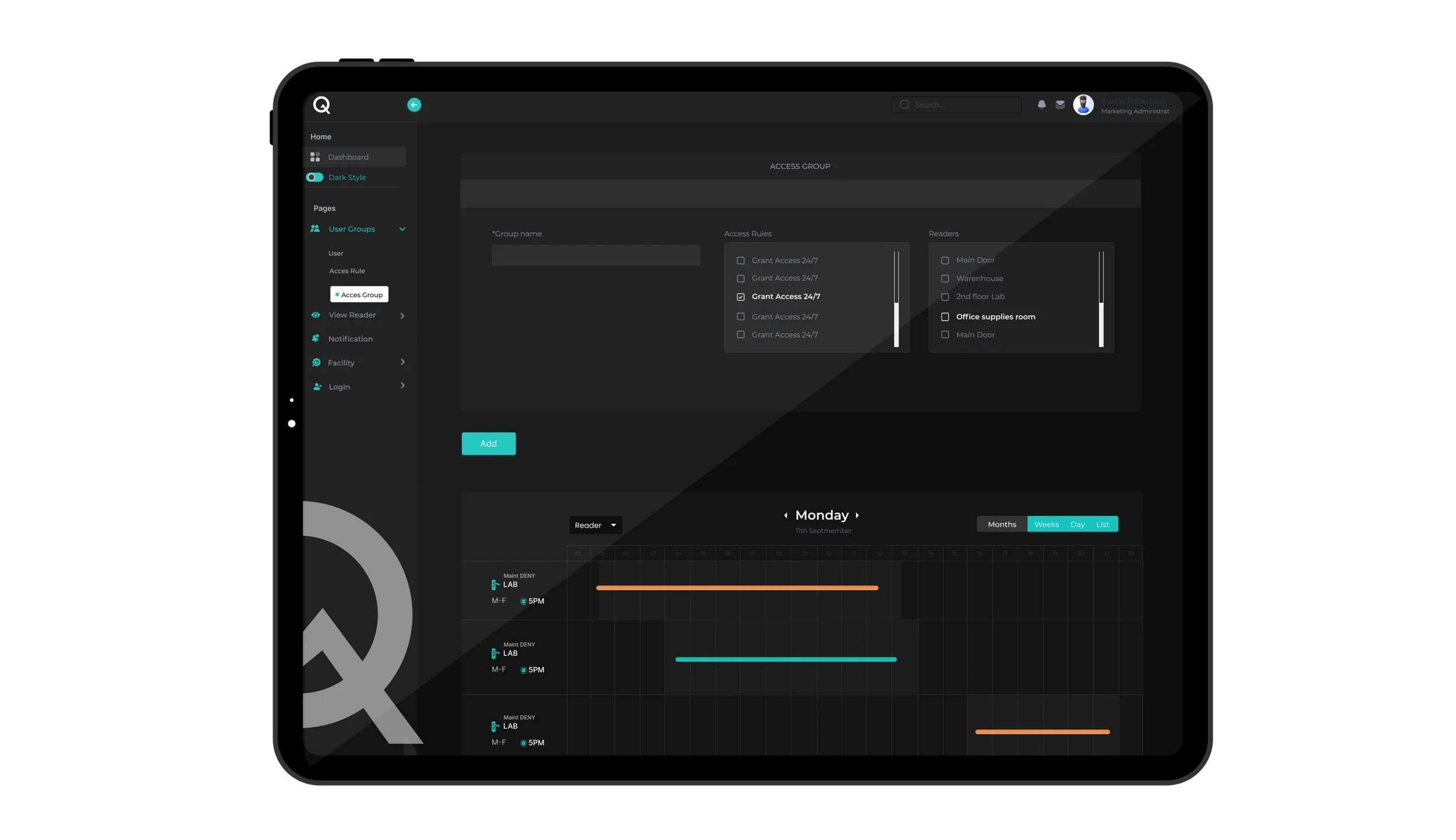
The original work carries the brand into Quantal’s website and software interfaces. A considered hierarchy makes complex information easier to navigate. The new access-log study extends this thinking with a focused, interactive task.
QuantalDemonstration workspace
ActivityLocationsCredentials
ACCESS MANAGEMENT
Studio / sample siteA clearer view of access.
TimeLocationCredentialStatus
North entrance · 09:42
The credential is recognised and the access event is recorded.
The credential is recognised and the access event is recorded.
Interactive design concept · fictional demonstration events. Select a status, then an event.
A brand that can enter the real world.
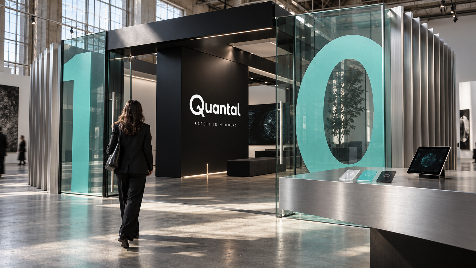
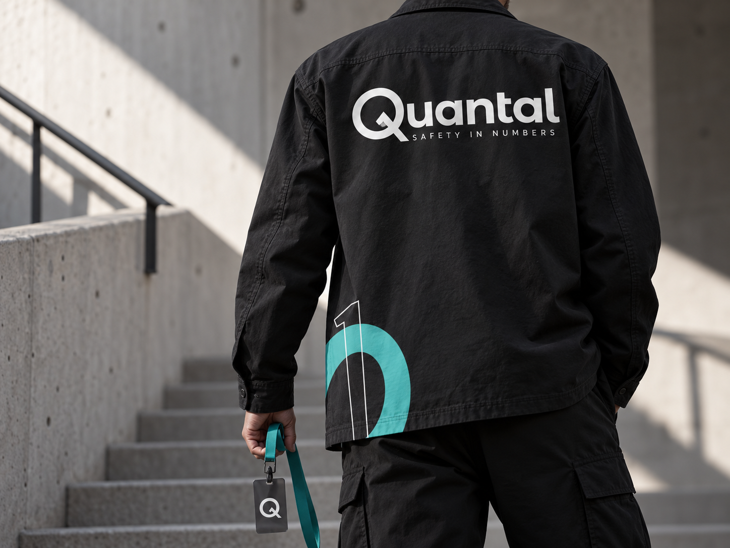
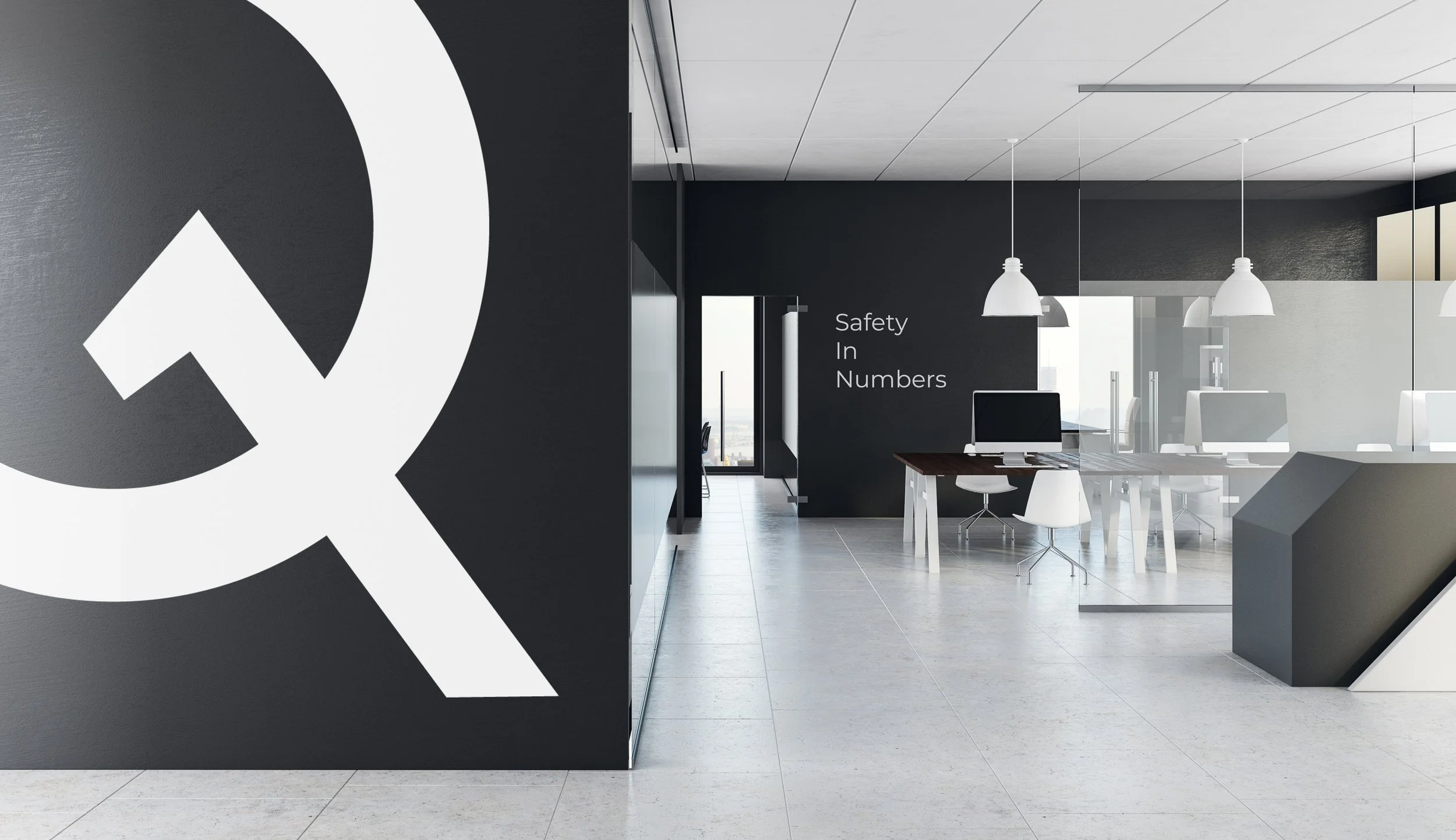
A new teamwear study and the original workplace presentation show how the identity can move between people, spaces and screens. The same distinctive elements adapt to each setting without losing their character.
Make the idea move.
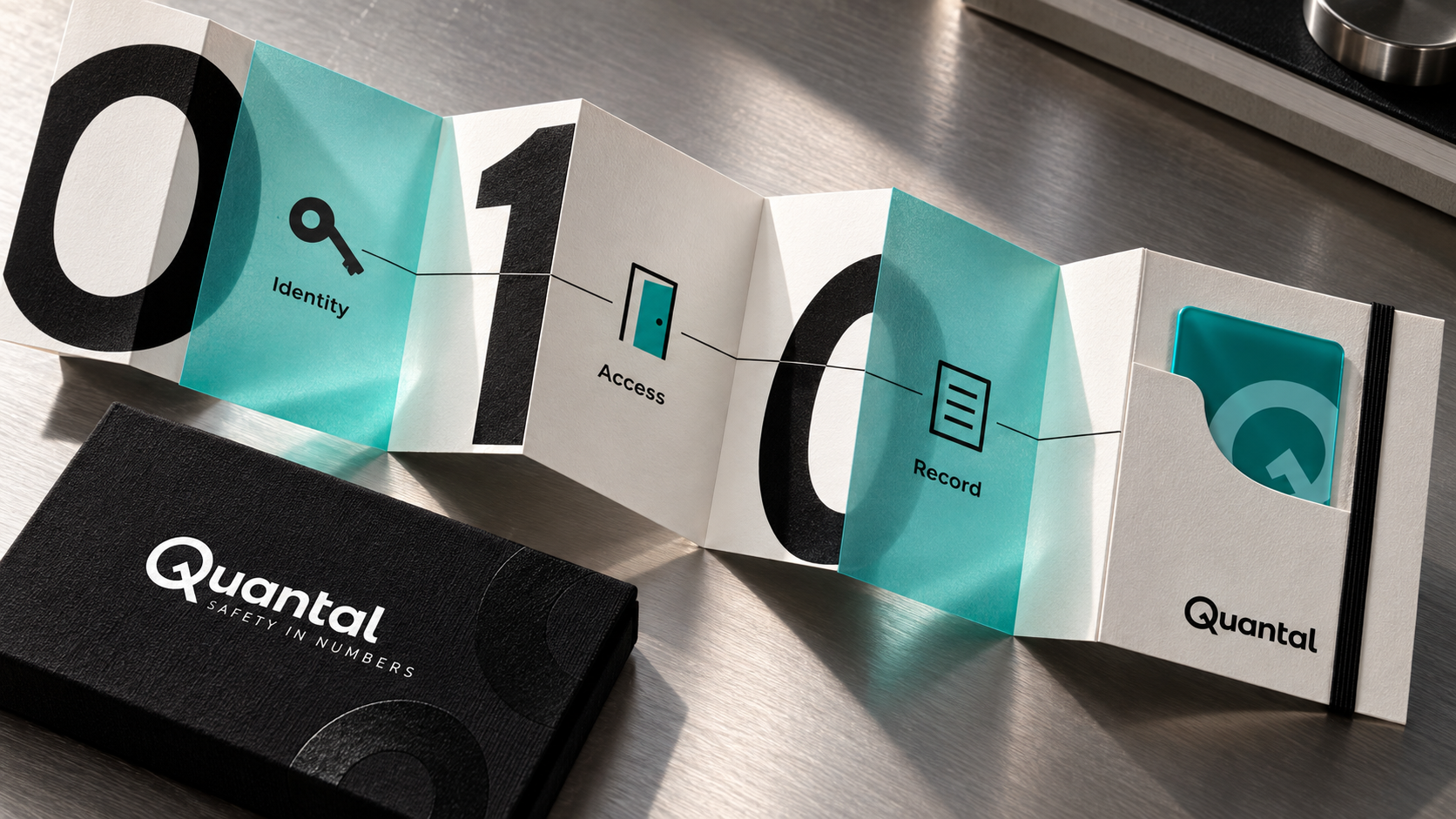
The original campaign line plays on the unpredictability at the heart of Quantal’s proposition. This motion study translates that idea into a sequence of numbers, a credential and a doorway. It is a brand explanation, not a technical simulation.
Quantal / Safety in Numbers
The future is
unpredictable.
unpredictable.
01
NumbersA visual language rooted in the proposition.
CredentialA connection between digital and physical.
AccessA familiar action, made understandable.
Illustrative brand sequence. The displayed pattern is designed animation, not a random-number generator or a demonstration of security performance.
Make complex technology easier to understand.
Quantal’s project brings strategy, identity, website and software design into one connected story. New applications in this folio explore the reach of that original work and are identified as concepts.
Talk about your brand →About the project
What did Phable design for Quantal?
Phable developed Quantal’s brand strategy, identity and messaging, then applied the brand across website design and software dashboards and interfaces, working with founder Erica Grant.
How do you brand a complex security technology?
Find a clear idea that connects the technology to its purpose. Build a recognisable visual language, then make it useful in the product, communication and customer experience. Quantal’s “Safety in Numbers” idea provides that connection.
Can Phable connect a rebrand with product UX/UI?
Yes. Phable can bring brand strategy, identity, website design and product interface design together, so the way a company communicates and the way its product feels support the same story. Tell us about your project.