Redburn Atlantic
Phable / Financial services branding
Identity · Editorial · Communications
Independent thinking.
Distinctly expressed.
Financial expertise deserves a clear and distinctive voice. An identity and editorial system connecting Redburn Atlantic’s research with the people who read it — across publications, presentations and events.
I / The editorial idea
Give expertise
a point of view.
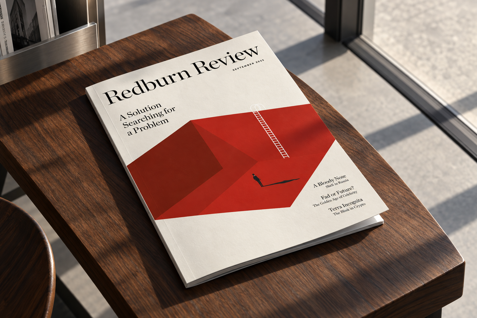
Phable worked with Redburn Atlantic, part of Rothschild & Co, on its identity and the materials that carried its thinking into the world. The work brought together logo development, the Review client magazine, reports, presentation templates, HTML communications and conference collateral.
The creative challenge was to make specialist material readable without making it anonymous. A disciplined framework holds the detail; expressive imagery gives each editorial story its own character.
Commissioned work: identity · magazine design · reports · presentations · HTML design · conference programmes and collateral

Room for a bigger idea.The original Review spreads used ambitious type and imagery to give complex subjects an inviting first impression. That editorial confidence is the starting point for the expanded applications.
A considered voice.
A precise framework.
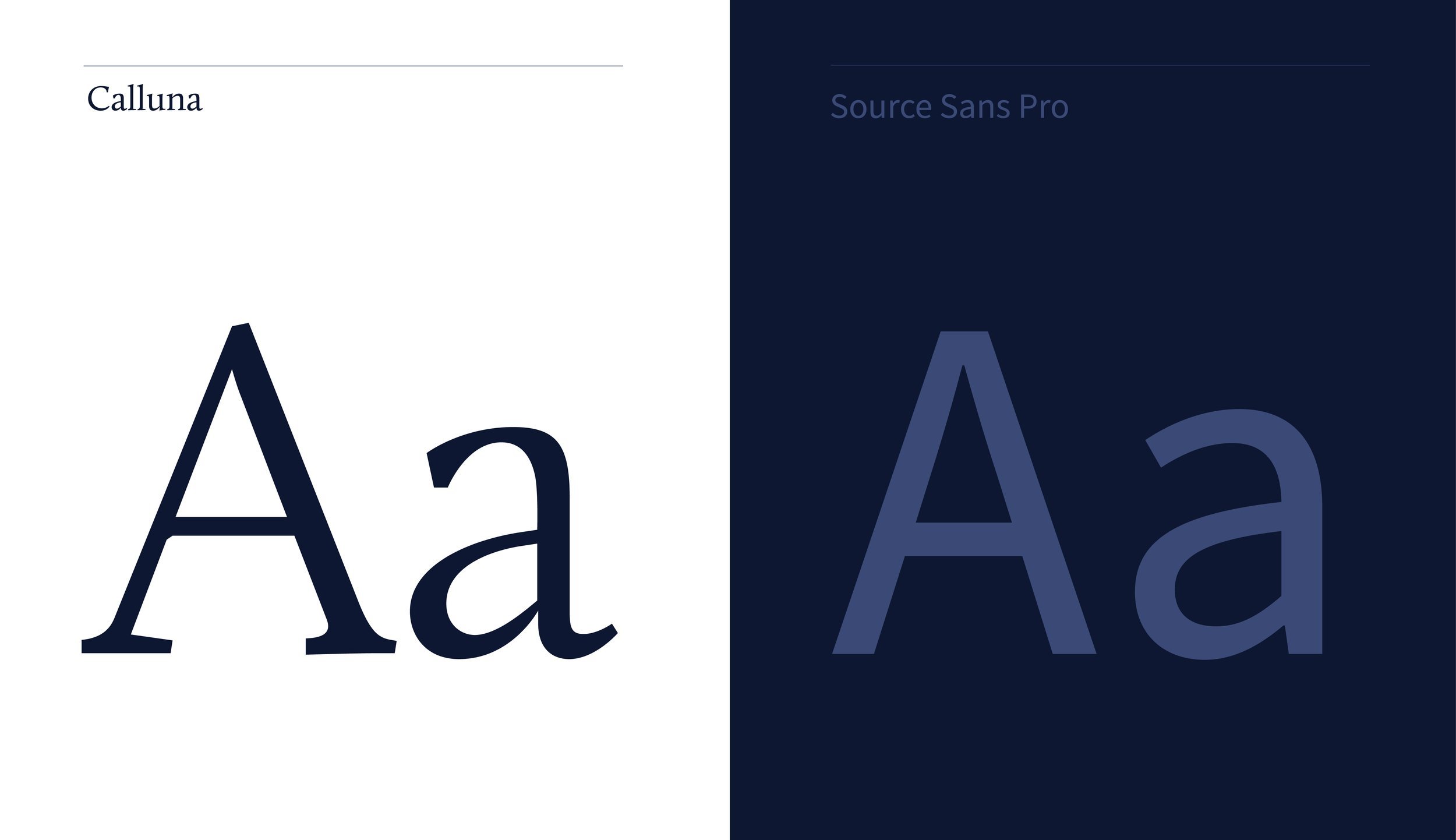
The project archive documents Calluna and Source Sans Pro: a serif voice for ideas, supported by a practical sans serif for information.
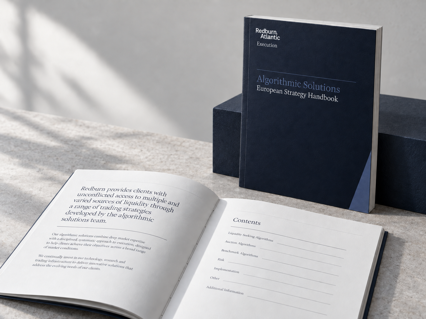
Thin rules, generous margins and a controlled hierarchy bring order to dense information. The same care should be felt in a printed handbook and on a screen.
II / The reading experience
From a first glance
to a closer read.
The following digital studies extend the commissioned visual language into a research library, a mobile briefing and an email. Each gives the reader a clear place to begin and a useful next step.
These are new interface concepts. They demonstrate how the identity can support reading and discovery; they do not represent a shipped Redburn product.
RedburnAtlantic
ResearchTopicsSaved reading
Research in perspective.Explore the ideas behind the story.
All perspectivesTechnologyIndustrialsConsumerEnergy
Editorial perspectiveLook beyond
the headline.
the headline.
Questions, context and a more considered view of the forces shaping businesses.
Read the perspective →
Sector perspectiveThe questions behind the transition.Explore the reading list →
From the Review archiveIdeas worth spending time with.Browse the publication →
A considered read, wherever you are
The morningperspective.
A concise introduction, a clear reading path and a save action help the reader return to an idea when there is time to explore it.
9:41••• ▰
RedburnAtlantic☰
YOUR READING BRIEFINGLook beyond
the headline.
the headline.
Start with the questions that help put a business story in perspective.
In this perspectiveWhat is changing?
What needs closer attention?
Where should you look next?
What needs closer attention?
Where should you look next?
Explore the full editorial perspective and related reading.
Continue reading →
+ Save for later
III / In conversation
Ideas travel
through people.
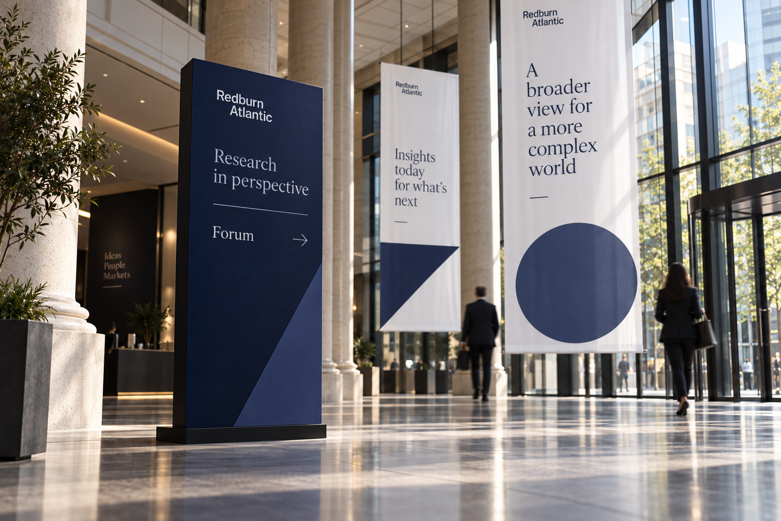
Conferences and presentations create a different kind of reading moment. The identity needs to hold its own at a distance, guide an audience through a room and give a speaker a clear structure.
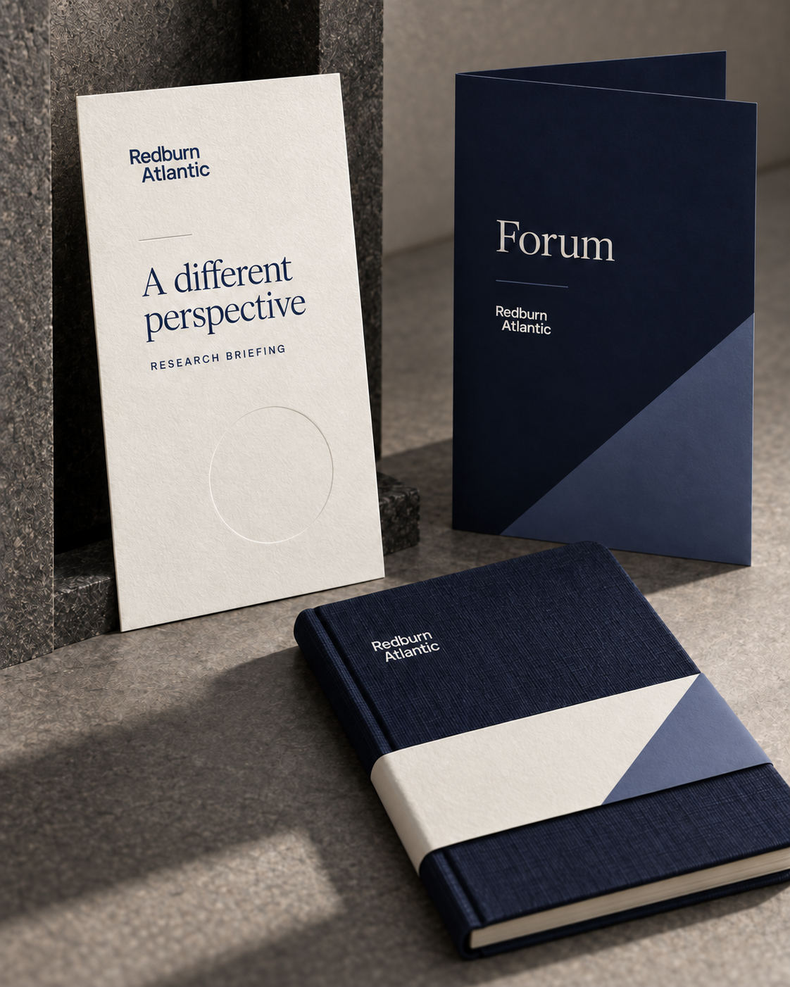
The original commission included conference programmes and event collateral. These new applications explore how that language can shape a complete research briefing.
An editorial email studyA first look.
A first look.
A closer read.
A wider view of the forces shaping tomorrow. Explore the stories, questions and perspectives inside Review.
Review / Digital edition conceptRedburn AtlanticSubject: Review — the wider picture
ReviewIdeas. Context.
Perspective.
Perspective.
From the Review archive
Port in a storm.
From the Review archive: Port in a storm. A closer look at the untamed power of the sea.
Read the feature ↗CONTINUE READING
01
The editorial perspectiveIdeas beyond the headline.
↗02
Further contextMore from the Review archive.
↗Redburn AtlanticEditorial communication study
Review / Editorial campaign studiesGive the story
Give the story
a visual argument.
Original commissioned imagery leads an expanded launch sequence: a moving cover, a graphic about reading beyond the surface, and an editorial route into the story.
REDBURN ATLANTICReviewIn perspective.Ideas that deserve a closer read.
From the original Review archive
01 / The moving coverPhotography, typography, perspective
02 / Beneath the surfaceThere’s more
There’s more
to the story.
A visual metaphor for editorial depth.
Not a market chart.
Not a market chart.
03 / The reading journeyFrame.
Frame.
Question.
Explore.
A striking image opens the conversation. A clear editorial structure gives readers a reason to stay.
- The first impressionPhotography sets the context.
- The editorial questionType gives the idea a voice.
- The closer readHierarchy carries the detail.
The original work,
in motion.
The existing project film remains below in its original player, alongside the expanded application studies.
Financial services branding & editorial design
Make specialist thinking
worth spending time with.
Discuss your brand and publications ↗Phable helps specialist businesses connect their identity with the communications people use: publications, reports, presentations, digital content and events.
This case study presents the Redburn Atlantic commission. The business now operates as Rothschild & Co Redburn. The work shown here relates to the earlier identity; it does not claim authorship of today’s wider Rothschild & Co brand.
Original project artwork and film sit alongside clearly labelled new application concepts. The concepts illustrate potential uses and are not claims of manufactured materials, delivered events or launched digital products.