Phable × Soulloop
A personal story.
A wider connection.
App iconography, social campaigns and film for a wellbeing brand connecting with audiences in the UK and Brazil.
Phable worked with Soulloop’s founder and senior team to give its launch a clear, recognisable voice. Bespoke icons, photographic campaigns and an explainer film brought the app’s story into everyday life.
App iconography · Campaign design · Social content · Film
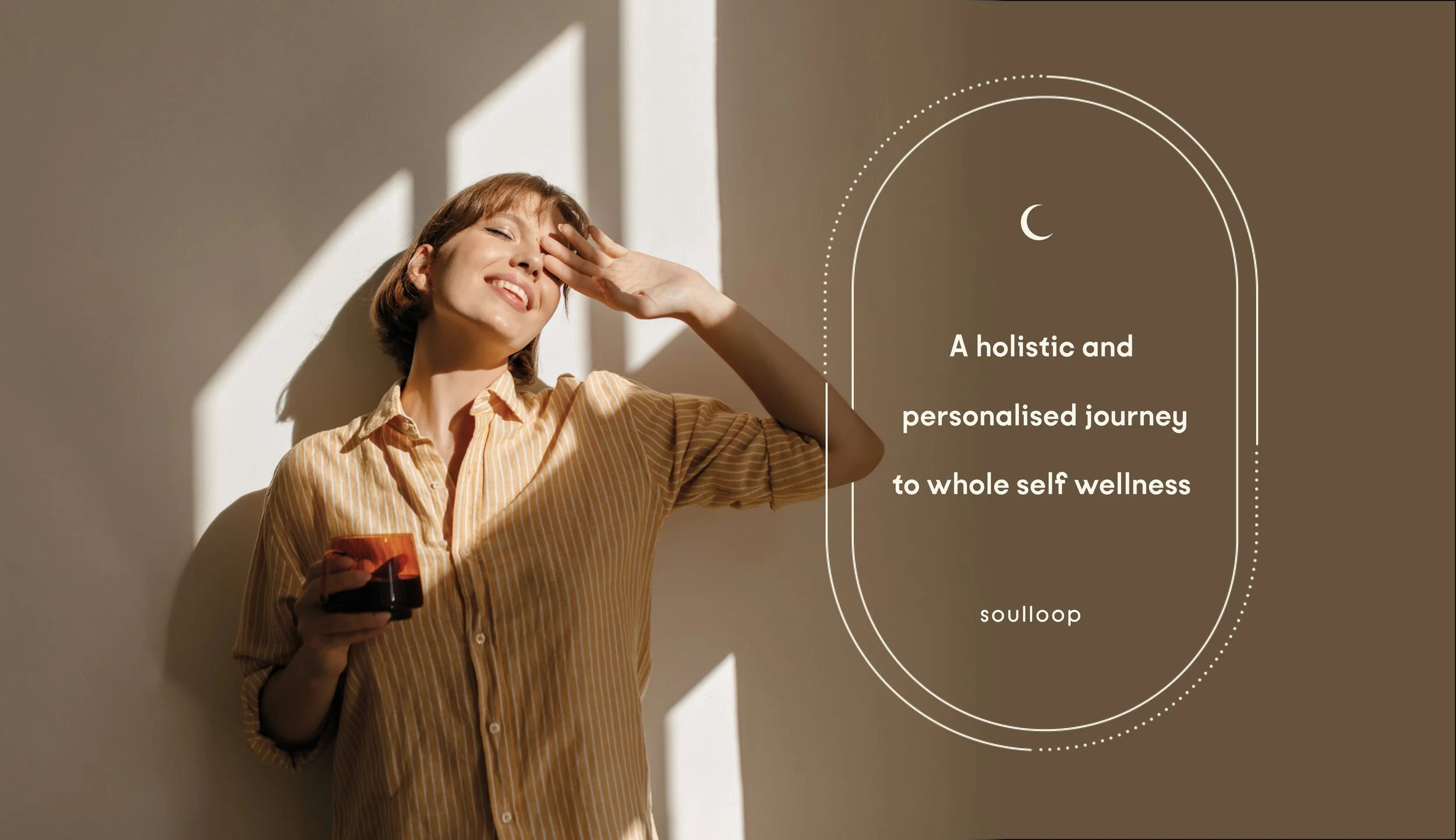


Small details. A connected visual world.
The commissioned app icons give the experience a distinctive visual vocabulary. Fine linework and softly lit spheres sit alongside natural textures, generous space and photography with an emotional point of view.

A little more
room to be.
room to be.

The original moving story.
Existing Soulloop films and campaign formats, retained from the original project.
From discovering the app to finding a moment.
The original campaign connects the promise of the app with recognisable situations and considered imagery. The new digital study explores a simple next step: choosing a reflective moment and opening a short prompt. It is a design concept, rather than a live app service.
A SIMPLE DAILY JOURNEY
Find your
own rhythm.
own rhythm.
01Choose a moment02Follow a prompt03Make it personal
A considered first step.
Space for the person using it.
soulloop ☾
A MOMENT FOR YOUWhere would you
like to begin?
like to begin?
A little room to notice.
What has caught your attention today?
This concept does not save or send your words.
TodayExploreJournal
 soulloop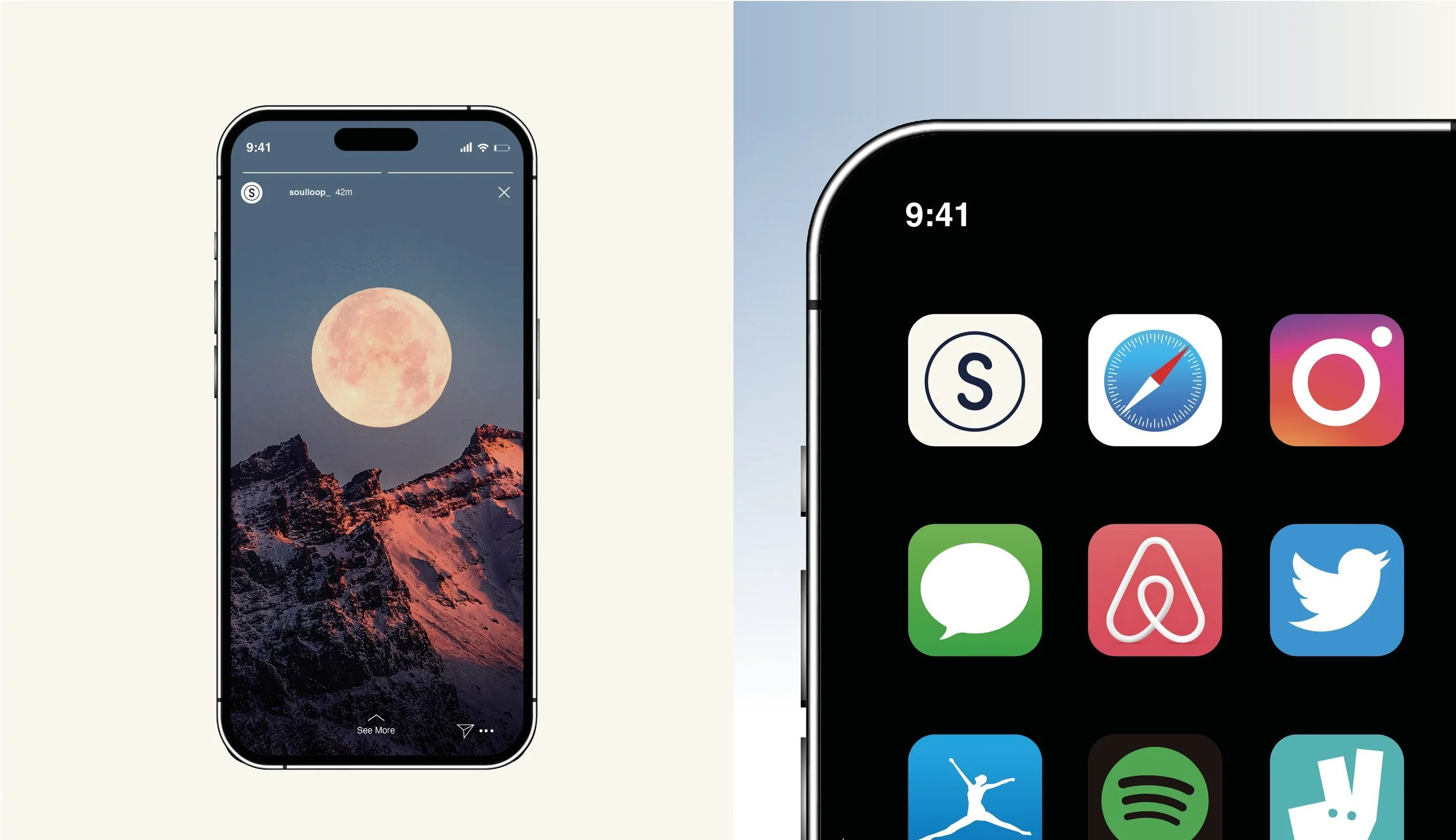
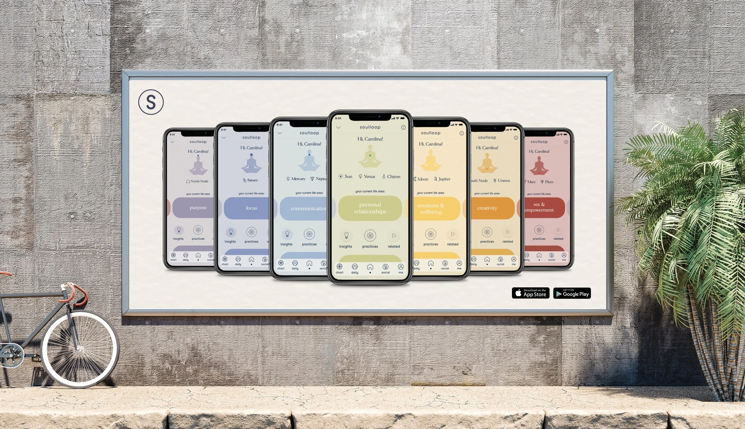
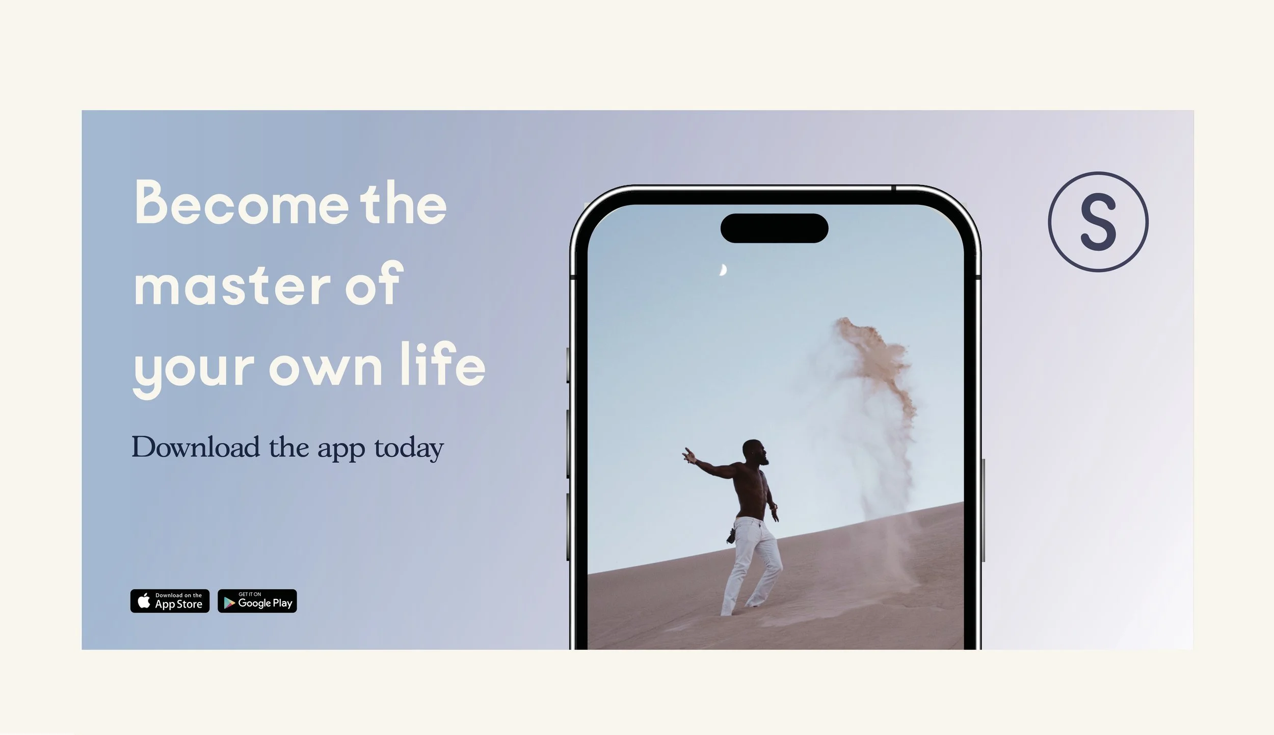
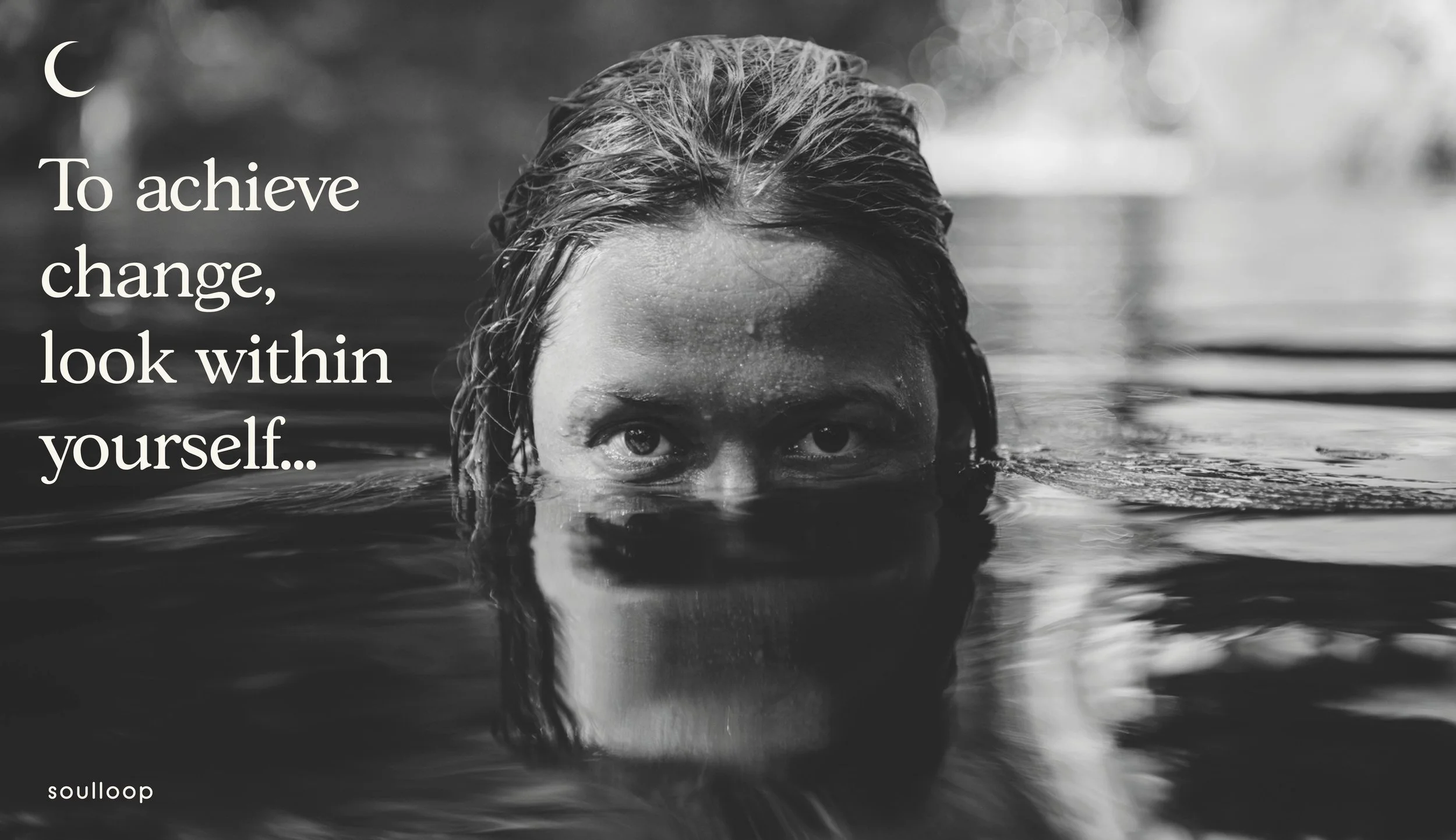
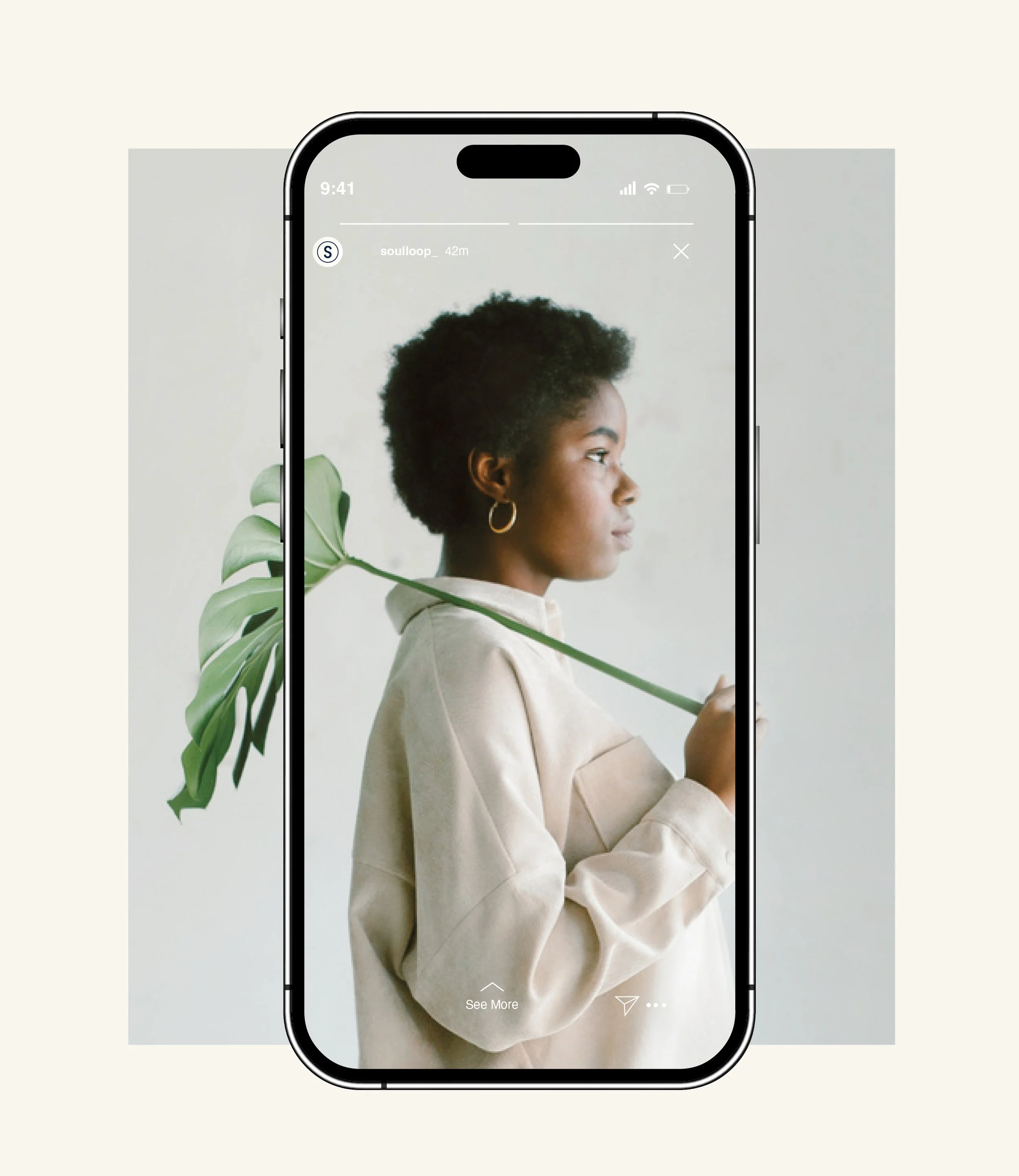
A campaign with its own rhythm.
The original social motion pieces and brand animation.


The experience, beyond the screen.
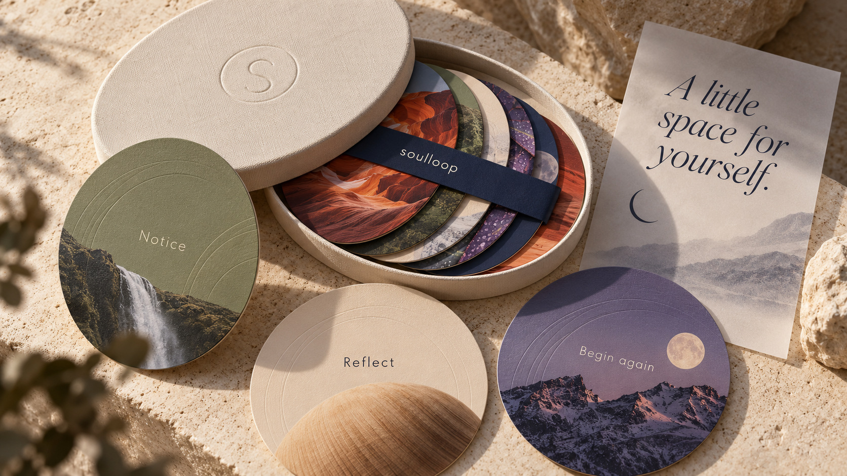
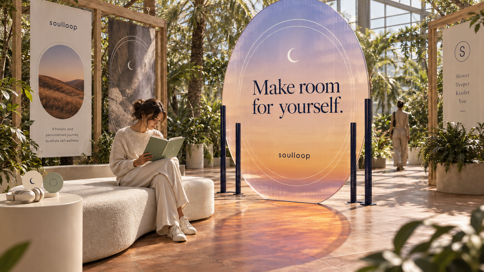
New physical and motion studies explore the potential of the original visual language. An illuminated pavilion makes space for a slower encounter; an interactive orbital map gives seven areas of the app’s story a coherent visual relationship.
soulloop / a connected journey
SEVEN AREAS. ONE PERSONAL JOURNEY.
Direction
A space to consider where you want to go next.
A visual map of the brand’s themes · illustrative orbits, not an astronomical chart.
Make the launch feel like the brand.
From a tiny app icon to a moving campaign, the details create continuity. Soulloop’s launch work connects its message, imagery and digital touchpoints through a recognisable visual language.
The original Phable commission covers app iconography, social campaign assets and an explainer film. New applications throughout this folio are identified as concepts.
Talk about your brand →About the project
What did Phable design for Soulloop?
Phable created bespoke app icons, carousel and static social campaign assets, and scripted and produced an explainer featuring the founder, working with the senior team on communication for the UK and Brazil.
How do you keep an app launch visually consistent?
Start with a clear message and a recognisable visual language. Connect iconography, campaign imagery, copy and motion so that each touchpoint feels like part of the same experience, while adapting its format to the audience and channel.
Can Phable support a wellbeing app launch?
Yes. Phable connects design, content and campaign production for growing brands. Tell us about your launch.