Phable × SubstackPublication identity · Editorial design · Digital experience
Substack
Independent voices.
A world of their own.
Branding and editorial design for creator publications on Substack. Giving each voice a recognisable presence, and every reader a clearer way into the story.
The writer leads.
The design listens.
Creator publication identities
Typography & editorial hierarchy
Long-form reading experiences
Brand and content design systems
Typography & editorial hierarchy
Long-form reading experiences
Brand and content design systems
A publication is a relationship between a voice and its readers. On Substack, that relationship needs a visual identity with character and a reading experience that knows when to get out of the way.
Phable worked with Substack’s internal team on bespoke visual and editorial systems for creator publications. Our contribution brought identity, typography, layout and content hierarchy together, supporting distinct personalities within a shared publishing platform.
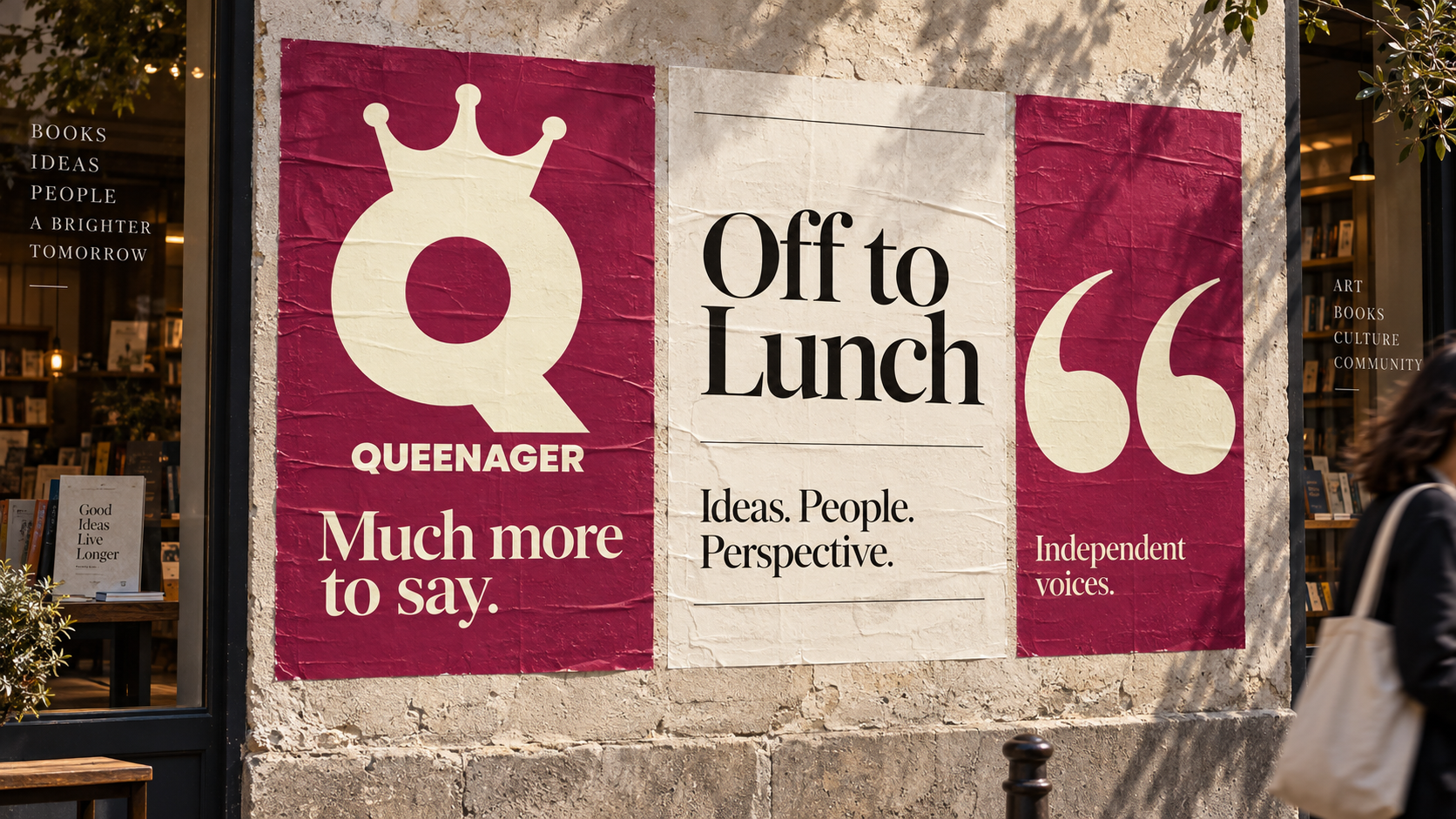
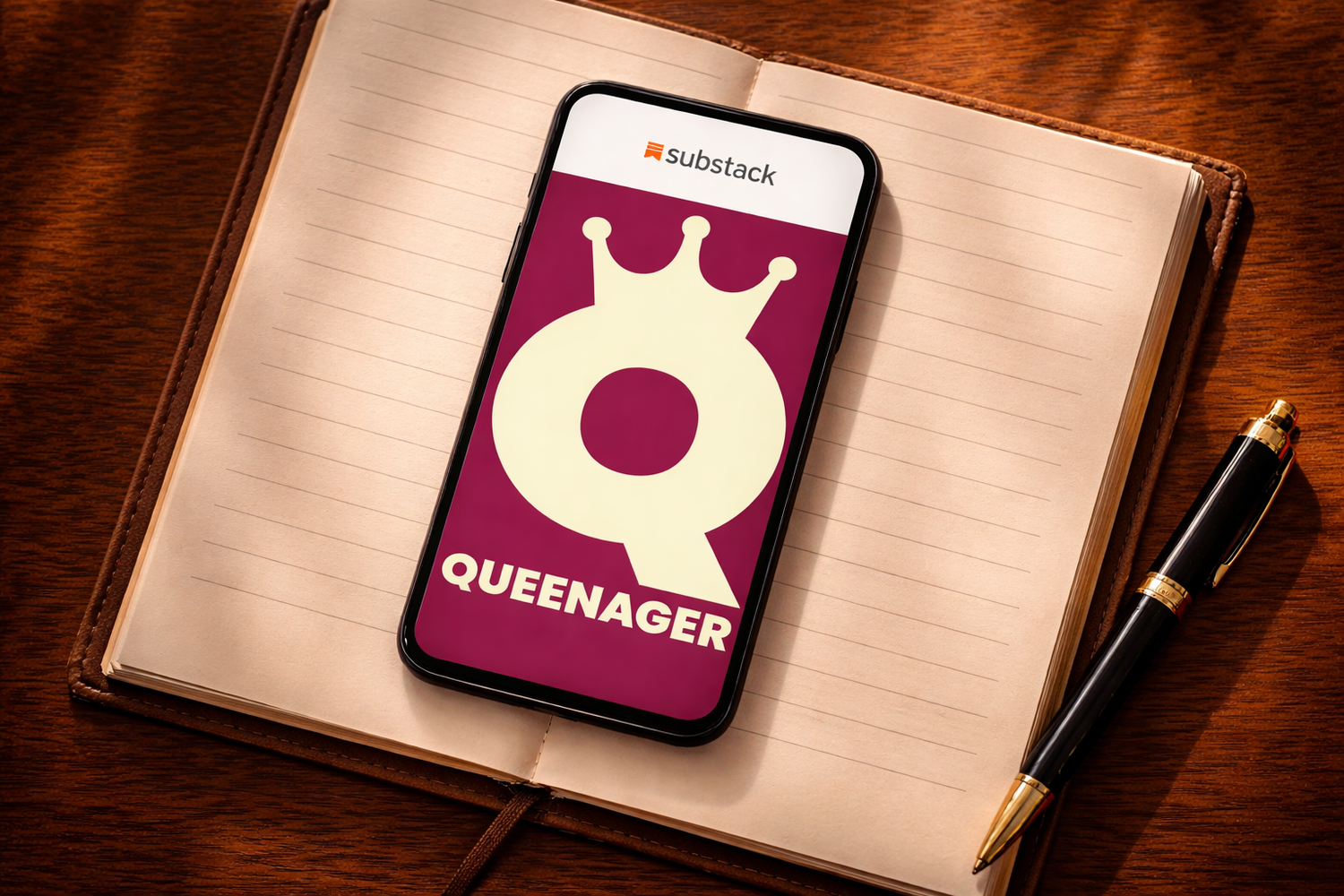
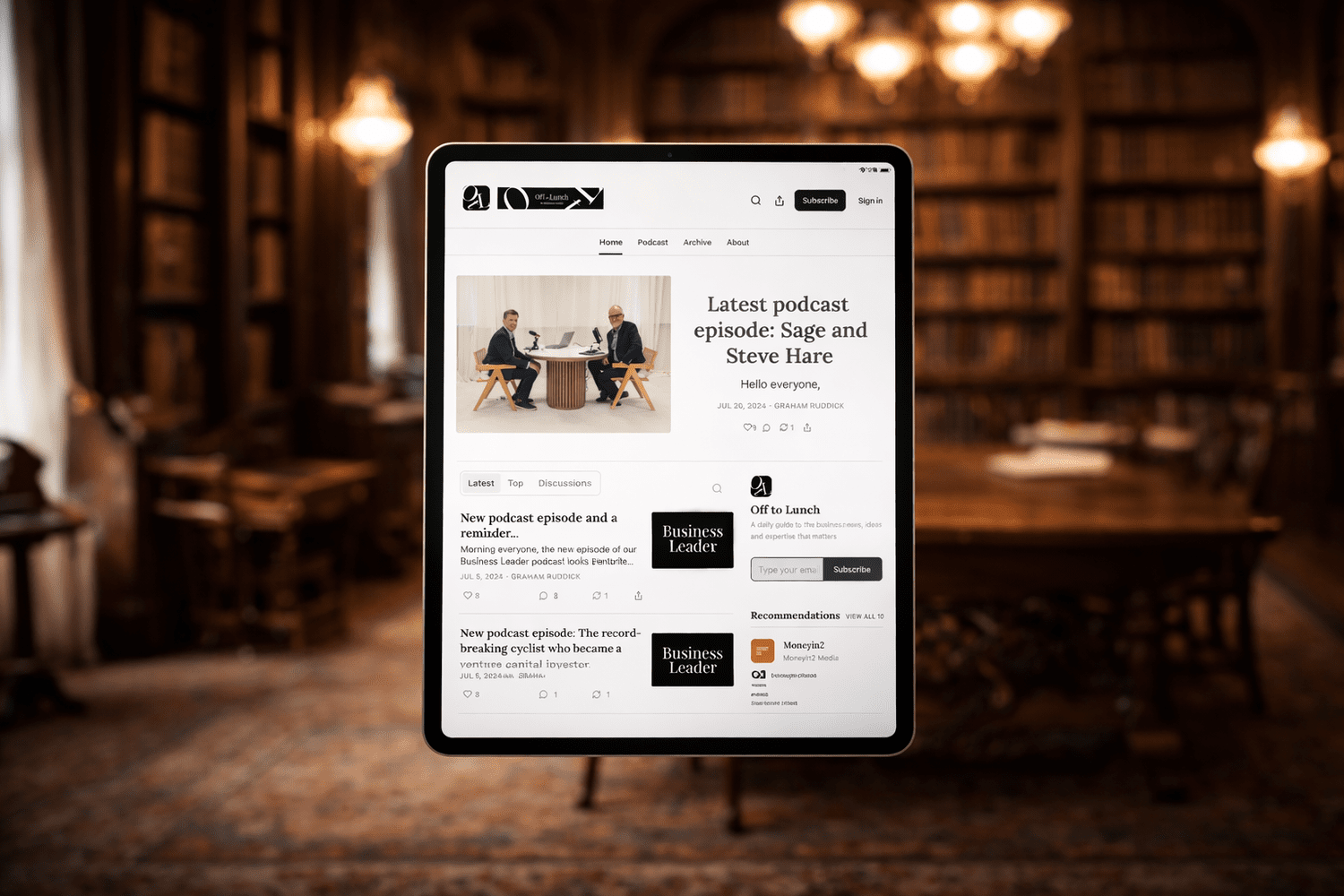
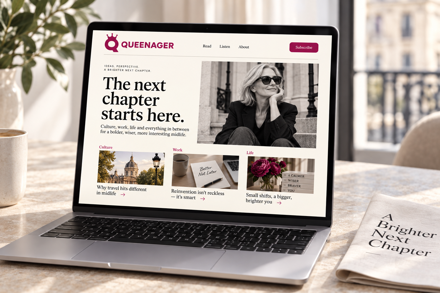
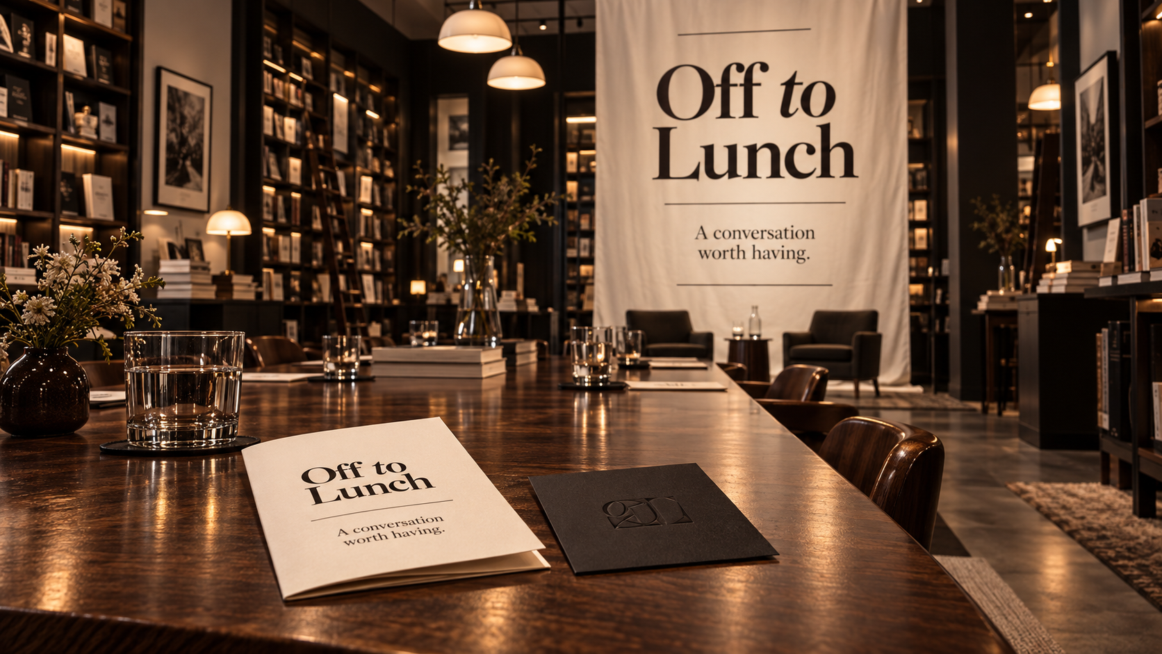
The project archive includes Queenager and Off to Lunch: two different editorial worlds, connected by the care given to how ideas are presented.
More places
for a voice to live.
The following concept studies build on the publication identities in our original work. They explore how a consistent editorial language could travel through reading, listening, print and community.
An editorial type study
A little
more
character.
more
character.
An invitation, in motion
Read.
Reflect.Listen.
Discover.Meet.
Belong.
Reflect.Listen.
Discover.Meet.
Belong.
Independent voices.
Shared curiosity.
Shared curiosity.
The reading journeyOne good story
leads to
the next.
leads to
the next.
A focused article. A considered invitation. A clear next step. The mobile study makes room for the writing before asking the reader to subscribe.
9:41••• ▰
QUEENAGER☰
PerspectiveA little more
room for you.
room for you.
What would you make space for, if the next chapter were yours to write?
Curiosity has no deadline. A different conversation, an unfamiliar place, an idea you have been quietly carrying: every one is a place to begin.
Sometimes the most interesting question is simply, what comes next?
More from Queenager →
9:41••• ▰
QUEENAGER×
Stay curiousYour next
chapter
starts here.
chapter
starts here.
Ideas and conversations for a fuller life, delivered to your inbox.
Your email address
Join the conversation
Thoughtful perspectives
Stories worth sharing
Space to see things differently
Made to be read.
And passed around.
A newsletter can become a much wider editorial world. These studies explore a tactile publication, a social sequence and a listening identity, each carrying the character of the writing into a different setting.
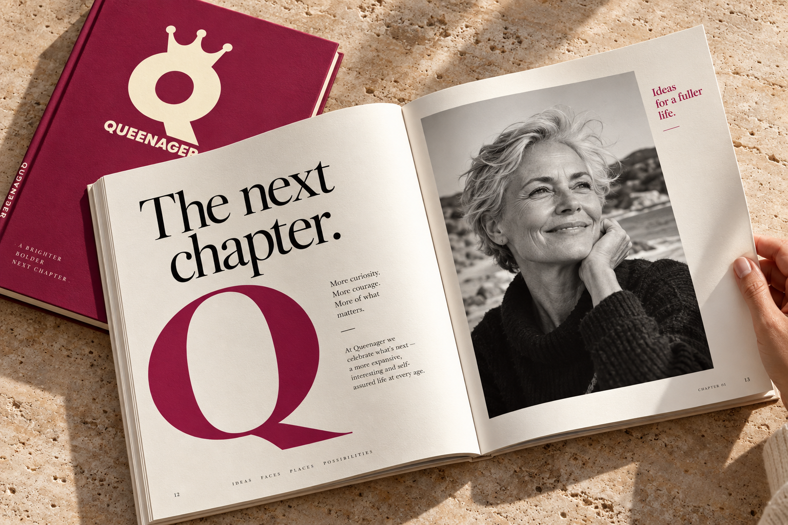
Ideas · People · Perspective
Off to
Lunch
Lunch
A conversation
worth having.
worth having.
From: Queenager
Subject: A little more possibility
Subject: A little more possibility
Welcome to QueenagerThere’s more
to come.
to come.
A place for ideas, experiences and new perspectives. Start with something that catches your eye, and see where it takes you.
Find your next good read →QueenagerPick
up
where
you
left
off.The next chapter
up
where
you
left
off.The next chapter
QueenagerKeep
your
place.
Find
your
voice.Much more to say
your
place.
Find
your
voice.Much more to say
Off to LunchA
little
food
for
thought.Ideas worth keeping
little
food
for
thought.Ideas worth keeping
A publication
people recognise.
And return to.
Looking for a Substack newsletter design agency or a creative partner for an independent publication? Phable connects publication branding with editorial design, so a distinct identity runs from the first impression to the reading experience.
Our work with Substack shows how bespoke visual systems can give individual publications their own presence while keeping content at the centre.
Let’s shape your publication ↗Explore our creative partnerships ↗Project archive images show work featured in the original Phable case study. The additional typography, interfaces, motion, campaigns, print and event applications are concept explorations. They are not presented as commissioned deliverables, current Substack product screens or photographs of real publication events. The proposed font pairing is an editorial study.