
Phable / Brand identity & launch communications
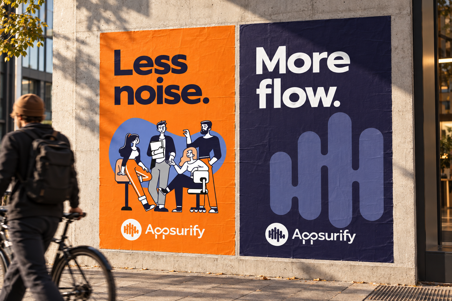
Less noise.More flow.
Appsurify
A clearer, more human brand
for the people behind software quality.
QA software branding & SaaS designFocus on what matters. ↘
The challengeA technical product.
A technical product.
An approachable
point of view.
Appsurify’s TestBrain helps software teams focus testing around code changes. The brand needed to speak to developers and QA professionals while bringing a more human character to a technical category.
Phable refreshed the identity and its expression across the website, social and marketing. Illustration, branded clothing, messaging and launch advertising gave the business a connected voice.
The original work is presented here alongside new physical and digital applications developed from its visual language.
Original identity / A distinctive double-p and rounded symbol
Prompt / The original type specimenFocus.
Focus.
Flow.
Feedback.
0123456789
Clarity has
a character.
Prompt’s wide, open forms give the brand a confident voice. We retain that original choice and propose IBM Plex Sans for reading, with IBM Plex Mono for technical labels.
Orange / Dark purple / Periwinkle
The people behind the productSoftware is
Software is
a team effort.
The original illustration brings the subject back to people: a conversation, a shared task, a different perspective. Expressive linework and warm colour give a technical offer a more approachable face.
01 / Make the useful information clearSee the change.
See the change.
Find the next step.
A test-review concept translates the brand into a focused workspace. Project context, selected tests and review status have distinct places, so the interface can be scanned without losing the detail.
● ● ●Appsurify / Product interface concept
Atlas web / Test runsSearch ◉
REVIEW WORKSPACE
Review requiredCheckout update
Example run · main / checkout-summary
Change contextCheckout summaryReview the related tests below.
SelectionRelated testsContext for the next decision.
Next stepTeam reviewKeep questions with the run.
Selected testsChange contextDiscussion
Test nameStatusAction
Checkout · summary✓ CompleteView details ↗
Checkout · address◌ Needs reviewOpen review ↗
Checkout · totals○ QueuedView context ↗
Review note
Confirm the address scenario with the team before closing the review.
Open discussion →Clear labels separate a completed test, a review task and a queued item. Colour supports the words, so status is never communicated by colour alone.
New, nonfunctional UX/UI concept. Names, states and content are illustrative; this is not a screenshot of TestBrain or a claim of delivered product development.
A useful handoffKeep the
Keep the
context
close.
A mobile companion concept carries the question and its context to the next person. The action is a review, with a visible route back to the test details.
A review needs your attentionAtlas web · Checkout addressOpen the discussion →
Illustrative notification and review state. No production system or real customer data.
9:41●●● ▰
☰
← Review queueATLAS WEB / EXAMPLE PROJECTCheckout
address
Needs reviewWhat changed?
The checkout summary has been updated. Review the related address scenario.
Next conversation
Confirm the expected address behaviour with the team.
View test context ↗
Context first.Action second.
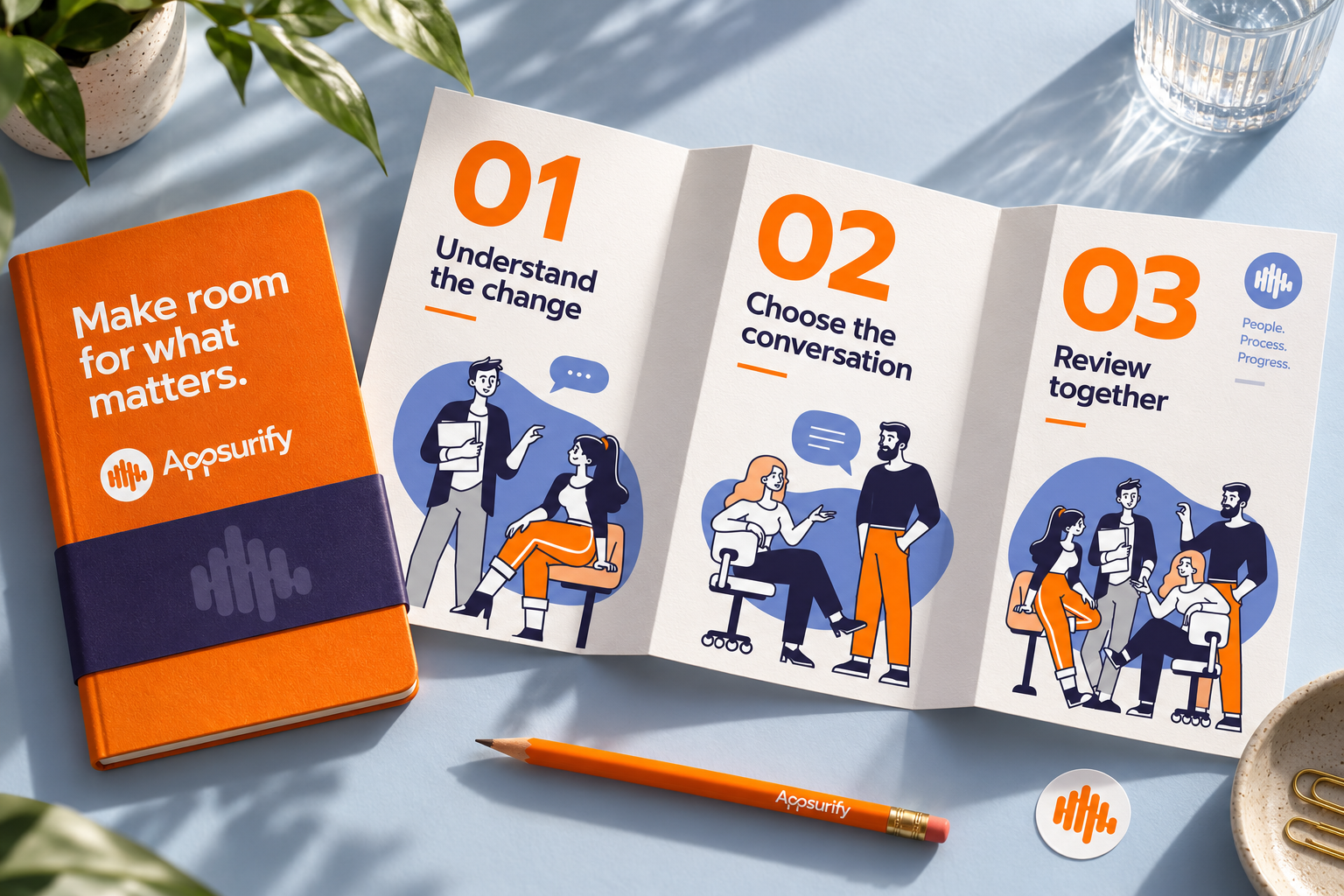
The illustration, beyond the screenMade for the people
Made for the people
doing the work.
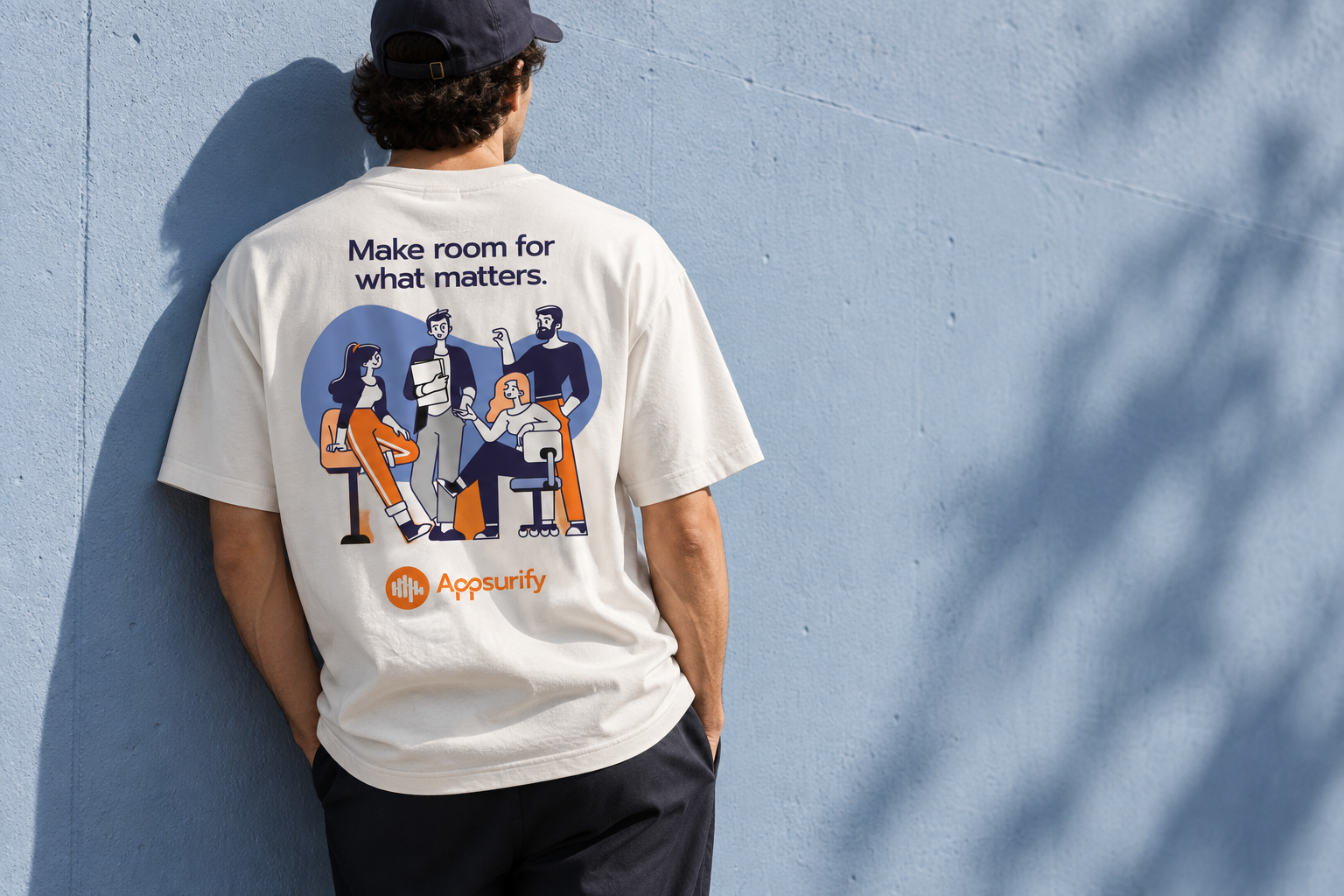
Make space
for a better
conversation.
A small workshop concept brings the identity into a shared setting. A round table, clear discussion prompts and useful printed materials turn the brand’s human character into a physical experience.

Simple shapes, useful meaning
A clear visual vocabulary.
A clear story
from the first slide.
A presentation toolkit gives the brand a consistent voice in product introductions and team discussions.
03 / Help people understand the subjectA useful idea.
A useful idea.
An inviting read.
A learning-page concept connects the product’s technical subject with the original people illustration and an accessible editorial structure.
Product Resources About
Ideas for QA teamsStart with
Start with
the change.
A clearer conversation about what to review next.
Give the review a shared starting point.
A useful review begins with context. What changed? Which questions need attention? What does the team need to understand before deciding on the next step?
A clear question makes a better conversation.
Keep the change, the relevant information and the discussion close together. Make the next action easy to find.
A rounded rhythm, with a clear focus
Find
your flow.
QA software branding & SaaS designMake your product
Make your product
easier to recognise.
And understand.
Phable connects identity, illustration, messaging and launch communications to give software businesses a distinctive, coherent presence.
Talk about your software brand ↗What did Phable create for Appsurify?
A refreshed brand identity, illustration, branded clothing and a consistent presence across website, social and marketing, supported by messaging and launch advertising.
Why does QA software need a clear brand?
Technical buyers need to understand the offer and recognise who is speaking. A coherent identity, relevant language and purposeful content help make that conversation clearer across channels.
See more technology branding case studies and ongoing creative support.
Original identity, Prompt type specimen, palette and illustration: Phable’s Appsurify project. New campaign, physical, digital, icon, presentation and motion applications are portfolio concepts. Photographic scenes are generated; interfaces and sample project states are nonfunctional. No software engineering, product-performance statistic or measured commercial outcome is attributed to Phable.