Phable × Verifa
Technical expertise.
A very human identity.
Brand strategy, illustration and website design for a Helsinki DevOps consultancy built around collaboration and open-source thinking.
Phable helped Verifa express the people behind its technical expertise. Workshops, visual exploration and a characterful illustration system shaped an approachable identity and a clearer digital story.
Brand strategy · Visual identity · Illustration · Website design
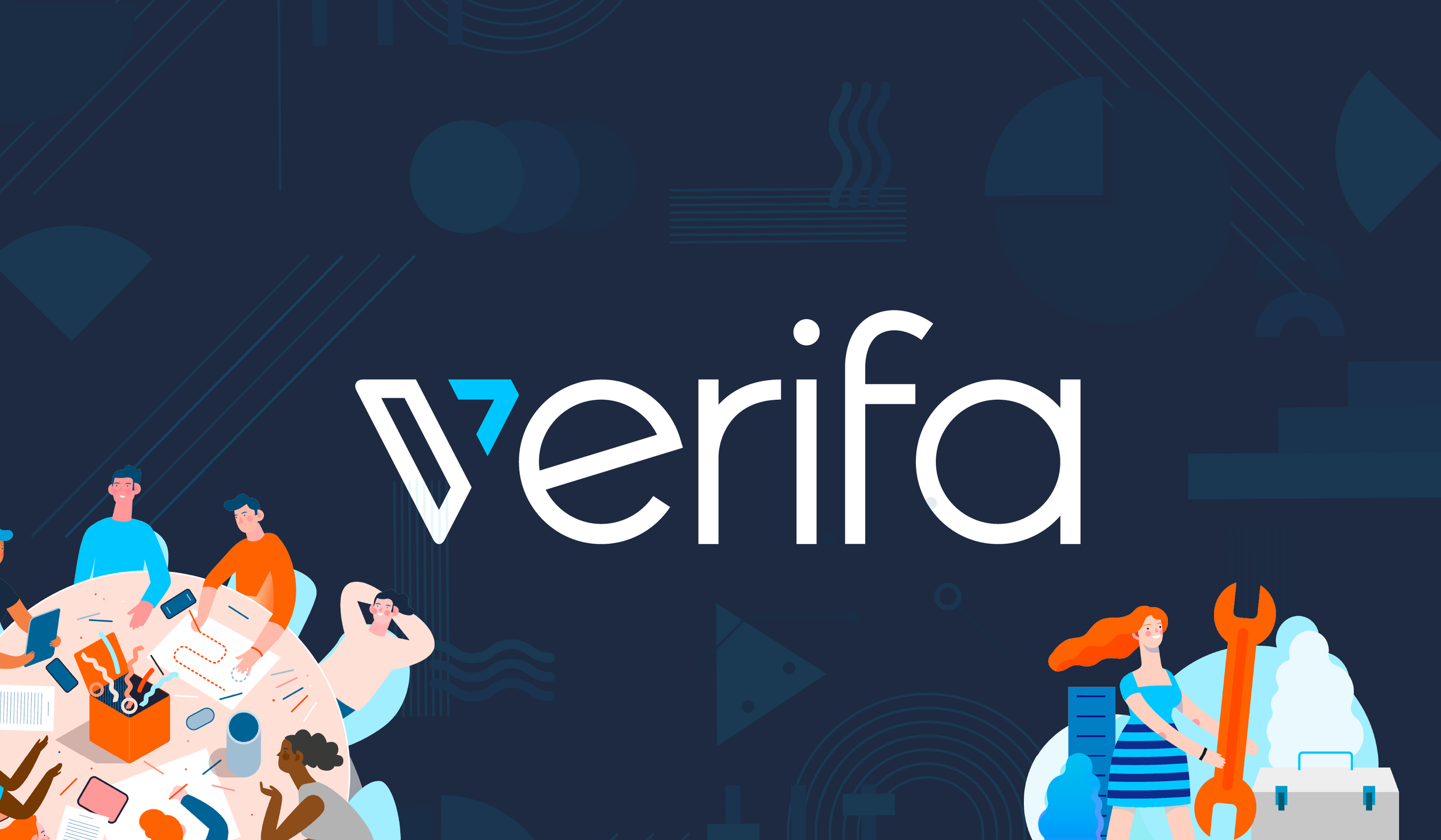
Open, collaborative and full of character.
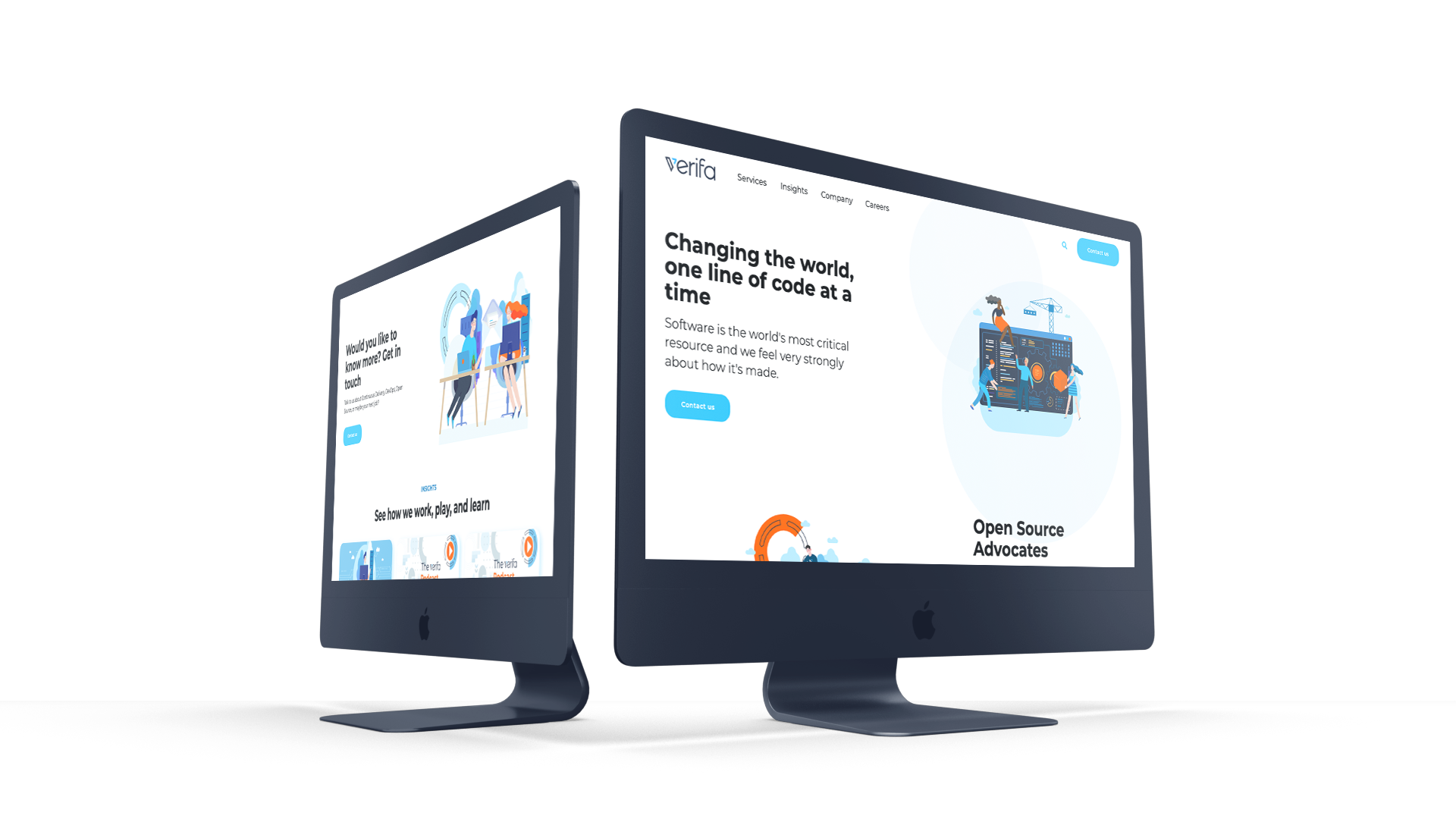
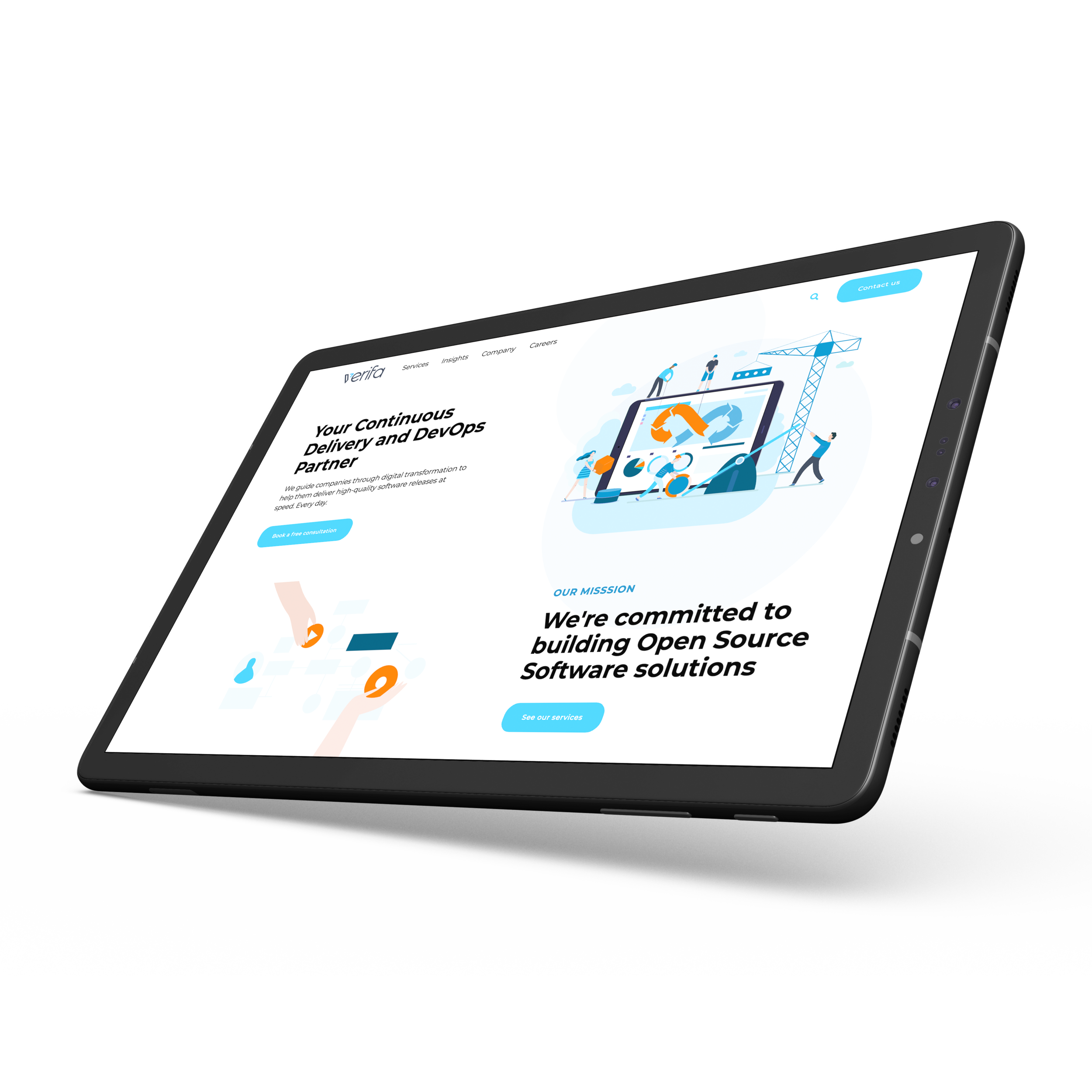
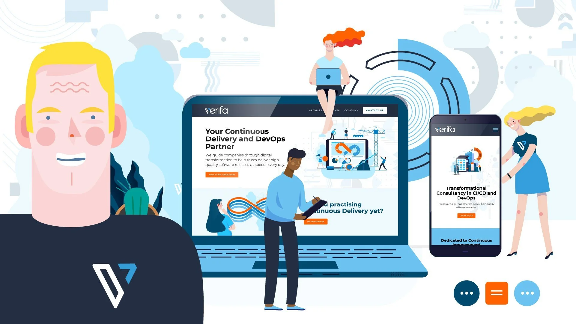
The project began with brand assessment workshops and exploration of Verifa’s visual language. The resulting identity combined a distinctive wordmark with illustrations that made teamwork tangible. These are the earlier Phable designs, before Verifa’s later change of identity.

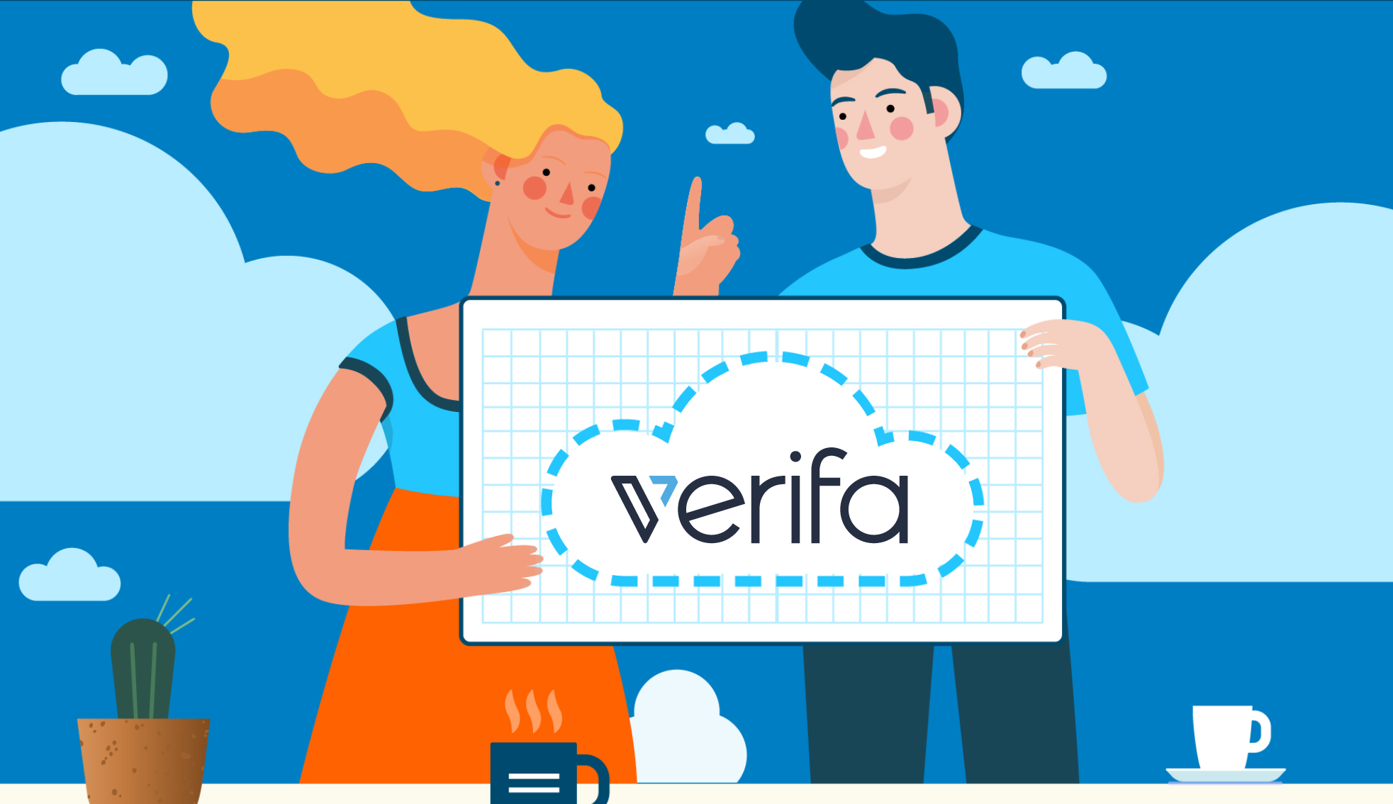



A digital home for the way a team thinks.
The original website work paired clear messages with a distinctive illustrated world. The new knowledge-library study extends that approach: real subjects from Verifa’s surviving technical archive, with a focused interface for finding them.
Verifa / Knowledge library — interface concept
VerifaIdeas worth sharing.
THE KNOWLEDGE LIBRARY
Good ideas
travel further.
travel further.
Explore practical thinking from Verifa’s technical archive.
3 resources
Delivery / ArchiveKeep your pipelines simple, stupid
A perspective on making delivery workflows easier to maintain.
Read the original ↗Cloud / ArchiveThe power of Infrastructure as Code (IaC)
An introduction to managing infrastructure through code.
Read the original ↗GitOps / ArchiveWhat is GitOps anyway?
A conversation about GitOps, its uses and practical questions.
Read the original ↗A proposed interface using real archive articles. Verifa’s consulting business closed in 2025; its technical writing remains available.
VERIFA / THE DELIVERY WORKSHOP
Small changes.
Shared progress.
Shared progress.
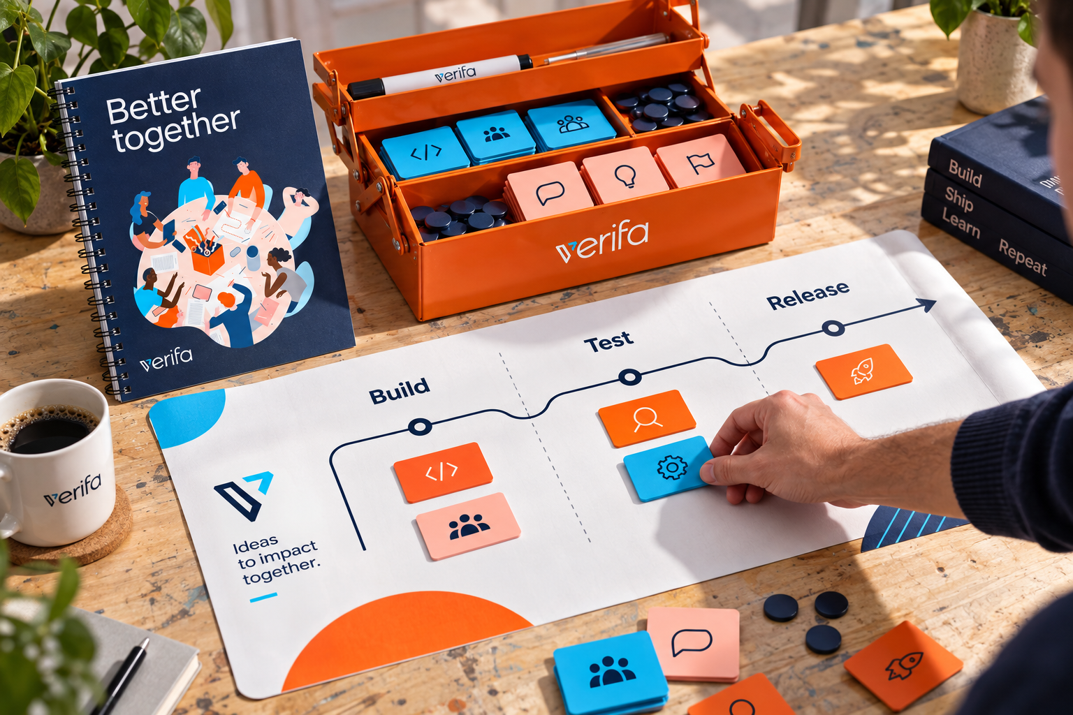
An illustrated rhythm for making,
reviewing and sharing ideas.
BuildReviewShare
Make the work visible.Illustrative brand sequence · not a live software pipeline
A shared identity, beyond the screen.
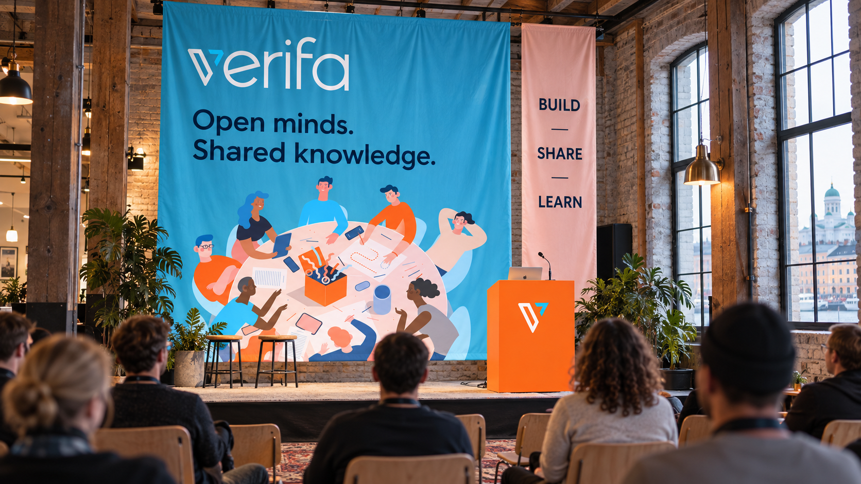
The illustrations can do more than decorate a website. These new applications explore how the original visual language could welcome people into a room, start a conversation and travel with the community.
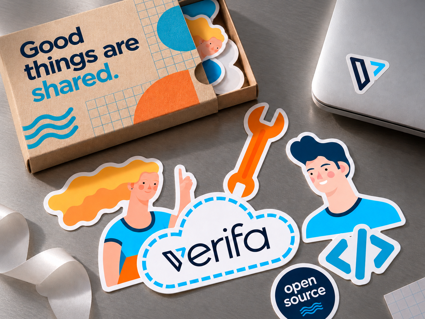
Give technical expertise a recognisable character.
The Verifa project connected brand strategy, a distinctive identity, human illustration and website design. It shows how an engineering business can express the people and values behind its expertise.
This folio documents the earlier Phable identity. Verifa introduced a different identity in 2022 and closed its consulting business in 2025. Its technical archive remains available.
Explore Phable’s branding services →
Talk about your brand →About the project
What did Phable create for Verifa?
Phable’s earlier Verifa project included brand assessment workshops, visual identity exploration, illustration and a content-led website. The original work is identified throughout this page; new concepts show further applications of that identity.
Why use illustration for a DevOps consultancy?
Illustration can make the human relationships behind technical work visible. In Verifa’s earlier identity, a recurring cast and a distinctive palette connected collaboration, recruitment and digital communication.
Is this Verifa’s 2022 rebrand?
No. This is the earlier illustrated identity. Verifa’s 2022 announcement documents a later redesign by Emanuele Pizzolorusso and an in-house website build.